UX for search 101️
Design for discoverability: Critical patterns for better user experience.

 When I started to work with the search feature as a designer, our challenge was droved by the business need of providing a good user experience when they typed a query for a gym or studio nearby and wanted to see matching results. Usually, most businesses keep the search feature simple, with a search box input for a query with 1 or 2 keywords and a basic results page, but the universe of the user discoverability with search evolves so much more, and it can be tricky.
Quoting Peter Moville and Jeffrey Callendar in their book Search Patterns:
“Search is a defining element of the user experience… Unfortunately, it’s also the source of endless frustration. Search is the worst usability problem on the Web.”
As we started to incrementally add features to our search, I went deep on understanding patterns that are specific for search interfaces that predict interactions and behaviors from users, to help us to build a complete and powerful user experience.
Search box x Navigation
We realized that expecting our users to rely on the search box only, as a solution, wasn’t enough for their discoverability journey.
Here’s is 5 whys from a Nielsen-Norman group study about the topic:
- Search requires knowledge of the search space
- Search increases memory load
- Search has a higher interaction cost than browsing
- Specific site search can often work poorly
- Users have poor search skills and don’t know how search works
Therefore, the recommended search model for an effective search considering users’ different behaviors (from novices to experts), is a balanced initiative between specific search and navigation through browsing.
Of course, there’s no one size fit’s all, but that’s is what makes sense to our product and often works well on other products such as Netflix, Twitter, Amazon, and many other players.
Navigation is very important because it provides users with a view from what they can find and teaches them about the structure of the search space, what can they search. Showing upfront content that they can recognize substantially improves usability because it reduces their cognitive load.
“Using the navigation categories is often faster and easier for users than generating a good search query.”
This way, through navigation, we can improve usability by reinforcing one important usability heuristic defined by Jacob Nielsen: Recognition over recall.
Successful interaction patterns
Also during our benchmarking and studies, we observed that businesses that are great in terms of search, succeeded by embracing search-centered solutions that recognize that search and browsing must be used combined to improve the experience and empower our users. These solutions usually have those 3 aspects:
- Federated
- Faceted
- Fast
Federated
It allows users to search across all of its content simultaneously through one search query. They can view all search results in one list, no longer needing to check everything individually. The federated search engine performs many searches at the same time for the user.
For example, Instagram has a federated search where you can search by all, accounts, hashtags, or places. On LinkedIn, you can also search by different databases, like jobs, people, or groups.

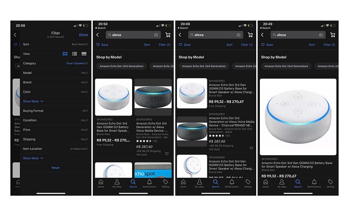
Faceted
It provides users the ability to narrow their options and find what they want, without having to guess our different products and structure or do too much filtering and browsing.
Quoting a Nielsen-Norman study on the topic:
“Such narrowing is invaluable for users who need to find something specific within a large content set. (…) A faceted system includes two critical elements:
Simple controls to construct sophisticated searches: Providing familiar controls empowers ordinary users to narrow down a large set of results to a small set that meets their exact criteria — without any special knowledge of Boolean logic or query syntax.
Simultaneous display of the facet controls and the results: Showing both the filters and the results at the same time makes it easier for users to understand the relationship between the two; ideally, this is reinforced by dynamically updating the results set as soon as the user selects a filter criteria.”’
As an example of the faceted search, we have the LikedIn, Mercado Livre, and eBay experience where users can refine their search, without having to go to another page and can see results updating while they activate the filters.

Pinterest has an interesting solution because they provide not only filters but also similar results as shortcuts on the top, giving the possibility to them narrow down results without much effort and providing a continuous and fluid exploration of their navigation.
Fast
This one is pretty much self-explanatory and it seems kind of obvious, but it’s a critical defining element for the user experience success, and it was a pattern observed in all search-centered businesses that are successful.

Companies must prioritize technology investments on hardware, software, and staff to deliver sub-second response times. Users expect fast responses from the system on every level of their discoverability process. It doesn’t matter their behavior, from expert to novices, they all expect quick responses.
There are many more interaction patterns for search documented, but these 3 are the ones that are present on the majority of successful design cases.
Design patterns
Besides the interaction patterns, we can also rely on design patterns to help us build a good search experience for users. Those design patterns are already used by many players like Google, Amazon, and many others, that we already know that works and we can apply in our product gradually.
Here are a few examples:
- Autocomplete
When the interface completes the user sentence with possible outcomes.

- Auto-suggest
When the interface provides user options before they start typing.
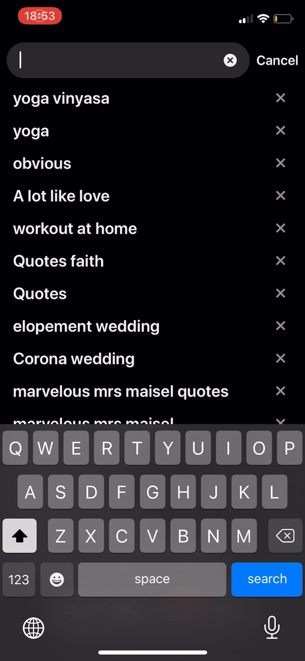
- Recent searches
When the interface shows users shortcuts with their latest searches.

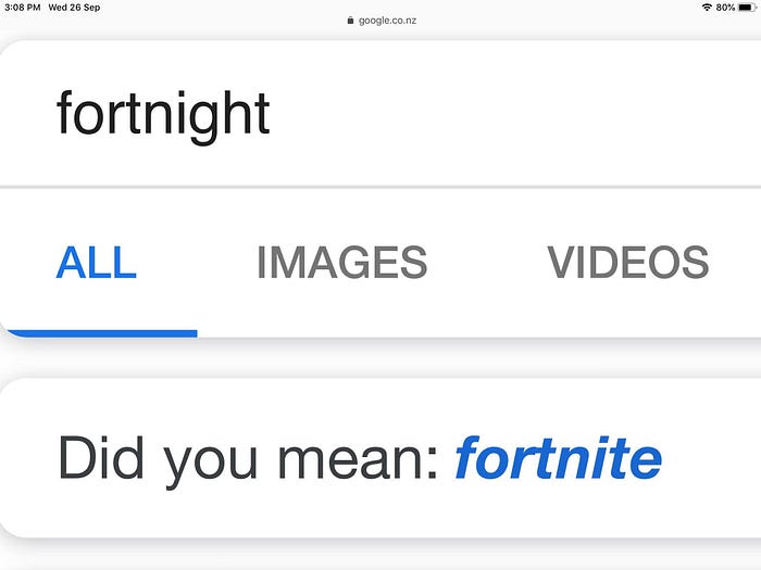
- Did you mean… (Autocorrect)
When the interface autocorrects the user’s input with the most probable match.
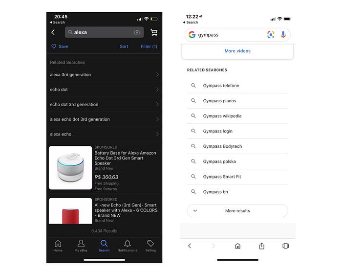
- Related search
It provides users different search options that are related to the query that they input, working as shortcuts to better navigation, implying on less cognitive effort from users.
- Personalization x Recommendation
Personalization is when the system captures information from interaction behavior or previews queries from users and translates into the interface in the form of recommendation, for example: “Because you love Yoga” or “Because you’ve watched Friends”.
In short, personalization can only occur based on the user’s personal usage of the product, so the engine can learn from it and translate it into personalized recommendations.
However, we can also recommend content not based on personal usage but on overall patterns, like “Popular on your city” or “Most users love this”. It’s a recommendation but not personalization.
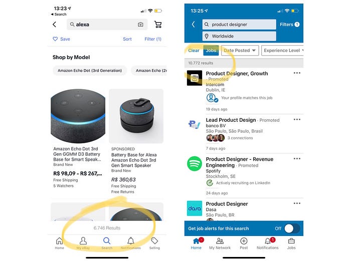
- Pagination
Pagination is a design pattern that works great when users are looking for something specific throughout a component that divides the content into separated pages.

Also, it can be relevant tor users see how many results they got from their query input, it provides to them, combined with the screen pagination, the sense of control and orientation.
- Sorting
This design pattern allows users to control which order they want to see the results and set their preferences. Providing more than one option to display the results creates a more flexible experience that can attend different needs from different users.

- Structured Results — Visualization
Structured results pattern is reshaping our results, changing the visualization, and transform the query results on a different form of visualization to help the users to recognize quicker the chunk of information and learn from it, throughout different visual elements.
- Actionable Results
When the interface provides users the possibility for users to take action on it, like for example save, favorite, or share. Understanding what users would like to do with your product results, can shorten a step for many users with a simple shortcut right on the results page.
Twitter is a good example of this pattern, you can take many actions right from the results page, such as comment, retweet, favorite, or share:
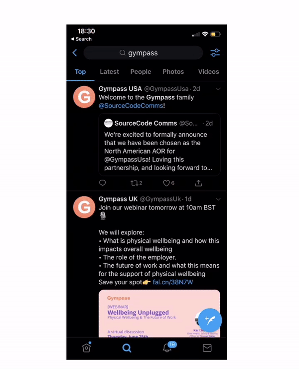
“In short, actionable results are the next step for users and for search. We must stay focused on the goal and design for results beyond results.”
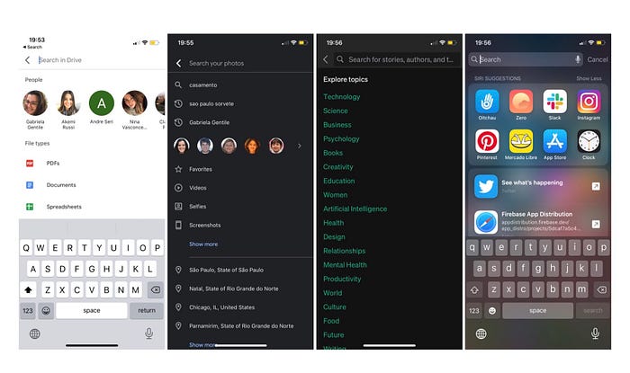
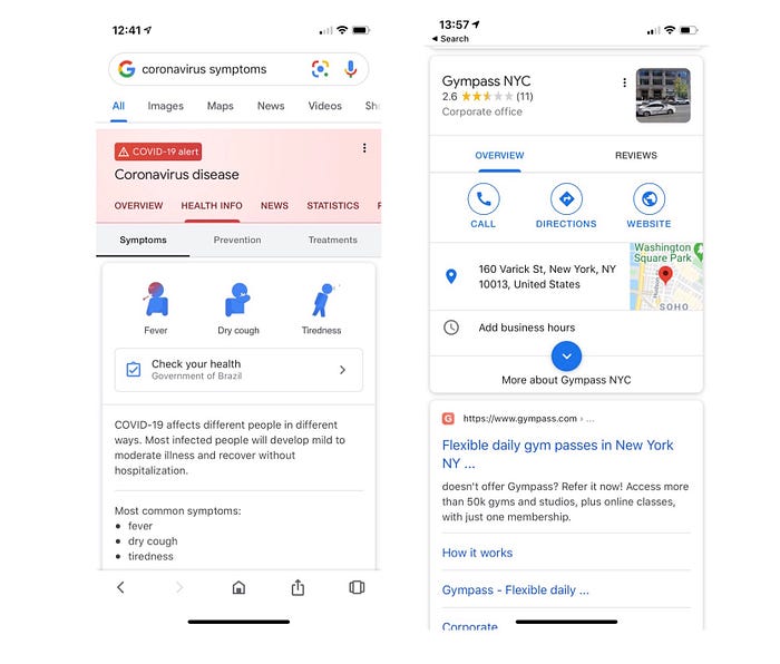
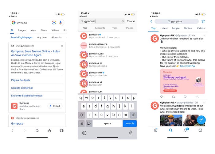
- Unified discovery
This pattern is for federated searches, that search the query on many databases. Unified discovery design pattern, provides to the user a screen where they have the option to see all results together on the same page.
As an example, we have the “All” and “Top” tabs from Google, Instagram, and Twitter respectively:
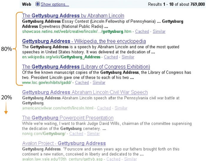
- Best first
This is a very important pattern to look at, while you are designing search experiences. The best first pattern may vary depending on the system, interface, and task, but it’s safe to say that the first results will always drive more attention than the rest of it. The CTR for the top results will always be higher because it implies fewer interaction costs for users.
Despite looking like a simple feature, the best first pattern can be a defining element of user experience. It should support users who are looking for a simple lookup search, but also provide support to query refinement for advanced patterns.
- Alternative Views
When the interface provides users different ways for they visualize the content.
There are several reasons why we use this pattern. Quoting Charles Brewer; Aynne Valencia; Jenifer Tidwell on their book Designing interfaces:
“Users have preferences with regard to speed, visual style, and other factors.
A user might need to temporarily view data through a different “lens” or perspective in order to gain insight into a problem.”
Some users recognize and understand better the content reading the product writing content, while others can be more image-driven. So applying this concept to the search we can provide different options to display information to users and they can choose from what works best for them to understand the content.

When I started to work with the discoverability journey from the search, it was very hard to find content summarized about the topic for designers, and that’s why I wrote this so I can help more people that are working with search or just curious about it.
Studying search patterns was very important for us to design a better experience for our users. Those patterns helped us to shape a new vision for our product based not only on our business and users’ insights but also on market insights from many benchmarking and studies based on their user experience.
Those explained in the article are only a few from the many interactions and design patterns that a search can have.
If you have any questions or if I can help you with anything, feel free to reach me on my LinkedIn profile.
Thanks!
References for this article and other cool links about the topic: