The Coffee Hut app — a UX case study
I decided to set myself another practice UX project. Like before, this project is totally fictional but I’ve approached it as if it were a real project.
Brief: Design an application for Coffee Hut’ customers to click and collect their hot drink order.
Operating for over 30 years, family is at the heart of everything Coffee Hut does. Looking at new ways to move the company forward, the owner of Coffee Hut wants to launch a click and collect service at her coffee shop. Although footfall is strong, she feels having this option where customers can order ahead of time and collect, will encourage more people to use her local coffee shop over competitors.
The Coffee Hut is a small stall based in the business district of Bristol. The majority of its customers are people travelling to work and offices within the city and the most popular hours are through the morning rush (6am-10am).
The most important thing for the new app design is the ‘Click and Collect’ feature. I’ve been told by the client that this must be at the feature point of the app so that customers can find it easily.
The client wants the app to:
- Allow customers to order drinks.
- Allow customers to see the menu.
- Allow customers to see opening times and location.
- Allow customers to pay via online payment or cash on collection.
- Allow customers to find the opening hours and location of Coffee Hut.
- Be easy to use and work on all devices.
Interview the client
It’s vital to get more information from the client so that you can get more insight into their aims of the app and what it is from a business perspective that they hope to achieve.
Questions:
What are the goals for creating this app?
The goal is to make it easier and more convenient for my customers to order their drinks and in turn increase profit.
Why are you creating this app and not just sticking to face to face shop orders?
Although walk in business is good, I often get customers who can’t make it in the morning because they are running late and they don’t have time to wait if there’s a queue at the stall. By having an online ordering system, that will hopefully solve that problem, if they can order ahead of time and have their drink ready when they get here.
How will we know that this app is successful?
An increase in morning customers ordering via the app and an increase in sales by 3% initially would be great.
Who will be the users of your app?
Predominantly office workers who have a morning commute, access to a smartphone and those who would prefer to order online to cut out the wait time. Our customers tend to be more middle aged professionals.
Why would your customers use this app? What problem will be solved by having this app?
As I said before, customers often skip getting coffee because they don’t have time to wait in a queue. We’re often the victim of our own success because when it is busy at the stall, people who have limited time turn away because of the wait and this means a loss of profit for my business. Having an app will allow customers to order on the go and have their drink ready by the time they reach us. This will discourage them to go to competitors and big coffee chains.
With this information to hand, I can now start researching and thinking about the strategy documentation. First up a persona.
Persona
For this project, I thought it would be good practice to create a persona for Coffee Hut. A persona is great for getting to know the type of user that would use the app, as well as their interests and likes/dislikes, technology use etc. Below is the persona I created for the coffee app:

Next I need to work out the business and user goals. To help me with this, I use observational research by observing people as they order a coffee on an app. Please note due to the current virus situation, I was unable to carry out observational research but here’s what I would have done. I chose to research middle aged people, who commute into work and enjoy takeaway coffee. They need to be comfortable with using a smartphone and using apps. They will also need to be keen on using an online ordering system, instead of the usual walk in and order method.
The research that could be carried out could include observing a selection of users as they commute into work and order a coffee on an app to collect on the way to their place of work. To help me with my research I use an Empathy Map:

Business Goals:
- Increase sales through a simple to use click and collect app
- Have all of the available drinks online
- Appeal to the morning commuter
- Increase sales by 3% initially
User Goals:
- Fast and convenient order app
- Good selection of drinks, just like the shop menu
- Minimal effort when paying. Pay via the app so that the wait time for a drink is reduced.
Archetypes:
Why do they use the product?
To make it quick, easy and convenient to purchase a coffee and skip the queue.
Behaviours and environments?
Busy morning commute to work. Travelling on public transport or walking on foot.
Goals, needs and motivations?
Avoid waiting and queueing by purchasing coffee via the app and collecting with minimal effort.
The user is a busy commuter who wants to order a coffee to collect with minimal effort on their way into work.
I’m now starting to get a clearer understanding of what it is that the app needs to do and how the experience can be shaped for the user. I find that it’s extremely important that the app is responsive and most importantly performs well on a mobile device, as this seems to be the device of choice for commuters. The UI also needs to be simple and clean with a straightforward user journey. Commuters often have lots of distractions around them. Some may even be stood up, especially if the bus or train is cramped and busy. When using an app to order there needs to be as few steps as possible in order for the user to reach their end goal.
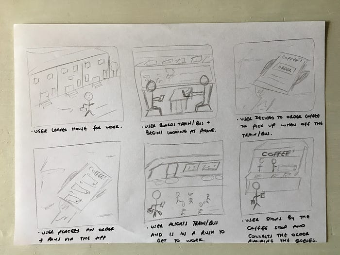
Storyboard
My next task is to storyboard, making sure that I focus on the users actions and environment. Here’s the storyboard I came up with.
User Journey
Next I start to map out the user journey. This provides a great insight into the steps that your app should have. It’s handy to do this before wireframing because you can start understanding what it is that your app should do and how the user is likely to use it. I also map out the users emotions to understand how the user may feel at each point of the journey.
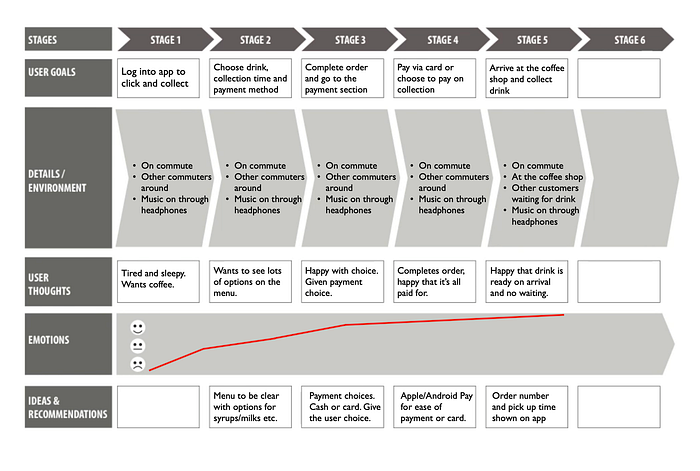
Scenario
The scenario goes hand in hand with the user journey. This allows me to map out any problems or scenarios that the user may come across when using the app and the suggested solutions to those problems. This is really important as I can take these scenarios and shape the wireframes around them. It’s always a good idea to think of these things before thinking about any app design or functionality.

Wireframing
Now that I have the storyboarding and user journey complete, I can now start to think about how the app can function for the user.
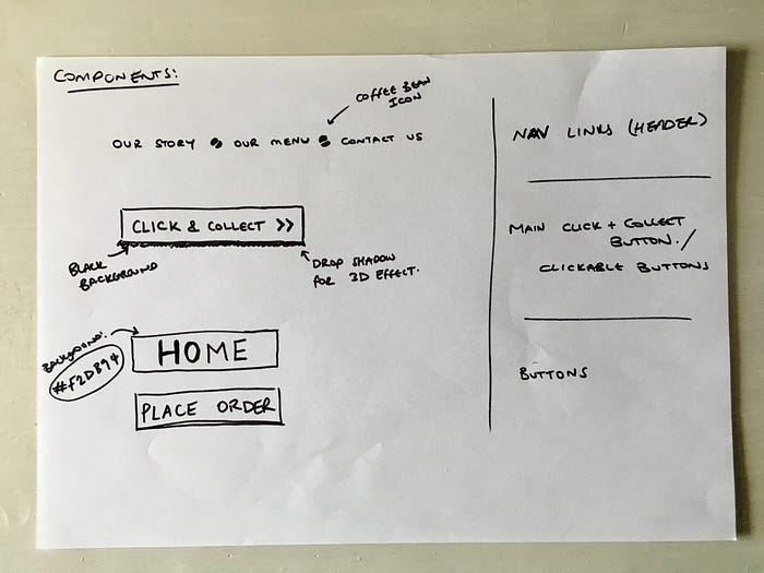
1. COMPONENTS (Below):
First I wireframed some of the components, looking at individual atoms and molecules.
2. LARGE SCREEN (Below):
Next I moved onto wireframing the landing page and the click and collect page for large screens.

When thinking about layout, I wanted the click and collect button to be nice and big and take prime position on the page. The client really wants focus on the click and collect feature and to make sure that her customers know where to go, so this is a way of achieving that. Open hours and location was also important to the client, so I’ve placed these just below the click and collect button on the landing page, so that this information is nice and clear to the user.
On the click and collect page, I’ve made sure that the process of ordering a drink is as simple as it can be with very little steps and inputs to fill in. There is a large ‘Place Order’ button at the bottom of the form. When choosing this layout I had the my persona in mind, thinking about them ordering a drink on a busy commute, so the form is designed to be easy and clear to use.
3. MEDIUM SCREEN (Below):
Next I moved onto wireframing for medium screens. The landing page layout doesn’t differ from large screens but the click and collect form field inputs are now on top of each other. Again the click and collect button is central to the page with open hours and location information prime position.

4. SMALL SCREEN (Below):
The final step was wireframing for small screens. Similar to the medium layout, the click and collect form fields for small screens are now stacked on top of each other to avoid it looking cramped. The elements on the landing page are also stacked on top of each other. Again a nice big click and collect button on the landing page so that the user can go to the ordering form with just one single click and the open hours are nice and clear to the user.

Prototyping
Now that I had wireframing done, the next step was to move onto prototyping. As with my previous practice project, for this I used a Low Fidelity prototype on paper. I move onto more High Fidelity prototypes later.
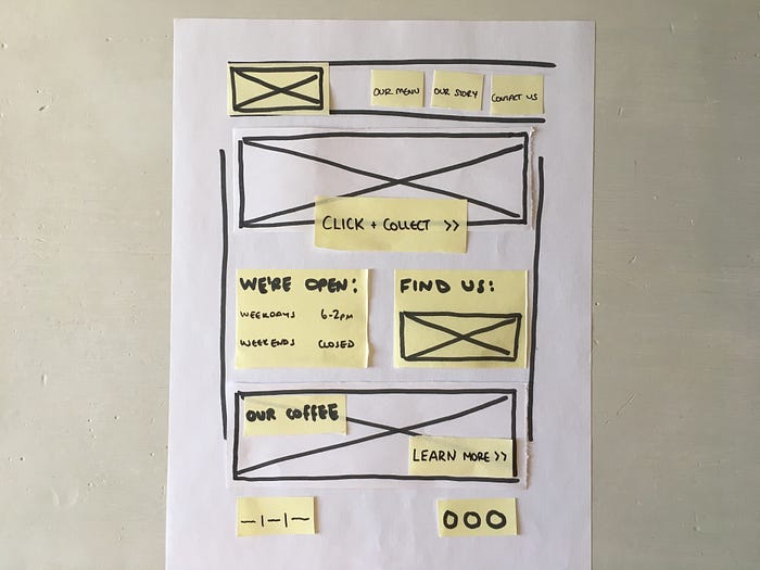
1. LARGE SCREEN LANDING PAGE (Below):
This is the landing page prototype for large screens. Keeping to my wireframing layout, I have the click and collect button in the centre overlapping the hero image. I also have the open hours and location below that button, as this is very important to the client. Prototyping allowed me to see how much excess space I had, so within this space, I’ve created a section that promotes the coffee that Coffee Hut uses. I thought this was a nice touch and is a selling point to many coffee lovers.
2. LARGE SCREEN CLICK & COLLECT (Below):
Here is the prototype for the ‘Click & Collect’ page. Here I have a heading stating ‘Click & Collect’ and I have a very simple order form. I’ve kept it as simple as possible, as I don’t want users to be overwhelmed which could result in them abandoning the user journey.

3. LARGE SCREEN ORDER SUCCESS (Below):
I thought it would be good to prototype how the order success screen of the click and collect order will look. Here I have kept it very simple for the user, stating their order number, chosen collection time and the address of Coffee Hut with a map, so that they know where to go. Here I have thought about new Coffee Hut customers who may not be entirely sure where to go.

4. MEDIUM SCREEN LANDING PAGE & ‘CLICK & COLLECT’ (Below):
My medium screen prototype is similar to large screen particularly on the landing page. However, on the ‘Click & Collect’ page the field inputs are now stacked as putting them side by side would make the UI look cramped.

5. SMALL SCREEN LANDING PAGE (Below):
Next, I move onto small screens. Here I’ve kept the content the same but it’s now stacked on top of each other to avoid it looking cramped. I have also replaced the nav bar with a burger menu, you can see how it looks when clicked on below.

6. SMALL SCREEN CLICK & COLLECT (Below):
Again for the ‘Click & Collect’ page I’ve stacked the form fields on top of each other. Putting them side by side would have made the UI looked cramped and I want to keep enough white space to make it look easy on the eye for the user. There is still a big ‘Place Order’ button at the bottom.

7. SMALL SCREEN ORDER SUCCESS (Below):
With the same content as large screen but for smaller screens, the map is at the bottom of the element instead of at the side. There is also a ‘Home’ button to take them back to the landing page if the user wishes.

8. SMALL SCREEN BURGER MENU (Below):
In this prototype I map out what the burger menu will look like when the user clicks on it. Just a nice simple drop down menu with the three items. The menu is at the top as this takes priority.

After prototyping on paper, I decided to look at more digital designs and how I see the app being developed moving forward. Below are my digital designs I’ve made for the Coffee Hut app.
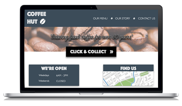
LARGE SCREEN LANDING PAGE (Below)
Here I’ve made the click and collect button the centre piece. On the button there is an arrow icon indicating to the user that clicking this will take you elsewhere. Following the clients requests, the open hours and location are all visible. On the navigation bar, I’ve put the menu item first so that it’s easy to locate, should the user need this. I’ve gone for a large hero image which stays throughout the site and on the image I’ve included a quote that symbolises the pride that Coffee Hut has for operating for so long. I’ve kept to the brand colours that Coffee Hut use - Blue, Black and White.
LARGE SCREEN CLICK & COLLECT (Below)
The ‘Click & Collect’ page sticks to the brand colours. I’ve kept the form short and easy to understand with very few fields to fill in, keeping the user journey nice and short. Since the paper prototypes, I added in a running ‘Total To Pay’, as I realised the user had no way of knowing the total of what they were paying. The second design is what the user will see upon completing payment. This is a confirmation with an order number, the time of collection and the address. There is also a convenient map that the user can click on. I’ve decided to put this within a box with a lighter blue background to make it stand out to the user. There is also a ‘Home’ button to take the user back to the home page if they wish.

MEDIUM SCREEN LANDING PAGE AND CLICK AND COLLECT (Below)
Below is how the app will look on a medium screen. The landing page layout is pretty much the same and the ‘Our Coffee’ section sits at the bottom. The Click & Collect page is still easy to interpret with minimal fields to fill out. The only difference being the form fields are now stacked on top of one another.

SMALL SCREEN LANDING PAGE AND BURGER MENU (Below)
The landing page for small screen has the same content only stacked on top of each other to utilise the space. I’ve put the open hours at the top as this is important to the client. The second design shows how the burger menu will expand when the user clicks on it. Again, I’ve put the menu as the first item as this is generally what the user looks at first when looking at a dropdown menu.

SMALL SCREEN CLICK & COLLECT AND PAYMENT SCREEN (Below)
Similar to the medium screen design the form fields on the Click & Collect page are now on top of each other as putting them side by side would make the UI seem very cramped. The second design shows the order success page. Again with this design, I’ve put the contents in a box with a lighter blue background to make it stand out to the user. The third design shows what the payment screen could look like if the user pays via Apple Pay.

There are of course more pages to this app but I’ve targeted the most important ones for this demonstration. The next stage for me would be to start coding an interactive prototype in HTML and CSS with working links and buttons, so that I can show the client how functionality works. If you have any further suggestions, please let me know!
🙋♂ ️Want to talk?
I’m currently looking for employment. I understand times are very tough with the Coronavirus situation and it’s hard for everyone but maybe we can start talking? I’m always keen to learn new things and discuss ideas and I’m happy to talk remotely with the wonders of modern technology and send a CV and more info.
Please send me an email joshmarston@hotmail.co.uk or drop me a message on Twitter if you’d like to talk and I’ll get back to you.