UX Design Principles: Part 3 of 3
Don Norman's design principles in practice and beyond
A user interaction guide to design efficient, effective, and delightful products using Don Norman's principles.

Principles from The Design of Everyday Things
In parts one and two, we learned about seven important questions of interaction design and seven fundamental design principles from Don Norman's best-selling book, The Design of Everyday Things.
The designer has the challenge of communicating their intent on how to use a product in the most correct and efficient way.
To conclude UX Design Principles, we'll put Norman's theories into practice by referring to a typical case study and then go beyond the design with testing, validation, and iteration.
Design principles in practice
Norman's seven fundamental design principles can help determine the answers to a sequence of questions, which start with a goal and end by comparing the results with expectations.
Taking one question at a time, we'll observe the application of the following design principles:
- Discovery
- Feedback
- Conceptual models
- Affordance
- Signifiers
- Mapping
- Constraints
1. Goal: "What is it I want to achieve?"
Our first question is the goal — our motivation to achieve something. Let's imagine the following scenario:
We need to find a new pair of running shoes in a certain fit, colour, and size.
The next stage is to plan how to achieve our objective by discovering and assessing our options.
2. Plan: "How can I do it?"

Let's imagine we've selected the Nike website as our preferred shopping medium. Upon first impressions, we're presented with many different options to choose from.
Discovery adds visibility to our available options. Clear navigation, prominent focal points, and a natural visual hierarchy constitute good discoverability and understanding.
Clear navigation helps us easily locate and understand the website's key offerings. However, the mobile experience makes content harder to discover since a burger menu obscures them.
Focal points are areas of interest designed to capture our attention; they include engaging images and videos, descriptive headers, and clear calls to action such as 'learn more' and 'add to bag.'
All the above components are arranged as part of a visual hierarchy to help us scan content in order of perceived importance. They are also positioned to meet optimum reading patterns. For example, the navigation, filter controls, and running shoe results are organised to the category pages' top, left and right, respectively.
Other design principles, including conceptual models, affordance, signifiers, mapping, and constraints, can help us determine how to use the website.
Conceptual models exist in many website features, particularly the navigation and controls for sorting and filtering results. These familiar design patterns provide us with a simple explanation of how they work. For example, we know that choosing certain filters will help refine our results.
Affordances are applied to various website components, such as buttons, select boxes, and accordions, to give us a perception of how they could be controlled. However, some affordances rely on signifiers to clarify an intended action.
Signifiers are widely used to communicate where the actions should occur, particularly for flat buttons with little affordance. A simple description, such as 'view more' or 'add to bag,' is enough to tell us about the intended action.
Mapping shows us where the relationships exist between objects, such as the buying tools on the product details page. When we select our options for the type of fit and colour, we see the visible effects on the page, including the available sizes and changes in price.
Constraints limit what, where, and when information can be used to reduce clutter, confusion, and cognitive load. For example, the navigation initially provides us with just the top-level categories.
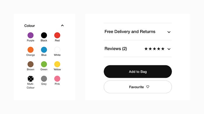
3. Specify: "What options do I have?"

Learning how to use the website allows us to specify a sequence of actions to perform. Let's take the following activity to perform on the website:
Select a sequence of option from the buying tools, including fit, colour, size, and add to basket.
Conceptual models, discoverability, mapping, constraints, affordance, and signifiers can assist us in specifying the sequence of actions:
- Select the fit
- Select the colour
- Select the size
- Select add to bag
There may be scenarios when certain options, such as size and colour, are out of stock. In the event of product unavailability, disabled button states are necessary to communicate what we cannot control and limit our actions to selecting in-stock items.
4. Perform:" What can I do now?"
We now need to perform our chosen sequence of actions physically.
Affordance, signifiers, and mapping will help us perform our actions. For instance, a button's perceived look and feel make us want to press it, labels tell us what the control does, and mapping allows us to see the effects of what we just operated on.
5. Perceive: "What just happened?"
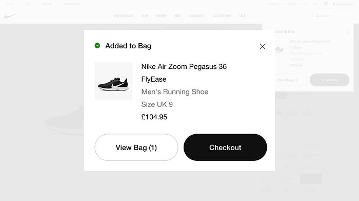
Once we perform our selected sequence of actions, we need to receive feedback on our request.
The basket confirmation message provides useful feedback about our chosen running shoe, including the name, colour, size, price, and quantity. We're also provided with a success message and some additional options.
6. Interpret: "What does it mean?"
Having seen the changes, we now need to translate them into something meaningful.
Once again, feedback is essential for providing us with enough information to determine the results of our actions. The success message – 'Added to Bag,' and the green tick icon explain what has happened, and additional options imply that our chosen pair of running shoes are now ready for purchase.
7. Compare: "Is this okay? Have I accomplished my goal?"

The final question asks if the results meet our expectations. This is where we compare the outcomes to our goal.
So far, we've used all seven design principles to determine the answers to our questions. Feedback will now provide us with confirmation of whether our actions have led to a successful outcome. If the results are not what we expect them to be, we would at least require an explanation of what has happened and what to do next.
Feedback can induce positive and negative emotions. If the results are not what we expect them to be, such as an error, they will likely evoke confusion or even anger. However, when our actions work to meet our goal, we'll experience that moment of delight!
For example, in the Nike mobile app, SNKRS, customers can enter a raffle to purchase a limited-edition pair of shoes. After a tense thirty-minute countdown, the winner receives a special message confirming their prize, adding pure delight to their experience.
Seeing this message gave me a real satisfying experience — a lucky winner
Beyond the design principles with user testing
Applying design principles is only the beginning of a UX design process. When someone engages with the product, we must learn about their thoughts, feelings, and perceptions. Can they use it? Do they find it useful? And would they use it again?
Going beyond design principles involves testing with real users to learn their behaviours and attitudes towards the design. Rich user insights can then be used to improve the product.
How to test your product
The earlier and more often we can test our ideas, the sooner we can iterate our designs to meet user needs and help achieve business objectives.
Here is a quick overview of some popular research methods:
Unmoderated remote user testing is quick, agile, and ideal for when design validation is needed early and often. Participants provide feedback on a design by using screen recording software. Remote user testing may also be facilitated to gain further insight.
Moderated in-person user testing involves a facilitator sitting with the participant in the same environment. The facilitator may follow tasks with questions or new activities during the study. This research study requires much time and preparation, but it can give you more valuable insight than most methods.
Guerrilla testing places the research team in the wild to interview random people. Certain locations can be picked to determine a demographic appropriate to the design you're testing. This research method is the most cost-effective, though you may need to consider offering participants a small reward as appreciation for their time and efforts.
Quantitative testing involves researching large volumes of users. Typical tests include card sorting, tree tests, click tests, and timeout tests. These research studies may not answer why users make certain decisions, but they can help benchmark clicks, mental models, and time-to-complete task ratios.
Analysis and iteration
Once the user testing results come in, it's time to analyse the findings. This can involve a lengthy process of consolidating insights, grouping them into themes (also known as thematic analysis), and making recommendations.
Research recommendations can help determine usability issues to resolve, pain points to focus on, and opportunities for enhancing the overall user experience. This is when the UX process becomes iterative; design changes are applied using the same principles and then tested until the product meets the user's needs.
Norman's principles can help us develop a deeper understanding of user interaction, including the types of questions people ask, their cognitive processes, and levels of emotion.
The Nike website case study demonstrated that the seven fundamental design principles can help us determine the answers to the questions and find ways to influence positive feelings, such as delight.
However, design principles are just the beginning of a UX process. To determine the product's quality of experience, we need to test the design with real people and then use insights to make necessary iterations.
This three-part article is based on Don Norman's best-selling book, The Design of Everyday Things. It was written more than 30 years ago — and is still relevant to the design industry today. There are, of course, many more principles to adopt, but Norman's philosophy serves as an incredible UX foundation.