UX strategies to guide users through a complicated journey
Are you designing a complicated and somewhat confusing user journey? Are you redesigning a product with features not connected cohesively? Are you trying to provide guidance to your users so that they are always clear on the next steps? If these sound like what you’re doing, the UX strategies I’m going to talk about will help you design to provide more guidance.
So when do we need to think about guiding users? By definition, guidance is the action of guiding or counseling. In the digital design world, two situations are especially suitable for providing guidance:
- The user journey is confusing or complicated: Let’s think of buying a car. There are a lot of things a customer needs to figure out: what type of car? new or used? what brand and model? what are my financing options? In these situations, users feel confused when facing so many questions at the same time and they will feel frustrated when there’s no guidance.
- It’s a first-time experience: The journey doesn’t have to be long and confusing necessarily, but if it’s the customer’s first time going through the journey, there’s usually a learning curve to get started. To many users, the first time of using your product is the hardest time.

To design for guidance, I divided the strategies into 3 levels:
- Product Level: A product is a collection of features together to satisfy one or more customer needs. From the product level, the strategy is to simplify the user journey: to consider the user journey as a whole, not piece by piece, to redesign the “steps” on the journey.
- Feature Level: A product may contain multiple features and each feature adds value to the product. Since the scope of features is smaller than products, from the feature level, the strategy is to streamline task flow so that users are guided through how to use each individual feature.
- Interaction Level: An interaction between a product or a feature and the users involves many aspects like aesthetics, frequency, timing, sound, motion and many more. In addition to interactions with the product or feature, sometimes a product also involves interactions between users. From the interaction level, the strategy focuses on promoting user actions so that users are always clear on what to do next and encouraged to form a persistent habit.
Product Level: Simplify User Journey
1. Help Users Set Goals and Provide Recommendations
Compared to search, recommendation provides a more personalized way to retrieve information from the database. Also, it helps to minimize the learning time by asking questions first — users don’t have to learn about the search filters they can use. When users don’t have much knowledge in the domain, asking questions is a great way to get users started.
Consider using when:
- There are a lot of search results users need to go through — in the case that users don’t have to go through 2000+ results, providing recommendations helps simplify the tasks and save time for users.
- Users are not familiar with the search results or search filters — in the case that users need to learn how to use the search tool, providing recommendation makes it easier to get started.
- Users’ search criteria are less likely to change over time frequently — in the case that getting more results is much more important than changing search criteria, giving recommendations instead helps users skip the search task (by asking questions the first time) but keep feeding users more results gradually progressively.
- And of course, if the search experience is complicated, time-consuming and not enjoyable.
Benefits:
- “How to use the search control elements (such as filters and orders)” is less confusing
- Users don’t need to have much domain knowledge to start with
- Giving fewer results at a time reduces cognitive load for users
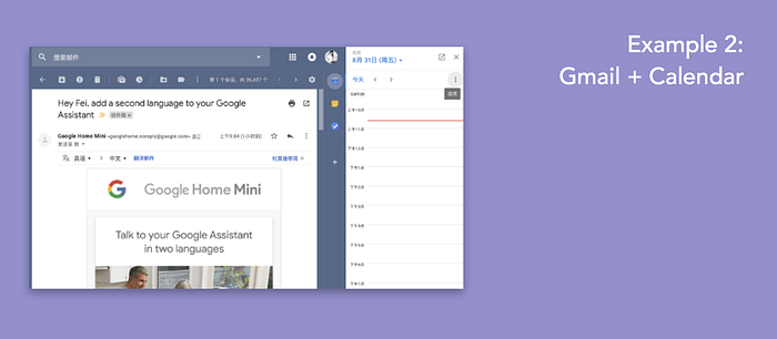
2. Eliminate Unnecessary Steps
Are you asking your users to do repeated tasks or input redundant information? It’s time to think if you’re asking your users to work on unnecessary things to complete a task. If users fill every form with the same demographic information again and again, why not auto-fill the forms or even let them submit forms in bulk? If two features are connected directly, why not eliminate all the barriers between the two?
Consider using when:
- Some steps are repeated, redundant, or unnecessary
- The user flow is frustrating and time-consuming
- The conversion rate is lower than expected
Benefits:
- Improve conversion
- Reduce user frustration
Feature Level: Streamline Task Flow
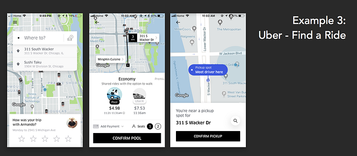
1. Linear Flow (for smaller or simpler features)
Sometimes what confuses users is the first step: should I do A, B, or C first? But a lot of times, the order doesn’t really matter. What matters is that you create a way to eliminate the “first step” dilemma. Although the flow isn’t naturally linear (tasks could be paralleled), it does not mean you cannot design it to be linear. By designing a linear process, you are helping your users determine what steps they should take first and next instead of leaving the problem to them.
Consider using when:
- The task is small and simple — A simple linear task flow is best for smaller tasks. For larger or more complicated tasks, we will cover in the next strategy.
- You have a mix of required and optional fields.
Benefits:
- Make users feel less overwhelmed.
- Allows users to focus on one task at a time
- A clear path to successfully complete the task: clearly defined start, next steps, and end
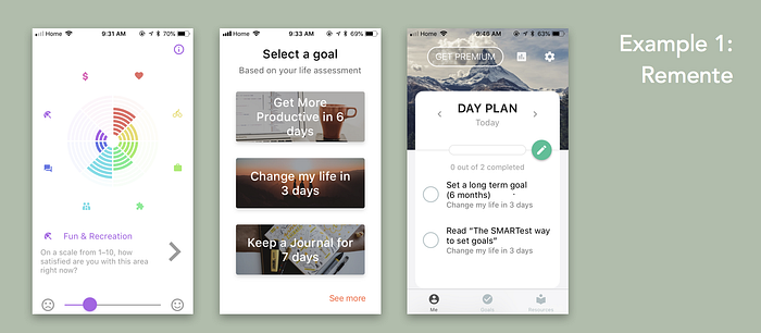
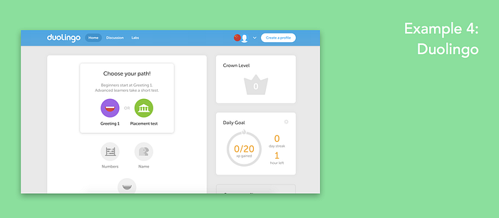
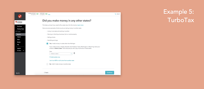
2. Progressive / Conversational Flow (for larger features)
Many times, a feature is more complicated than finding a ride — it may contain a lot of content or require a lot of input from users. We don’t want to overload information onto users when they start to use the product — that makes them feel overwhelmed and clueless. To make a better experience, more and more digital products start to change forms and content into conversations. Just like the linear flow, conversational flow also allows users to focus only on one task (or a limited amount of tasks) at a time. Also, instead of serving users all the information they could potentially consume, more and more products start to reveal the “journey” as the users get more familiar with the domain or the product.
Consider using when:
- The feature is relatively more time-consuming and complicated
- Progressive: You’re giving users a lot of features/content to start with: in the case that users have a hard time finding the right path to achieve their goals on your product, you probably want to define the best path for your users. Starting with the content that is too hard to consume would discourage users from using your product. Start with something relatively easy and digestible and then go to some more complicated task/content progressively.
- Conversational: You’re designing complicated forms with conditional questions — Users hate long forms and they want to spend as little time as possible on filling out those forms. Instead of asking the users to fill out all the forms and then tell them which forms are actually needed, there’s a better to collect user input — start a conversation. From the progressive conversation, your product is collecting information from users by asking one question at a time and simultaneously filling out the forms for users. And because in a conversation, every question is stand-alone, it’s highly flexible to avoid any unnecessary questions from getting in front of users.
Interaction Level: Promote User Actions
Often times, a digital product involves two types of interaction: user-product interactions and user-user interactions. Promoting user actions through interactions enhances user engagement and helps form a habit. It also shows a clear direction of what the product suggests them to do next — helping connect the features to form a cohesive product experience. So I will briefly talk about some strategies to promote user actions on the interaction level:
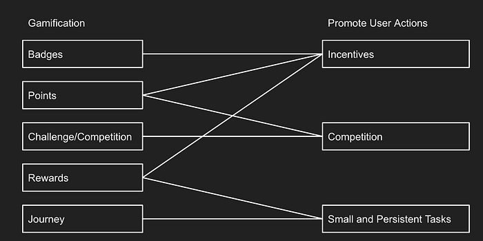
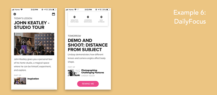
1. User-Product Interaction: Small and Persistent Tasks
Although users may not have several hours to spend on your product, and they don’t need to, it’s possible to develop a habit with small and persistent tasks. The tasks are designed to be small because you don’t want your users to feel overwhelmed but persistent so that you can help them form a long-term behavior.
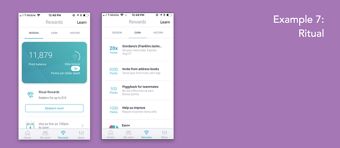
2. User-Product Interaction: Incentives
Providing incentives to users is another easy way to promote user actions. The incentives could be tangible (such as rewards, credits, or gifts) or intangible (such as points, levels, or badges).
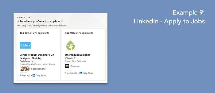
3. User-User Interaction: Competition
A lot of times, competition and peer pressure are a great power to push us forward. Many users enjoy competition because they can show that they have the ability to conquer the challenges.

At the end of this article, I’d like to mention that gamification is also a great way to promote user actions. Many gamification mechanics was carried out as the solution to implement the UX strategies I talked about above.