How Spotify’s user experience is helping them win the streaming wars
 At the time of Spotify’s initial launch in 2008, music streaming and streaming in general was more of a novelty than the competitive battleground that it is today. There were definitely players in the space such as Rhapsody, but they still had a hard time convincing a mass audience that streaming was the way to listen to music on a day-to-day basis.
Fast forward to today and Spotify boasts over 299 million users and 138 million paying subscribers. Compare this to Apple Music’s 68 million subscribers and Spotify definitely seems to be winning the war at this point. Granted there are many different factors at play here including the fact that Apple doesn’t have a free option available, but I believe part of Spotify’s success is how easy-to-use and delightful their interface is.
I myself have bounced between Apple Music and Spotify over the past 5 years and I can say that Spotify continues to win me back every time. With virtually the same selection music and similar ancillary services (music recommendations, radio playlists, curated playlists) it would seem that the user experience shouldn’t be that different. However, from a UX/UI perspective, Spotify implements a number of simple strategies to great effect, serving as a perfect case study in what exactly is Spotify doing to get me and 299 million users to keep using their platform.
1. Dark Interface
Dark mode is more a recent trend in interface design, allowing users to choose or toggle between light and dark interfaces in various applications yet Spotify has maintained a dark interface since its inception. Not only does this differentiate itself from Apple Music, but studies have shown that darker backgrounds with lighter text are easier on the user’s eyes. Even if it’s not even perceivable to the user, this level of visual comfort is a contributing factor to incentivizing continued browsing on the application. Additionally, this makes images, buttons, and featured content stand out, making it easier to follow the intended user flow.

Take note that this is not an open endorsement for every application to adopt a dark interface. For websites such as Medium where prolonged reading is the main task, dark text on a white background is best while Netflix’s dark interface works perfectly in the dimly lit environments it’s often viewed in. Furthermore, user adoption for dark modes seems to be entirely subjective. In cases where it’s not clear which one to use, play it safe and give the option to the user.
2. Device Optimization
For any app that will be viewed on a variety of devices, it’s key to optimize the experience for that specific context. This is particularly difficult for Spotify as they want users to be able to listen in virtually any environment with any device.
a. Desktop
Device optimization most often refers to mobile but Desktop views still need to consider how to best present its elements to users. More screen space means more opportunity to overwhelm users with crowded content and an overabundance of functions. Fortunately, Spotify neatly arranges its plethora of content in visually consistent grids and well-spaced out lists. Softly colored dividers help separate different modules of content and healthy headers help promote good visual hierarchy for the user.
b. Mobile
If you have transitioned from desktop to mobile, you’ll notice right away that the experience and interface are markedly different. Browse has been rolled into Search as a primary navigation item, collapsing the sub-tabs into a grid for easier navigation. Your Library is given its own page, neatly categorizing content into 2 main sub-tabs with 3 filters. Home functionality is largely the same but incorporates new horizontal card designs to better utilize the screen real estate.

Other simple changes include taking sub-tabs and turning them into high-contrast cards and moving playlists from a top-level to a sub-tab in Your Library. These may seem like small changes but they actually dramatically changed the site-maps of the application that require designers to ask foundational design questions in order to achieve an intuitive and delightful experience.
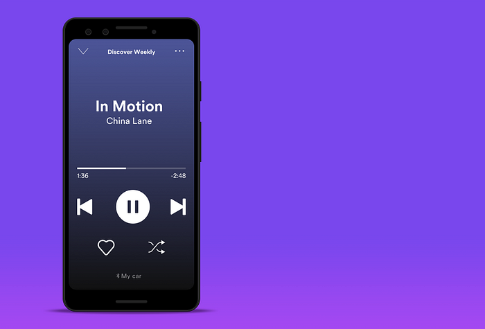
b. Car View
In a further innovation, Spotify has created a special mobile viewing mode that automatically turns on while driving. This simplified interface strips away all of the bells and whistles such as background images and enlargens primary functions such as play/pause and next/previous. This increases clarity for those glancing at the screen for a brief second while behind the wheel.
3. Quality Button Design
Aided by the dark interface, Spotify’s buttons stand out incredibly well and make it easy for the user to complete primary tasks. These bright green buttons pair well with the outlined or “ghost” secondary buttons that make them easy to find without calling too much attention to themselves.

Of course, being bright isn’t the only thing buttons need to do to be effective. As demonstrated by Tess Gadd in her in-depth post “UI cheat sheet: buttons” (which I highly recommend you read), there are a variety of considerations when designing the right button.
a) Hover States & Micro-interactions
When hovering, Spotify’s button ‘pops’, enlarging and brightening, to indicate that this button is interactive. Additionally, when clicked it gives a second ‘pop’ that indicates the action has been received.

This is a fairly common tactic but an important point of parity as users need to know that their input has been received. What if they click play and they don’t hear anything? By using hover states and micro-interactions users can know it wasn’t a mis-click on their part and they can quickly find that they just needed to turn their volume up.
b) Text & Colors States
Not only do the buttons stand out and have great micro-interactions, but they also communicate to the user what state they are in and what clicking will actually do. By doing this, this reduces frustration by decreasing mis-clicks and keeping the user in control.
As demonstrated by the Follow button, when clicked the text now turns green and now states “Followed.” When hovered back over, it pops and reads “Unfollow,” importantly indicating to the user that by clicking this button you will unfollow this artist. Click it again and return to its original state with white text and reads “Follow.”

Both a) and b) are simple in theory but by applying them consistently it creates a sense of control for the user. At any point in time, the user knows exactly what is in their control and is never surprised at the outcome.
c) Curved Edges
Similar to a dark interface, fully rounded buttons or “pill” buttons are not objectively better in all cases but have properties that can be more eye-catching and distinctive for the user. The trick is to design the right button for the right context. In a sea of grids and index tables listing songs and albums, fully rounded buttons catch the eye and invite users to click. With rounded corners, however, the button needs to be bigger but Spotify can afford to do so because it already preserves a great deal of whitespace throughout the rest of the interface.
4. Visual Hierarchy
By using size, color, positioning, and alignment of various elements, Spotify promotes a good visual hierarchy that communicates what the users should be paying attention to first. By doing this, users can quickly digest and orient themselves within the app experience.
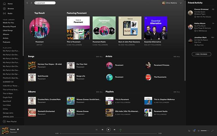
For example, when searching for the band Pavement, Spotify gives me a page with a lot of content yet this page is designed in such a way that I can quickly navigate to which aspect of this artist I want to explore.
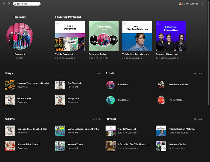
It could have given me just a list of songs by the band or just a list of artists that have the word “pavement” in it. Neither of those options gives me much flexibility in my next actions. Instead, Spotify answers my search result by placing the band’s picture big and in the header so I can know I’m in the right place. Below this, in a smaller, left-aligned section, Spotify shows popular songs and albums that I can click through if I want to. By doing this, I already have found most of the content I could want from this search result and it didn’t even require me to click through another page.
Note that in the event that the band Pavement isn’t what I wanted, there is a section of other artists on the right-hand side for me to browse. Accounting for these kind of scenarios is key in any user experience.
5. Consistent Design Language
After using Spotify for a while you start to pick up the small things that it does to communicate to its users. By developing this consistent design language, users begin to navigate the app in an intuitive manner, often making decisions based upon subconscious information.
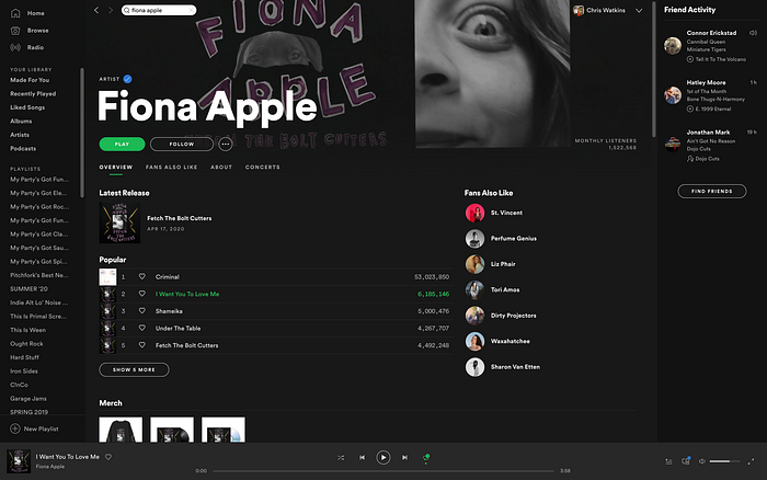
For instance, Spotify always places Artists in circular frames while Albums and Songs are displayed in square frames. That means when I search for something I can easily distinguish between clicking on something to see more versus clicking on something to play a song or album.
Furthermore, on desktop Spotify places common context in an orderly fashion on the left-hand side and reserves the right side of the screen for ancillary or suggested content. In the case of Fiona Apple, Songs & Albums are all on the left-hand side with suggested artists on the right. On the search results pages, direct search results appear on the left (artist, songs, albums) and ancillary context is on the right (featured playlists and & other artists).
6. Snappy User Experience
This may be more of an indictment on Apple Music, but the process of actually navigating through Spotify’s interface feels lightyears ahead of Apple Music. With its seemingly light-weight app architecture, Spotify seems to rarely have blank loading screens or any sort of hiccup when searching for artists or clicking through content. On the other hand, Apple Music is fraught with frozen loading screens.
This is further amplified when disconnected from the internet during a flight or while in a dead zone on a road trip. At these moments it is critical for users to be able to access their downloaded music that they pay for with their monthly subscription. I can recall numerous times when I’ve boarded a flight and opened Apple Music to find it paralyzed by searching for a cell signal and unable to simply navigate the music that is local to my device. If I had had cell service at that moment, I would have switched to Spotify immediately.
Spotify does a lot of simple things right with its UX/UI and much of it may seem obvious. However, visual hierarchy, good contrast, and quality buttons isn’t a recipe that you can just copy and paste into any environment. The challenge for designers is to contextualize these principles in a way that seems intuitive and natural to the user.
This post could have carried on to list 100 more things that Spotify does to enhance the UX/UI of their platform and if you noticed anything else that Spotify excels at, or needs to improve, leave them in the comments below.

