DESIGN PROCESS
Introducing Vertically Works
Thoughts on applying vertical type into digital products.

I’ve always found side projects to be fun, because they enable me to think outside the box about an existing solution, step into a field I’m unfamiliar with, and most importantly delve into design with no external constraints. After all, side projects are all self-propelled (or jointly propelled, depending on the axis of collaboration) with very little tangible outcomes expected. So its very important to have motive behind on why you are doing a side project. It could be to learn as simple as wanting to learn a new tool, improve on existing tools, dive into a problem that you are passionate about, or to spice up your portfolio.
Since working at Facebook, I found it very difficult to allocate significant amount of time on side projects. I often found myself too lazy to open my laptop after coming home from office. Yet I felt like I needed a dedicated time to keep learning about different aspects of design.
This coincided with my growing interest in typography.
Beginning
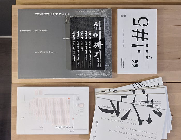
My interest in typography grew due to two factors. One was periodical updates on a crowd-sourced type project called Baram Font by Yong Jae Lee. As Yongjae shared his progress of developing a vertical-native Korean font Baram, I began to realize the level of complexity and constraints that type designers may go through. Unlike latin characters, Korean alphabets morph their size and proportions when combined into characters. Due to this, a typical Korean font would require 3350+ characters to be drawn, which includes 2350+ Korean type variations, 1000+ alphanumerical and special characters. Vertical text format is an antiquated text directionality in East Asia. I found the development of typeset which is designed to be used for vertical typography to be very intriguing.

As a complete noob in graphic design, I bought books on Korean typography to study them. Then used my spare time to do mini projects. I made my Korean resume in vertically format and designed small posters using this font.
Read more about them here
Another was my daily work in digital product design. Typography is one of the most important aspect of digital product design, because texts are main element of digital product. It is found everywhere — from button, labels, navigations, to contents. The information architecture and layout of digital product can depended on the density of text. Designers often struggle in balancing aesthetics and functionality(legibility) of type in its medium.
“Why don’t we have any user interfaces in vertical format?”
The Question
Then I asked myself, why don’t we have any user interfaces in vertical format? Indeed, this was a very stupid question. Vertical text is supported by only certain East Asian characters. And its popularity and presence is diminishing, due to lack of compatibility with alpha-numeric characters in digital medium. From functional aspect, text and their directionalities should deliver optimum readability. We no longer read or write in vertically in daily bases, therefore vertical texts have significantly low legibility and readability. Directionality of text is an acquired preference, as we see that different cultures/regions adopt different directionality (eg, Arabic, Hebrews is written in right to left — RTL).

Tracing the history behind wide adoption of horizontal texts, I noticed that the Western influences in globalization has been a critical factor. Western innovation in communication tools such as printing, typewriter, internet, computers, and mobile phone has been made horizontal-native. This naturally led to global adoption of horizontal text.
Human beings do not live in the objective world alone, nor alone in the world of social activity as ordinarily understood, but are very much at the mercy of the particular language which has become the medium of expression for their society. — Edward Sapir, American linguist
Interestingly enough, the directionality of language is so fundamental to humans, in ways people consume textual content and distribute them. The directionality determines various ways that people communicate; including but not limited to iconography, form factor of medium, and layout of information.
Defining
Yet I felt an urge to try out if current digital medium could showcase vertical texts. This seemed quite an unfamiliar field left with uncertainties. I called my ex-intern buddy Yanlin to get feedback about this idea. Over video call, we talked if we can shape this stupid question into a side project. I was quite excited to pitch it. However, the scope of the project was quite hard to tackle, as we found it hard to define at the early stage of the project. We agreed that this project could branch into many tangible outputs. By defining this work as an exploration, we settled on the idea that we will be taking very scrappy approach to deliver a website that delivers a following thought-provoking message: can vertical type work in user interface? The question lied in understanding when and where vertical type can be appropriate. This allowed us to set the tone of our project and stay away from other issues such as inherent text readability, human input device form factors, and lack of character compatibility.
Okay, so… what is Vertically Works?
Vertically Works is a design exploration on east-asian typography in digital user interface, jointly lead with yanlinma. The project is our attempt at taking vertical text and see if they could work in digital products. We hope to understand if there are cases when vertical user interface could be appropriate in websites, applications, or even larger operating systems.
Collaboration
It has been a little over a year since we had our very first video call about this project. Part of the reason that this project took a long time was that as full-time designers, it was hard to coordinate time to sync and allocate time to work on this project.

Most of our conversation took place at bi-weekly calls. We set priorities and planned monthly milestones for how to accomplish the project. Following are key priorities that Yanlin and I divided up to efficiently deliver and track progress.
- Project brief write-up
- Translation (Mandarin/Japanese/Korean)
- Vertical App mocks (several applications)
- Logo/Bradning
- Documentation
- Website Design
- Signup Website Implementation
- Final Website Implementation
- Medium Blog write-up
We planned to create a website that would house where we showcase our attempts at questioning the appropriateness of vertical text in user interfaces. It would essentially include our problem statement in different languages, and also include design works and tools to help others rethinking digital user interface in vertical direction.
Logo / Branding
The branding of vertically works is very literal. As the name implies, Vertically Works means two things. First, we want to see if vertical text in user interface works. Second, we want to gather various works (or attempts) of adopting vertical typography into vernacular digital products.

We needed a symbol-based logo for Vertically Works, so that it could reinforce vertical aspect, and also so that it could work in non-english settings. The set of vertical writing in Korean, Mandarin, and Japanese were put together. The Logo seemed quite blend as descending blocks. We added the iconic hollow dot replaces period in vertical writing. The logo embraced this as a supplementary graphical element to reinforce vertical setting.


To use this logo, we’ve also created a signup webpage to get collect people’s interest in this project. The detail of the project was obscured so the signup just communicated that this project is related to vertical text typography.

Outcome
We wanted to use vertically.works showcase our journey toward answering questions about vertical user interface. As a first step toward this, we decided to adopt vertical directionality for vertically.works’ desktop layout, with a horizontal scroll from right to left.

The website vertically.works is divided into 4 parts. Introduction, Redesigns, Tools & Documentation, and Teams. In this order, we want to walkthrough our thought process with visitors about the vertically works. We started with a question that became an idea for project. We then tried couple redesigns of existing digital products to understand vertical UI constraints and its validity. We used learnings from this to capture guides and provide tools for designing vertical UI.
Here are some of the redesigns to explore compatibility of vertical text in mobile user interface for existing apps. The application are randomly selected, and they are not meant to be taken literally. Rather they are meant to spark discussions around what works and what doesn’t.


Whats Next
After speaking with various people about this project, we quickly realized that there are so many ways to extend this project. This is only a beginning of Vertically Works.
We believe in collective intelligence.
With Vertically Works, we would like to encourage and empower more people try designing and thinking about vertical user interfaces. The more we try, the more we will learn about them. As mentioned earlier, dual-axis change in directionality of textual content is truly a radical change in user experience, regardless of its medium. Couple of scopes that we want to further explore are followings. These are a big, big areas that would be super interesting to tackle, and are in random order.
- N-shaped pattern for vertical text reading (akin to Z-shaped pattern)
- Design tools to build vertical UI
- Acquired learnability of vertical type
- Feasibility of vertical UI in spatial environment
- Human input devices for vertical typing
- hardware form factor vertical-native operating system
- Definition of vertical-native applications
- Design Framework for converting from horizontal to vertical
- Animations and transitional elements in vertical UI
As a first step toward this, we recently had a new member, Jackie Chui, join the team. Jackie has been thinking about building design tools to make vertical UI design accessible and efficient. His first project in the team was building a Figma plugin to convert regular horizontal text box into a vertical one.
Closing
For those that found this interesting, and want to be part of our team, please visit vertically.works or @vertically.works and contact us! Like I said, this is just a beginning. We are always looking for team members to collectively design and explore ideas.
Wow, there it is. If you actually managed to read all of this, thank you so much. For next round, I’d like to expand on the aforementioned ideas to elaborate on how each ideas can benefit Vertically Works.
Special thanks to friends and mentors who provided valuable feedback
Yongjae Lee, Kyuha Shim, David Lee, Jae Yeop Kim, Eddy Jung, Brian HK Park