Village Cinemas website redesign — a UX case study
A UX Case Study on a redesign for the desktop experience

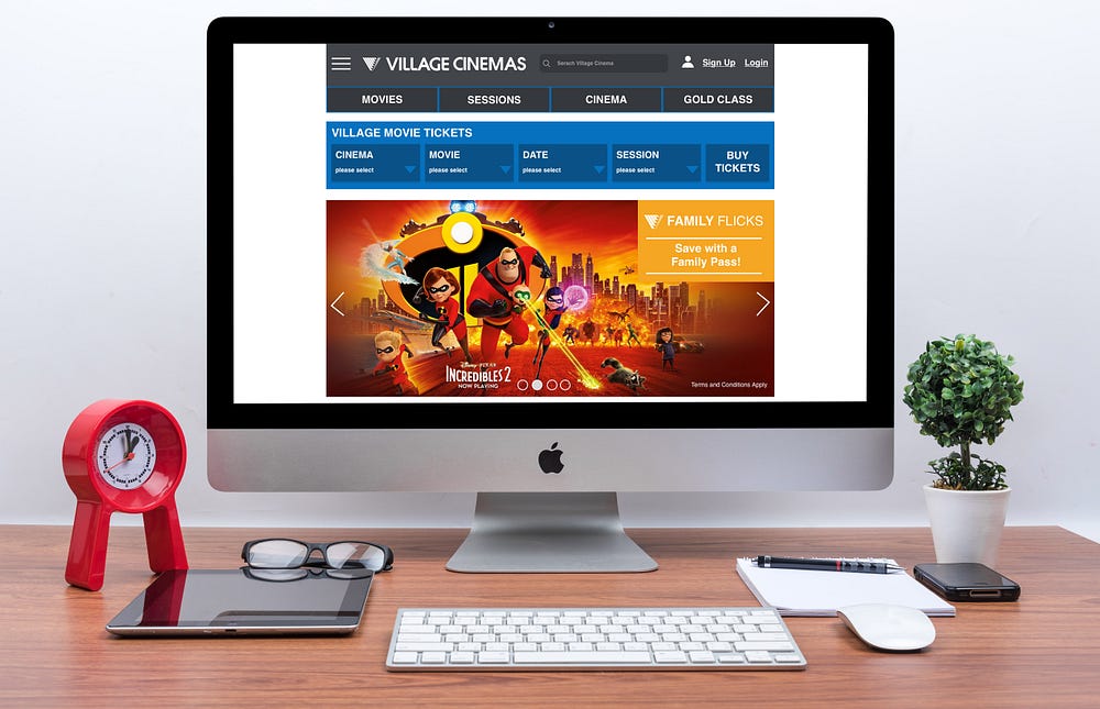
My independent project was to tackle the Village Cinemas desktop website. I believe their website could be improved dramatically so users find it easier to use and have a clean experience when purchasing tickets.
The goal was to redesign and produce an interactive HI-FI prototype of the Village Cinemas desktop website.
Process:

User Research
After interviewing 5 users that have used the Village Cinemas website, we found the following patterns in our affinity mapping process.

Key Findings
· Buying tickets could be more streamlined
· BUY TICKETS is duplicated twice on the home screen
· Drop down fields showing text is too small
· Missing information when purchasing tickets, no indication of cinema
· Users find the website confusing as they don’t know where to look
· Users only click on 4 tabs (Movies, Session, Cinema, Gold Class)
· Users look up trailers on YouTube
Problem
Customers are unclear where to purchase movie tickets online because they find it confusing and unsure where to go on the home page.
Solution
We believe by creating a new interface to purchase movie tickets it will allow the customer to quickly and easily identify where to go.
Competitor analysis
Identifying Village Cinemas main competitor, I analysed the strengths and weaknesses of their websites and how the service compared between the two.
Main Competitor analysed:

· Hamburger to find out more information what Hoyts offer
· Navigation bar big and easy to read
· Modern, clean website with nice layout
· Not cluttered with too much content
· Strong continuous use of branding colours throughout website
· 4 easy steps to purchase movie tickets
· Have to scroll continuously to find your movie
· Don’t provide times for days in advance
Ideation
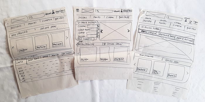
I started my ideation by sketching multiple ideas on what the home page would look with a new interface design of purchasing movie tickets, so users would identify immediately where to go.

Feature Prioritisation
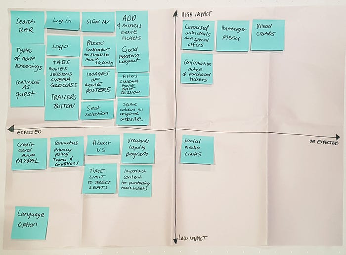
From the research and the creative ideation process I’ve listed what features to include in the website design by organising a feature prioritisation matrix.

Identified key features required for the website
· Sign in / login
· Search bar
· Now showing /coming soon slide interaction bar with play trailer link
· Hamburger menu with more information
· Bread crumbs
· Carousel with deals and special offers
· Select movie seats
· Added +/- option so they can adjust the quantity of movie tickets
· Numbered process indicator — showing how many steps to finalise the purchase of your movie tickets
· Indicating what kind of cinema type screening you are attending
Information Architecture
Below is my recommended sitemap representing the website’s information architecture.

Scenario
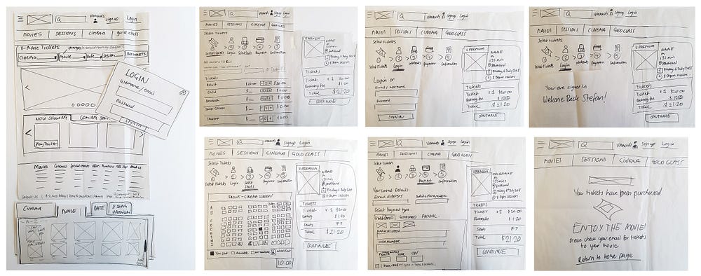
Stefan is a member of village cinemas, he hasn’t been on the website for about a month and has forgotten the process to purchase tickets. Stefan wants to buy tickets online for himself and his girlfriend to see the movie of SOLO: A Star Wars Story friday night around 8.30pm.
Paper Prototype (usability testing)

I conducted 5 user testings with the paper prototype using the scenario I had given. After testing the first paper prototype, iterating the findings from user testing and repeating the process again, I gained effective information of what the users wanted and needed when interacting with the prototype.
The following are some constructive feedback the users provided:
· As a member, logging in would be the first step before buying movie tickets
· Liked that if you don’t sign at the start, the option is available at the prior to selecting your seats and paying for your tickets.
· If they don’t sign in, replace with checkout as guest.
· Users got confused within the process stage that had two buttons, ‘Sign In’ and ‘Continue’, recommended one button only.
· Understood the process of buying the Village movie tickets on home page
· Users asked the question why have email and mobile number when paying for the ticket as I’m have set up an account already. Recommended fields to be automatically populate your information
· Loved the bread crumbs showing the process
· It was an easy process from start to finish
· Liked that when selecting a movie, the name appears in the box
· After receiving confirmation of purchased movie tickets, suggest a return home button
· Consider the placement of the continue button
· They were aware that there is a time limit to choose your seats
· Not sure if mobile needs to be mandatory when paying for tickets. Suggestion of adding a sentence stating why it will be useful
· Liked the confirmation page which stated an email will be sent with your movies tickets attached

Interactive Prototype
Learnings
Working autonomously, you have to manage your time effectively so you can complete all aspects of your work on time.
Hi I’m Robert, I’m a Graphic/Digital Designer with 8+ years’ of experience and have also established my own clothing label “Collision Clothing”. I’ve worked with many different companies with a variety of products within Melbourne Australia. I currently specialise in user experience design. I enjoy solving problems and am passionate in designing clean, attractive and functional design solutions for the user.

