Member-only story
Visual Design is important, but it’s not the only thing that matters
How to present your work when it isn’t visually stunning

“I’m not sure what to do. There seems to be a heavy emphasis on Visual Design,” a designer complained, reminding me of where I struggled years ago.
There’s no getting around it: many organizations nowadays prioritize visuals. Applying to specific jobs often requires showing high-quality and beautifully designed visuals in your portfolio.
But that emphasis leaves some of us, myself included, wondering how to present our work.
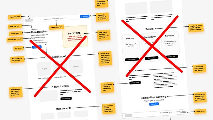
My first projects weren’t visually interesting. My design work revolved around fixing form fields and upgrading 30-year-old visual interfaces.

If you’re suffering from the same issues I was, you must first understand why businesses focus so much on visuals.
Aesthetics, usability, and tangible outputs around design
After working as a UX team of one for a lot of my career, I’ve found that a few things drive demand for high-quality visuals.
First and foremost, beautiful interfaces are perceived as more usable (Aesthetic-Usability Effect). When an interface looks nice, not only do people think it’s more usable, but more people will tolerate UI problems when something looks nice.
However, this effect has its limits. After all, most businesses don’t want to create art pieces that don’t do anything. They want high-quality visuals that drive action, like getting users to create an account or clicking to learn more.
“Design is NOT art. Design has to show value.”-Donald Judd
So, while high-quality visuals are appreciated for their appearance, businesses often like them because they are tangible output.
Not everyone knows much about design, but if you show them a “before” and “after” visual of your re-design, they can immediately tell what the designers did.