Visual hierarchy in UX design

This week at Lambda, we’ve been diving into some design theory- from typography and color, to designing for the human mind. Right now, here are my gatherings on visual hierarchy.
Whitespace-
Isn’t necessarily white. It’s the isolation of the object with the buffer of nothing around it that indicates it’s a hot shot and needs room for its ego, so you really should look at it. This includes if the object is small! (as it often goes, ahem). The more real estate it’s got, the more important.


By placing only two items on the screen: a visual and some text, they are leaving a fair amount of open space. This lets you know that everything present on the screen is all you need to know. The visual backs up the text, in case you look at it first, as we tend to do withe human faces (especially with lips like that, aiy!). Either one you focus on, you’re still getting the message of minimal, hip shaving materials.
Eye Tracking-
When we read a page, depending on its lay out, our eyes will generally follow either a Z or F pattern. This is good to keep in mind as it shows us where our users are most likely to focus their attention. The way we lay out our content influences this- blogs and denser text are read in an F, while the Z pattern is used for a quicker scan of a lighter page. Look at these next few screens from the Dropbox page that exhibit this.


See how it reads: image, text, text, image. It is moving your eye in this Z formation. This is a little tricky as it relates to…
Implied Movement- another related principle of visual hierarchy. It says that we can influence the way someone engages with a page by designing the way their eyes will travel across it. When we lay out the page with an implied flow of where to look, using diagonal strides between the content, it is easier to digest. There isn’t any real movement, but our brain can connect the imaginary dots and feels that there is a flow. This is really conducive to making your content digestible- if Dropbox had shoved all their information together in a blog type format, you wouldn’t feel terribly enthused about reading it. This simple, guided Z is much more pleasant.
Symmetry- is actually less engaging, if we’re talking text format, like above. It doesn’t give you a visual map of where to go. Everything looks equally important. Clean, yes, but boring, and not taking initiative to tell you what is has to give you and how. In some cases, it is helpful though. Look again at another Dropbox page.
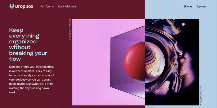
“The data in our visual field usually has more than one possible interpretation, but our vision automatically organizes and interprets the data so as to simplify it and give it symmetry.” This photo is a complex scene, but the mind takes it and halves it cleanly, seeing only two elements of the many that are possible. In doing so, it leads you to the side of the screen with the pertinent information. This image is a rough example of…
The Rule of Thirds-
The rule of thirds means dividing your page using 2 horizontal lines and 2 vertical lines, and placing your important content along those lines, or at the points where they meet. Your main focus shouldn’t be front an center, but in one third of your field.
The Rule of Odds-
The brain finds odd numbers more interesting than even groupings, similar to the way it finds symmetry disengaging. You can harness this by positioning elements on your interface… not symmetrically. Having offset chunks of content and visuals as well as using Implied Movement in tandem will create a more stimulating experience for your user.
Below the Fold-
When newspapers were our main mode of information gathering, they had above the first fold to catch enough attention to warrant being bought. We have a similar situation in the digital world, with a limited amount of screen to catch the user’s attention enough to motivate them to scroll. This can be seen by A) placing your most powerful content above the fold, and B) giving users a sneak peak of the next element, showing them there is more, but since part of it is obscured, they must scroll.
Here, we’ve got rude of odds also at work- two elements above, then it siphons your vision down the directly below to the single element that is there, below the fold,- which you cannot see all of! Therefore you scroll.
Contrast-
Making one object stick out compared to another. The greater the contrast, the more important it seems. This is mostly done with colors, like white on black, teal and black, etc. Contrast that is sharp and apparent will naturally draw the eye quickly.
Size-
The bigger, the more important. Usually the biggest thing on the page gets looked at first. However photos will take precedence- so if you use big text then photos, especially of faces or people, those will be noticed first, followed by text.
I am finding myself thankful that color, typography, and layout actually have a science behind them. There is a fair amount of creative flair and personal touch that can be utilized here, but design really is a method, with theories and proven paths to help your content look less ugly. Learning the rails for why things are they way they are help you make they way they are… better?! Whew. Sometimes, rules are good.

