Visual perception in user experience design
How a key feature of human physiology and behavior can impact the design of interactive systems
In the design of user experiences, it is imperative to appreciate how human beings (users) assimilate information surrounding such experiences. The five traditionally recognized methods of perception are taste, sight, touch, smell, and sound. Theories surrounding these physiological capacities of organisms have been studied by a variety of fields ranging from neuroscience to cognitive psychology.
In the field of graphical user interfaces (GUI), most information is conveyed visually. From trying to read the texts in this article to discovering the equal to (=) button on a calculator, we generally pick up information from visual representations in a GUI by a quick, simultaneous movement of both eyes between two or more phases of fixation in the same direction. This process of jumping our eye around to pick up different parts of a visual representation is called saccades.

One establishment that can be easily made from the concept of humans trying to make meaning of visual information through eye fixations is that: just because you put something on the screen does not guarantee that your users are going to look at it.
According to a series of studies by Jakob Nielsen, people scan web pages and phone screens in an F shaped pattern.

Deconstructing the image above, it was found out that:
The red regions are places where a group of users through multiple studies spent the most time looking at.
The yellow regions witnessed lesser views from the users.
The blue region had lesser views than the yellow region, and:
The grey regions are places where essentially nobody looked at all.
Also, a lot of people look at the top left region, because this is a place where the first search result shows up and most people expect there to be high-value information.
How do we interpret images?
Psychologists who study human vision describe the process in which humans make sense of visual field as taking place across three stages:
The first stage (Feature Detection):
Our eye breaks down the visual field into a set of features like colors, shades, angles, slopes e.t.c

Let’s do some quick visual exercises.
Find the green circle in the image below:
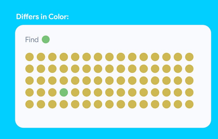
It was quite easy to spot out the green circle.
Find the yellow rounded rectangle in the image below:
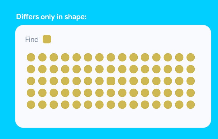
Harder than the first right?
Find the green rectangle with only rounded corners on the top left and bottom left in the image below:
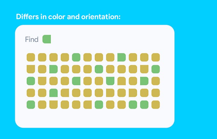
No doubt, this is the hardest of all.
Visual feature detection happens very fast and primitively, allowing certain features of the visual space to pop out can help draw our attention immediately without any conscious effort.
This baseline feature detection is what supports subsequent stages like the identification of patterns and the recognition of objects.
The second stage (Pattern Identification):
After detecting the features in the first stage, we compose those features into patterns e.g shapes or groups of shapes that are connected in different ways.
A set of psychologists in the early 20th century known as the Gestalt School of Psychologists studied the way that this pattern recognition works. They identified these as Gestalt Principles. set of principles that define the way that our eye breaks up the visual field.
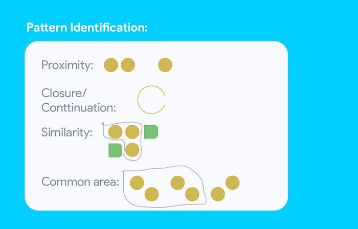
So far, the best explanation of the Gestalt Principles I have seen was done by Pablo Stanley on his twitter page:
Below are 3 examples on how to take advantage of these principles in practice:
Use pop out to attract attention

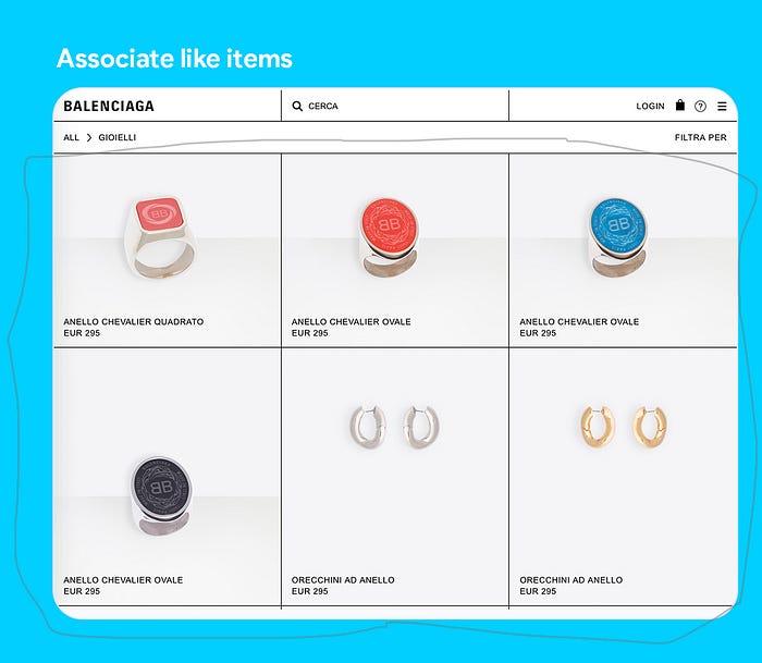
Use Gestalt principles to associate like items
Use Gestalt principles to organize for skippability

The third stage (Object Recognition):
We interpret those patterns as objects that we recognize. Feature detection + Pattern identification ultimately leads to Object recognition.
Visual Perception Advantages
1. Make important information and actions visible
Information that is not immediately visible and perceivable by users is less likely to be noticed and if extra effort is required to find it, the number of users that will find it and take action on it is going to be reduced significantly.
2. Leverage people’s natural order of progression when designing information architectures
Placing key information in locations that have been proven to draw users’ attention based on how they read will reduce the effort required for them to perceive such information since we are exploiting the natural order they would ideally take the information in.
3. Run heatmap analysis to gain insights
It is important to ask key questions like “What is the most valuable task you want the users to take?”. Running a heatmap analysis will help to reveal discussion starting points on whether they are taking the intended actions or not. You’re not the user and following the F-shaped viewing pattern does not automatically mean these primary actions will become obvious to your audience. Consequently, we can take advantage of this knowledge of how people view the page when conducting usability evaluations.
In conclusion
When you have a lot of information to present that is valuable to the user, it’s important to use gestalt principles to support nonlinear reading of the page. By making use of these principles and reducing visual clutter, you can make it easier for users to find the information and the opportunities for action that they need to find to have a better user experience. With regards to the human visual system and the concept of saccades, we can exploit our knowledge of visual perception towards delivering better user experiences.

