Visualising UX: translating ideas into communicative sketches
Conceptualising ideas with different sketching styles, building your visual muscle & practical tips.
This article is part of a series about how to get your design practice more visual.
In a previous article, I shared how drawing can boost your design projects. Sketching boosts our mental processes, helps us communicate & memorise a vast amount of information and, in regards to User Experience, anchor human-centred, context-specific information to our attention.
Now that you are convinced & motivated to get your practice more visual you might wonder… How do I do that? In this article, I’d like to share practical insights on how I translate ideas into visuals for my design projects.
Conceptualisation: from ideas to paper 🖼️
Once you have in mind the content you wish to visualise, it is time to translate the text and idea into a communicative and compelling visual. How do you choose how to visualise something? According to Roel Uleners, creative director at Xplane, there are 3 styles to approach visualising abstract concepts: literal, metaphor & schematic.
Before diving into the details of each style, let’s use the example of ‘collaborative intelligence’ to compare the 3 styles.

The first image that ‘collaborative intelligence’ evokes me is a common activity in my work: a co-creation session! This is the literal, a tangible activity where collaboration takes place. Another idea that comes to my mind is that ‘the whole is greater the sum of its parts’, like a puzzle where the different pieces come together to create a new image. At last, ‘collaborative intelligence’ be thought schematically as the addition of individuals creating a big idea (commonly depicted as a lightbulb).
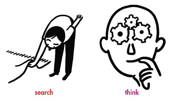
1. Literal
This is about visualising the reality of a situation as it happens: someone doing something. Literal illustrations are descriptive and involve humans figures, their emotions & actions as well as objects & things that set the context in which the scene takes place.

This style is particularly suited to visualising a current or experience to be in the form of a journey or a storyboard. Visualising users in their environment supports human-centricity and ensures to keep the context in mind.

2. Metaphor
This is about telling the story with an analogy to help us make sense of an abstract concept or to reinforce a message. These can be inspired by verbal metaphors, common allegories, shared myths & parables… and even pop culture.
For example:
- a metaphor for ‘success’: reaching the top of a mountain 🏔️ or hitting a target 🎯
- an analogy for ‘fast’: a hare 🐇, a sports car 🚘 or the Greek god Hermes
- an allegory for ‘freedom’: a dove 🕊️
- a shared story for ‘to lie’: Pinocchio 🤥

This style is particularly suited to express abstract concepts or emotions. Using metaphors is an efficient way to create memorable images; you will find that this technic is commonly used in editorial illustration.

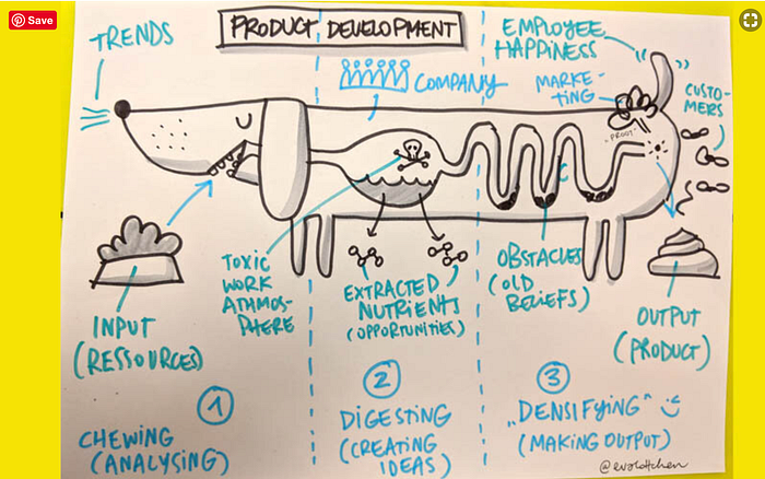
3. Schematic
This is about communicating the idea with the support of icons. These are a simplified representation that uses symbols, colours & connectors (such as lines and arrows) to create meaning.

This technic is especially suited to refer to commonly understood concepts and it is a very fast way to communicate as it builds on commonly understood representations. It is powerful to enhance the literal or metaphor styles. When built with digital icons, I find that this style can feel impersonal. Using icons with a hand-drawn look & feel can make this style more human.
Be mindful that not everyone interprets symbols in the same way across cultures & geographies. To prepare for the Olympics, Japan had to change the traditional symbols for hot springs since overseas tourists misunderstood it as a hot cup of coffee.

To conclude, these 3 styles should enable you to visualise anything and can be used in complement of each other.
Build your visual muscle 💪
What I learnt in design school is that to build a craft, you need to consume a lot of the best of content and train your eye. This means following illustrators, artists, designers that have a great eye for communicating concepts, character design, composition or colour…
Below is a (non-exhaustive) list of artists & designers that inspire me.

Practical tips ✏️
In my work as a service designer, I combine illustrations into digital documents such as user journeys, actors maps or service blueprints to visualise an experience. Being user-centred means representing humans: I often end up sketching little people performing various activities.
😁 Big heads & dynamic body postures to represent emotions & actions
Characters with large heads will allow you to better communicate emotions with the use of facial features, such as eyebrows, mouth & face orientation.
🤡 Use clothes & objects to represent an archetype beyond clichés
When drawing little people, it is useful to equip them with clothes or objects that can help identify their function or personality. A cook does not need to be a man with a moustache but will often wear a toque, an apron or a vest. For more tips on how to include more diversity into your sketches, you can check this article.
🎄 Use objects to symbolise the context
Symbolise the environment with objects & things that represent the context. Keep it simple!
💬 Symbols & text to complement or reinforce the meaning
Adding symbols, speech bubbles and text to make an emotion more tangible or codify information.
For example:
- a delight ❤️
- a pain point ⚡
- a tool 🛠️
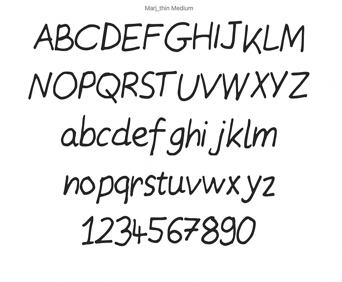
✒️ Create your own font!
It can be hard to find a good cursive font that fits with the atmosphere of the sketches. For this, you can create a font based on your handwriting with this tool. If you like my weird handwriting, you can also download my personal font here (it exists in thin & medium).
🛠️ Using Adobe Capture to digitalise drawing
Take a picture or easy way to digitalise using Adobe capture.
It works best pen or marker with high contrast with the paper. Take a picture of your sketch and quickly improve it with the smooth function. Adobe Capture will translate your artwork into a vector shape.

To conclude, visualising user experience is about translating ideas into communicative visualisations that bring to life human emotions and actions in a particular context. Being aware of the different styles and strategies to visualise a concept and following inspirational artists to train your eye will help you find your style and sketch memorable scenes.
Let me know how you visualise user experience and feel free to share your sketches or inspiration at marjoriebroudieu@gmail.com.
In the next articles, I will explore visuals metaphors in the context of workshops. Keep tuned!


