Member-only story
Want to get better at using color? Try a scatter plot
Creating scatter plots teaches you advanced lessons about color

Scatter plots are usually charts that people are vaguely familiar with.
It’s a chart that’s often thought of as complicated and niche. But they can offer important lessons about color that you might not realize until you’re trying to create them.
And it starts with the type of message it’s trying to convey.
Scatterplots, distribution, and relationships
Scatterplots are mainly used for two major reasons: to show distribution patterns and relationships. They allow you to encode data on both the x and y-axis to see if relationships or patterns exist between two variables.
But they have a reputation for being hard to understand. This is where I might be tempted to say that is a misunderstanding, but it’s really not: scatter plots are often hard to understand. To explain why, first, let’s talk about an easier chart to understand: a bar chart.
I haven’t included labels, axes, or even an explanation of what these bars might represent, but there are many conclusions that you can draw from this.
You could talk about how the purple bar is big (which can be good if it represents us), how it’s several times bigger than the grey bar, or how the grey bar is small.
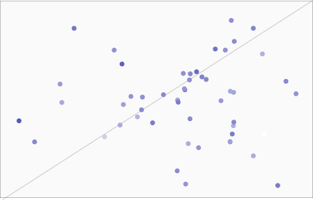
Now try doing that with a scatter plot.

Without labels, context, or any other sort of guidance, it’s hard to make sense of this sort of data at a glance.
If I had gone one step further and removed the trend line, it might be even harder to make any sense at all.
The data itself might be hard to understand by itself, as there are no immediately obvious patterns, but that shouldn’t faze us as UX Designers.
We can work in complex domains, such as finance or healthcare, and make sense of otherwise difficult-to-understand data or terminology. But there’s one thing that stands out with…


