WAZE: the interchange problem — a UX case study

Waze is one of the best applications currently on the market. It has a very large client base, and yet, in my opinion, there are a few aspects of the app that leave room for improvement. Specifically, when I say a few aspects, I mean in this article to address a very particular facet of the application regarding the way it handles complex situations encountered on the road. Take for an example a situation in which a driver finds himself on an interchange with more than three lanes (which does not happen very often). There is a high risk for the driver making a navigational error due to the lacking user interface. Even though they get confused, most drivers are too embarrassed to admit it.

I’m always reminded of what the legendary designer Don Norman used to say: “always ask stupid questions. The most important questions are often the stupidest ones. When you ask: why is it like this? That’s the force that drives innovation.”
So I asked all my driver friends. Everyone simply accepts things as they are or too embarrassed to admit that they also find the app confusing.
I thought about different segments of the population: is this a problem encountered by older people, young people or simply people who are nervous drivers? Do they get confused? Turns out — they do.
Oops, another wrong turn
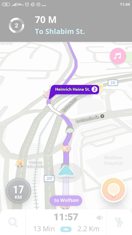
It happened to me as I was driving on highway 20 northbound in the direction of Tel Aviv near the Wolfson interchange on my way to Shlabim Street.
Waze is showing me my destination. It displays the contours of the roundabout, which I’m not familiar with and which is not conspicuous on the Waze map. And the current road I’m driving on is indicated down at the bottom with the purple arc.

It turns out that the turn happens after you enter a sort of roundabout. The road swerves to the left, therefore I too got confused because the map did not clearly indicate the road conditions — namely that I was entering a roundabout. I could not figure out where I went wrong, but I did start to ask a lot of questions.
So I performed a short survey among seven drivers to see if they also got confused similarly. If so, how things could be improved.
As you can see (in the figure below) while taking a decision the drivers I interviewed cannot focus at all in the area of the screen marked in red. Therefore, it is inadequate to have the indication for “Wolfson” down in this area, the way it is displayed in the Waze app. Not only do drivers have to keep their eyes on the road in high-pressure situations, but when they do look at the app it is always at the black strip at the top, that is where their eye automatically goes. They are so focused on this area that they do not even notice Waze showing them the name of the road in the purple bubble below.

Problems arising from the survey:
- Drivers don’t ever look at the bottom part of the screen when they turn because they are so focused on the road and therefore they miss the indication “to Wolfson”
- The drivers I interviewed don’t listen to the voice directions and when they do look at the purple route, if it doesn’t show the way clearly, they prefer to look at the black strip with the instructions.
- The driver knows he or she is going to Shlabim Street, therefore this information is irrelevant to the actions he or she has to perform at the moment.
- Displaying the circular icon with the number 2, which is supposed to indicate: take the second exit out of the roundabout doesn’t mean much to a new Waze app user. It is not a critical issue, but there has to be a solution that will work for new users who are not familiar with Waze’s visual languages as well as for seasoned users.
Solution:
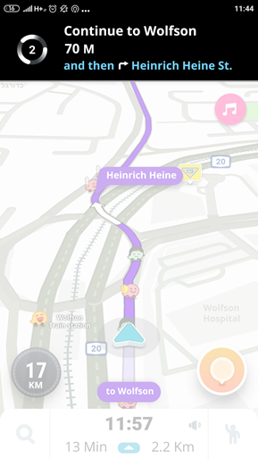
- Displaying the number of the road the driver is supposed to be turning onto rather than the road he or she is currently on. Plus insert color indication on the black strip instead of “Shlabim Street”. The app should show that the road I am turning onto is “Heinrich Heine Street”.
Regarding the color indication of the road number:
At the moment, according to my research, there are a lot of roads that have no number and this is one of them. When the road has a number, Waze displays it in the text, which is great.
My only suggestion would be perhaps making it into an icon, like a road sign, so that the driver can immediately recognize where he or she must go. But this is not crucial.
- Directions to the driver regarding what he or she is supposed to be doing now in white, with further instructions in blue.
- Fading out all the unnecessary things on the map (side roads, unnecessary markings) to minimize cognitive noise and focus the driver’s attention on what’s relevant.
Marking the roundabout with stripes and in full bold color will make it clear to the driver that he or she is about to enter a roundabout, rather than relying on markings that a beginner user would not be able to recognize.

Numbering or writing the names of streets on the map and indicating the exit number on the map rather than just in the voice instructions and the icon at the top.

- Relocating the information about which road to take to the top: “Continue to Wolfson”, as opposed to its current position down below so the driver can’t miss it.-
- The follow-up instruction should be regarding the next action the driver has to take rather than the final destination, which the driver already knows.


Let me know what you think on the comments below.


