Web design theory: Texture
Texture has become an indispensable element in web design. It is not only a trend but also a quick way to increase the depth of web pages. When designers learn to use textures, they can strengthen the appeal of web pages. It can be said that they must be mastered in web design. The texture itself can show the key content of the webpage by guiding the user’s sight.
However, the texture seems to have been misunderstood as a “GRUNGE” style design for a long time. In many web pages, we can see that in order to highlight cool effects, they are used in large quantities and even suspected of abuse. The result of abuse is that its real benefits are buried. Texture can indeed enhance the appeal of a web page, but it is by no means the protagonist in web design.
Texture VS Pattern
Before we dive into textures, let us distinguish this pair of confusing concepts. These two words are usually regarded as a set of synonyms. The pattern usually consists of some small repetitive elements, with a certain visual rhythm. The texture is composed of larger elements than the pattern, which is not necessarily repetitive. If a set is used to represent these two concepts, then the texture and pattern will be two circles with only a small part of the intersection, and the rest are relatively independent.
Texture function
People like to use textures in web pages. The reason for design must not be just because “looks beautiful”, but should be based on satisfying a certain function, and most of the purpose of using a texture is to enhance the level and vision of the web page. depth. Let’s take a look at the specific functions of textures.
Attract users to click
Elements such as icons, buttons, titles, etc. can all be textured. It can attract users to click on the corresponding elements. This may be the reason why the use of texture is popular.
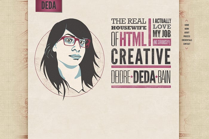
The minimal use of texture is to apply a texture to elements so that they can be distinguished from other elements on the web. Guide the user’s sight into the next step we expected. This method can also highlight the brand image on the webpage, such as using texture on the LOGO.
There are two ways to use texture for LOGO: the first is to use texture for your LOGO with a clear background, and the second is to maintain a clear LOGO and use a textured background. As shown in the following two screenshots.


Enhanced visual presentation rules of information
Since texture can be used to guide the line of sight, just like lines, boxes, and contrast, it can also be used for typesetting to display content according to certain visual rules. At the same time, the texture effect should be used properly and coordinated with other visual rules, and the final output effect will be very ideal.

Choose different textures for different content, which also conforms to the law of contrast. Users can proceed to the next step according to different needs, without losing their way in the endless information on the homepage.

At the same time, the texture should be perfectly matched with the style and theme of the website. For example, handmade websites match cloth patterns, and painted websites match paper patterns. All these elements can reflect the content of the website through a certain logic rule and strengthen the overall information display.
Create atmosphere and highlight individuality
Now, more and more customers like that their website can use the interface design to convey more information about themselves. They hope that the website can highlight their own personality and exert a brand effect. The texture may meet this expectation to some extent.
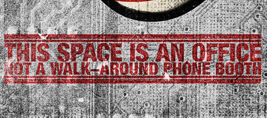
Keep it legible
Legibility is the bottom line that a web page must maintain. Even if it is a beautiful web page, users will not continue to use it if the legibility is not good. Be sure to avoid this situation as shown in the figure below.
Use texture sparingly
When designing printed matter, the texture effect is usually exaggerated. In web pages, we need to be restrained and not to use them on a large scale, so as not to interfere with users’ attention to the main content.
Practice is upgrade
When using textures, try more. Only after trial, you will know the final result. Place the texture in a place you never thought of, and you may find different things.
Use it purposefully
You also need a lot of practice before designing for the actual project. Usually, when we study, we often use a certain texture because it looks good. This is not conducive to the ultimate goal of the design. If you can’t determine why this element uses the purpose of texture, then give up doing it.
It is purposeful and means focused, and it appears to highlight the theme. If excessive use causes a situation of stealing the spotlight, then also give up texture. At the same time, I recommend using weaker texture patterns as much as possible, as this effect will make the advantages of texture play better.
Serve the final effect
Experience tells us that it is common to overplay textures when designing, and always remember the effect we want to achieve to overcome this. For example, if we design a web page and use a satisfactory weak texture background, if the final effect is met, we will continue to design the next element.
Collect resources at ordinary times
In order to save a lot of time when designing, believe me, it is the best solution to make backup resources in peacetime. If the time for downloading and collecting resources is used in the design process, I am afraid that you will face time pressure.
Use mask
The texture can be used in conjunction with the mask to create more novel effects.
Don’t compromise on texture quality in order to shorten the loading time
There are many ways to reduce the page load time, so textures still need to be high-fidelity. Using seamless repeating small patterns as texture tiles are the best choice so that large image loads can be avoided.
Choose a texture that has some internal connection with your entire design. Just like my example in this article, the website of a fishing club, they use a lot of boat wood as a background texture.


