Member-only story
What can designers learn from iOS 14 and macOS Big Sur?

With the introduction of iOS 14 and macOS Big Sur, we are the witness of the next big thing in UI Design. Changes are not so revolutionary like in iOS 7 years before, but they undoubtedly present the trend UI Designers will follow in the future…
…and it won’t be Neuomorphism. 😉
Flat Design is No Longer A Trend
Let’s make it clear — minimalistic does not mean flat. Some people tend to use these terms as one thing. New Apple Operating Systems remain minimalistic, but their appearance gains more shadows, textures, and 3d shapes.
Like Alan Dye, VP Human Interface at Apple said: “Depth, Shading and Translucency are used to create the hierarchy. New materials are rich and vibrant….”
Apple reduces visual complexity and makes the design even more minimalistic. Some elements are flatter, but the feel is the opposite. Both iOS and macOS brings more 3d dimensions to their user experience.
👋 Tip for Designers: Think how minimalism may gain space in your design. Observe how simple effects (shadows, translucency) build visual hierarchy.

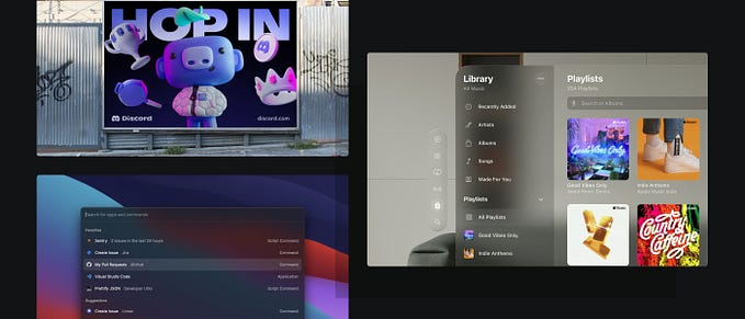
New Subtle Affordances
The human brain needs a hint to recognize the object. We tend to perceive 3d objects as interactive ones. That’s why lots of buttons still have a shadow.
However, motion is also an additional clue. Apple designers know that and the macOS toolbar icons lost their shapes to remove visual complexity. But, when a user drags the cursor around, their background highlights and encourage them to press the action.
The last obvious affordance is color. Apple wants designers to use Tint (or Accent) color to make active elements more visible. This tone should reflect the brand or product color. Thanks to this user immediately build a mental connection between the company and the application.
👋 Tip for Designers: Don’t be afraid of not highlighting all options. Not every button needs to have a shape. It may appear when a user hovers over its…


