What does UX in education look like?
Designing for education can be challenging, yet extremely rewarding. Knowing that every time a student engages with your product they will get just a little bit smarter and closer to their aspirations bring a true sense of purpose. This incremental growth that you and other designers of educational experiences have created and used by educators, builds over time. This creates opportunities for students and hopefully helps to make the world a little smarter than yesterday. This passion for education is what has kept me in the industry for more than a decade, and will continue to inspire me as a designer and problem solver. This article discusses a few areas where designing for education slightly diverges compared to other industries, adding to a constant flow of interesting challenges and constraints to design for.
The term UX can be defined as the experiences that occur for people as a result of them interacting with the product you designed in a given context. When thinking about product design for education, I like to start with IDEO’s “The Three Lenses of Innovation” which include feasibility, viability, and desirability, but like to add a fourth lens, “learner efficacy”. This lens is integral to the success or failure of any educational product.

So what is efficacy? Much like the healthcare industry, many educational products make claims that they will help students achieve some pre-determined outcome. In health that might be curing an illness, in education it may be learning a particular topic or learning objective. It goes without saying that an educational product that doesn’t help a student learn is a failure, so it is integral to make this lens a foundational element of educational product development and gather evidence on its effectiveness against the claims.
While assuring that students learn when using educational software might sound obvious, when it comes to traditional user experience it gets a bit complicated. I will discuss several factors that UX designers interested in education might want to keep in mind.
Tensions on efficiency and effectiveness
If there is one thing that I’ve learned watching students as both a researcher and as a faculty instructor, it’s that students are masters of efficiency. The problem is that their speed in getting things done may come at the expense of their effectiveness in achieving their long-term learning outcomes. This is one of the area where tension builds when making design decisions.
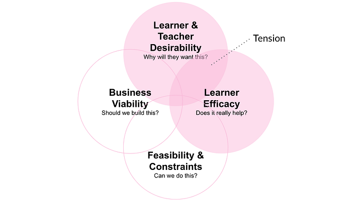
As a product design team, it is imperative that UX designers and learning scientists collaborate from the ground up, making sure that the decisions they make factor in the impact on desirability and effectiveness. Unfortunately, many times these two lenses are at odds. A 2010 Harvard Business Review article titled Stop Trying to Delight Your Customers states that “delighting customers doesn’t build loyalty; reducing their effort — the work they must do to get their problem solved — does”. While this makes sense for most scenarios, when the outcome you are chasing is learning, effort and learning go hand-in-hand. The effort, in this case, does not mean disregarding traditional user experience outcomes. Ease of use is just as important from a usability perspective. However, your learning strategy might require effort as a key component of the design from a learning outcome perspective. These are not the same thing but should complement each other.
“Desirable difficulties”, first introduced by Robert Bjork, is the notion that introducing certain difficulties into the learning process can greatly improve long-term retention of the learned material (Bjork, 1994). Let’s take a couple of examples of what this tension looks like.


Designing for “desired difficulties”
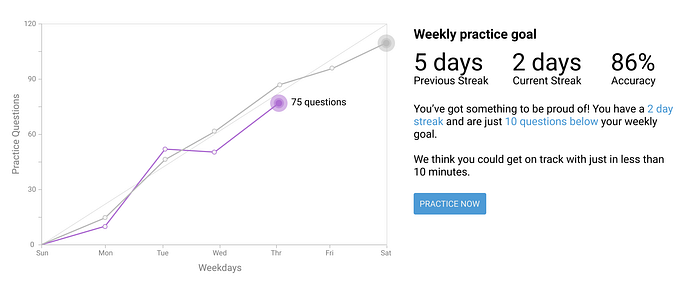
If we are going to ask students to go against their natural tendencies and knowingly increase their effort in the pursuit of learning, designers might think about how to address motivation through areas such as variable rewards, goal-setting, and feedback-driven metacognition.
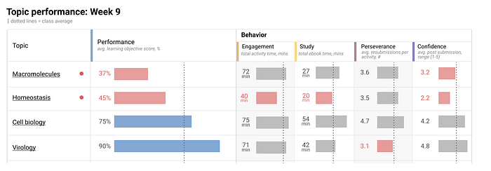
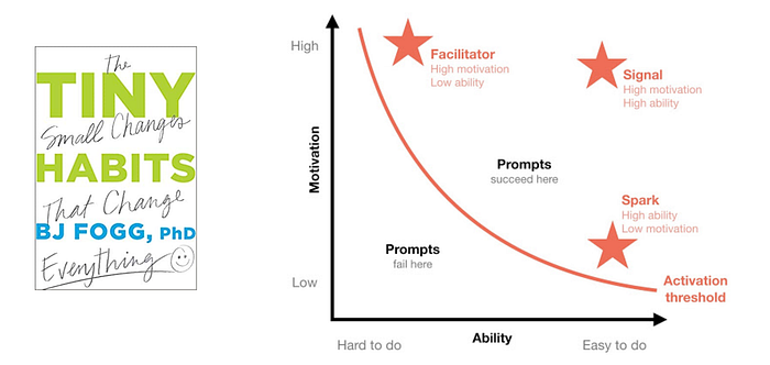
Taking this a little further, we might think about how we use what we know about individual student ability and motivation based on their engagement in the system to guide them towards better habits. Behavioral psychologist, BJ Fogg writes that behavior is dependent on a person's motivation, ability, and prompts. With this knowledge, we could start to think about how to design a system that might differentiate the mode of instruction by offering additional scaffolding for the highly-engaged student that lacks the ability while at the same time pushing students that lack motivation towards an experience that might spark interest.
Battling against myths
Another tension between desirability and efficacy is due to the engrained myths that many people have about learning. The most popular one is Learning Styles, a belief that individual students have different modes of learning such as auditory, visual, and kinesthetic. Teachers like to think that they can reach every student, even struggling students, just by tailoring their instruction to match each student’s preferred learning format. Many people, even those in the educational industry, share the same belief of self-labeling themselves as a visual or kinesthetic learner”. Unfortunately, this is not the case. It turns out that a learning style is actually a learning preference. There is no evidence that adapting to a preference will impact student achievement. Instead, learning science recommends that teachers (and product designers) focus on learning strategies such as retrieval practice, interleaving, and spaced-practice to name a few.

There are many strategies that exist, and most of them do in fact increase student achievement…so what do you pick? In the book Visible Learning, John Hattie states that it is surprisingly difficult to implement a teaching strategy that doesn’t in some way increase learning. The important thing to note is the relative effect size on student achievement across strategies (2009). This is not to say that designers should only focus on strategies that have the highest effect size and disregard all others. It is completely appropriate to use approaches with less effective size and paired them with more effective strategies. Below is a small glimpse of some of Hattie’s findings. You could find a complete set on his website https://visible-learning.org/.
Design for learning
In user experience, Jakob Nielson speaks about usefulness in terms of utility and usability. The utility of an educational product includes the ability of the experience to assist the learner in achieving their learning outcomes. Utility without usability will make the experience less useful.

Usability is a measurement that assesses how easy user interfaces are to use. UX designers, across industries, use a variety of research methods to evaluate and iterate on a product’s usability, as well as adhere to heuristics such as those introduced by Jakob Nielsen. While important, in regards to education, this doesn’t explicitly take into account design decisions and heuristics that impact the learning experience.
…instructional design involves not just presenting information, but also presenting it in a way that encourages learners to engage in appropriate cognitive processing. — (Mayer, Multimedia Learning, p. 168)
Multimedia Learning Theory, proposed by Richard Mayer, fills that gap. This theory consists of twelve principles that were conceived based on what we know about information processing, such as dual coding, working memory, and cognitive load. These principles have been divided into three areas of impact: minimizing extraneous load, managing intrinsic load, and optimizing germane load.
Principles That Minimize Extraneous Load
This group of principles focuses on reducing the wasted cognitive effort on material or details that don’t support the learning outcomes.

The Coherence Principle: “People learn better when extraneous material is excluded rather than included.” (p. 89)
The Signaling Principle: “People learn better when cues that highlight the organization of the essential material are added.” (p. 108)
The Redundancy Principle: “People learn better from graphics and narration than some graphics, narration, and printed text.” (p. 118)
The Spatial Contiguity Principle: “Students learn better when corresponding words and pictures are presented near rather than far from each other on the page or screen.” (p. 135)
The Temporal Contiguity Principle: “Students learn better when corresponding words and pictures are presented simultaneously rather than successively.” (p. 153)
Principles That Manage Intrinsic Load
This group of principles focuses on the cognitive effort required to represent the material in working memory. This group’s goal is to address the complexity or difficulty inherent to the learning materials.
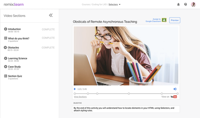
The Segmenting Principle: “People learn better when a multimedia message is presented in user-paced segments rather than as a continuous unit.” (p. 175)
The Pre-Training Principle: “People learn more deeply from a multimedia message when they know the names and characteristics of the main concepts.” (p. 189)
The Modality Principle: “People learn more deeply from pictures and spoken words than from pictures and printed words.” (p. 200)
Principles That Optimize Germane Load
This group of principles focuses on the effort required of learners to actually understand the material and is strongly affected by their motivation.
The Multimedia Principle: “People learn better from words and pictures than from words alone.” (p. 223)
The Personalization Principle: “People learn better from multimedia presentations when words are in conversational style rather than formal style.” (p. 242)
The Voice Principle: “People learn better when the narration is spoken in a human voice rather than in a machine voice.” (p. 242)
The Image Principle: “People do not necessarily learn better when the speaker’s image is added to the screen.” (p. 242)
Design in support of teaching frameworks
The previous sections focused on how we should design experiences from both a cognitive and design perspective to impact learning. In this section, I’d like to briefly discuss the context in which your product might live in the student journey.
Depending on the type of educational product you design, your product is (most likely) a small part of a much larger learning experience designed by the teacher. I like to think of teachers as people who are delivering the service of teaching in a given context, such as their classroom or virtually. Service Design focuses on the full end-to-end experience in this context which may include your product at some point in the journey.
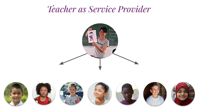
When designing their course, teachers will have a perspective on how the pace, sequence, and goals will be. The methods they use will depend on a lot of factors including what might be appropriate for a given subject matter, class size, class duration, and subjective factors like overall confidence with a new way of doing things. How a teacher designs their course is a highly personal activity.

Below is a glimpse at the basic framework I use when designing my own course that I teach at NYU. Like many other teachers, I select each digital product to serve a very specific need, a cog in my vision. This enables me to have students experience my course the way I believe they should. That is not to say that there aren’t full-course platform solutions that exist which might align well with what an instructor has in mind.

When designing for teachers, make sure to take a step back and see where your product might fit in their holistic plan and environment. Learn to take into account what a teacher might be doing right before they use your product, and what they might do right after. How well does your product fit in those transitions? Are there opportunities worth exploring?
Interoperability
Looking at the collection of products I use in my class might seem a bit daunting. There is a lot there. Luckily there are platform called Learning Management Systems that help bring some organization to that. Some of the more popular platforms include Canvas, Google Classroom, Blackboard, and BrightSpace. These products allow instructors to organize content that they want to use from the web or uploaded from their computer in one centralized area which includes an assignment list, calendar, gradebook, roster management, and slew of other course management features.

With this centralization of disparate content from all over the web comes standardization in the mechanisms in which 3rd party websites communicate with the LMS and vice-versa. The most popular transmissions include LTI and xAPI. The details of these, and other standards is outside the scope of this article, but the general gist is that your product may likely be launched from a hub alongside others.

From a UX perspective it is important to understand how you could design your assigning experience to work in these systems seamlessly. I am a big fan of how Google allows publishers to leverage their “Add to Classroom” button. Adding an assignment is as easy as liking a post.

Most importantly, if you are developing content that will be used in these systems it is critical that you understand what LMSs do, and figure out what your place is in that ecosystem. For example, you may not need to design a roster creation flow. The LMS will send you the roster via LTI, or some other method. Before designing an educational product that you’d like to be compatible with an LMS, make sure to do some research.
Who are we designing for?
When thinking about the target audience for educational products, this tends to get murky as well. While the beneficiary of the learning outcomes is the student, many times the student has little say on which products they will use. These decisions are typically made top-down by districts, departments, teachers, and/or parents. Because of this, many designers will tend to shift their attention to the decision-makers. While the lens of these people is important to understand, it is the student that needs to engage in the job of learning using your tool and should have a strong voice in design decisions. Let’s take a glimpse at who students are.
Designing for everyone
As we hone into the students, the complexity does not end. Students quite literally come in all shapes and sizes. This includes everything from age, race, social-economic status, physical and cognitive abilities, and many more characteristics. It is important to understand these differences and how to design for them.

Finding Similarities
Many UX designers like to use personas to help empathize and understand the customer they are designing for. This paradigm, in my opinion, doesn’t really work on its own in education, especially when personas are predominately demographic-based. While you may be able to brainstorm an ad campaign around this information, it may prove difficult to make product design decisions with that alone.
Instead, I prefer thinking about differences in terms of traits and context. There are many traits that students share, and those traits are highly influenced by context. For example, a student might be considered an underachiever in English class and be a highly motivated star pupil in biology 45 minutes later. Personas alone, don’t take into account how human motivation shifts and changes sometimes at the very same moment. Below are a few traits that were identified by my team, as we started to define our own student archetypes that we design for when designing digital products.
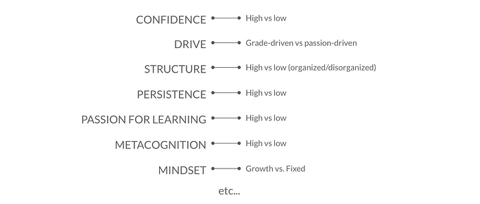
Each of these traits could be overlaid to drive insights, and those insights could then build strategy such as thinking about how we could shift a student from one quadrant to another if that happens to be an appropriate strategy.
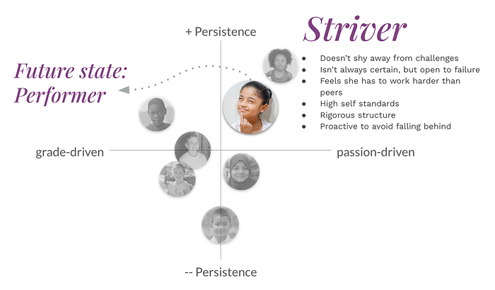
You could read more about my thoughts on designing for Affect, Behavior and Cognition, in my ABCs of attitudes-based archetypes post.
Accessibility
Making your educational product accessible is not optional. This is a very intentional design requirement that needs to happen at the very beginning of any educational product development initiative. Several guidelines have been put in place such as the Web Content Accessibility Guidelines (WCAG) which help to identify areas that require attention.
Rosenfeld Media has created a collection of personas to help designers empathize with students of various abilities. These students are dependent on educational product designers to make good conscious choices with how they prioritize accessibility, in order to grant them access to an education that they are entitled to, just like anyone else. The short video below is very powerful in helping to understand why accessibility is so important. I show it to all my students as they learn how to design and code interactive learning experiences.
Diversity
When designing educational products it is important to think about whom you might be unintentionally excluding. The D4D Framework is a guide to get you started in building equitable products, services, and content. In it, you will find questions to ask yourself and your team such as:
- Who might you be excluding?
- How will you engage the people you want to reach within your design process, equitably?
- Is the ongoing process of improving your product/service informed by The Source?
To see what being deliberate about diversity and inclusion with design might look like, take a look at the amazingly thoughtful work by AirBnB. Their “Your Face Here” initiative came about after their intention to erase any cultural identity of their illustrations by removing all the skin color had the unintended consequence of doing the exact opposite.
“When a person appears as an outlined white space while their hair and clothing have color, it’s easy to assume they’re caucasian.” — airbnb
These conversations need to happen in education across the board. From illustration to language, to content. There are many places were might be unintentionally ignoring or doing. harm to a group.
Hopefully, I was able to share a glimpse of what doing UX in education looks like. While every vertical from finance to fashion has its own unique challenges, education is filled with interesting obstacles that make working in the industry so rewarding.
In a future article, I would like to focus on another tension. This time between efficacy and viability. If anyone has any other considerations that they would like me to write about, or want to share their own experience, toss a message in the comments below.

