What is a 5-second user test and how can it help you in the design process?
Know more about users’ first impression of your design.
Imagine you are building a checkout experience. A user would add products to their cart, enter their payment details, and place an order. If the payment goes through, the user is prompted with a confirmation page with the order details.
The goal as a designer in the confirmation screen would be to highlight key details about the order such as payment status, shipping information, etc. How can designers in this scenario ensure that the information is conveyed effectively and offer users with clear directions to what will happen next?
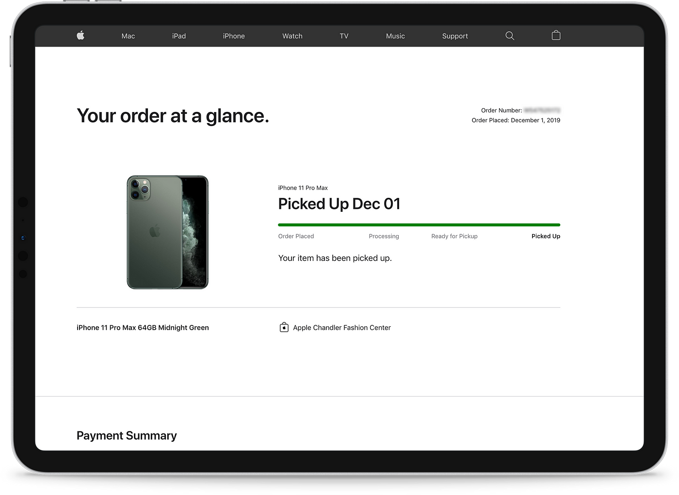
You might ask, if it’s an order confirmation page, people would anyways be more likely to spend more than 5 seconds on it to confirm their order is through. How can this be helpful here? This is true, but the initial impressions can be vital here to assess if users will be confused or have a clear sense of the purpose of the page.
This is where user tests like the 5-second tests could be valuable. They are quick, easy to run, and can get the desired insights for the design team.
What is a 5-second test?
The 5-second test is a user test where you would show one or more versions of a design to your participants for 5 seconds and then ask a series of questions.
Note that, it alone is not a sufficient measure of the usability of design [1]. But, where it shines is to offer insights on first impressions — what users feel, what they recall from the limited exposure, and how comfortable they are with what they just saw.
To run a 5-second test successfully, it is also important to choose designs that accomplish a simple task (List view, confirmation pages, review page, etc). [2]
Where does this land on the design process?
5-second tests could be used to test after you’ve reached a point of preparing high-fidelity designs and ran a couple of usability tests.
To give you a scenario, imagine you conducted a series of usability tests for a design project. You have got some feedback and made changes based on user feedback. Now, what if you had a couple of design options on certain sections of this project that you feel could work for the users?
There would be a couple of options in this case:
- Go ahead with shipping all options and use A/B split testing or multivariate testing to identify which version works the best.
- Use a 5-second test to filter out options by gathering qualitative information and then depending on how confident you are with the outcomes, either release the top-performing option or release the shortlisted options and measure their performance with A/B testing.
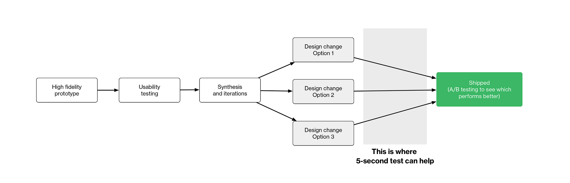
Depending on the project you’re working on and timelines, you can tweak to fit this test to get the desired insights.
In my experience of using this test, we were also able to identify accessibility issues as well. We were testing a list view in a workflow automation feature of the product. One participant in the test looking at one of the design options mentioned that they couldn’t distinguish any difference among items. This happened because we used color solely as a distinguishing factor for each list item. We were able to fix it immediately even before a single line of code was written.
What will a 5-second test not help you with?
As this is a simple task-based user test, it is not suitable for testing flows or designs that have multiple interactions and tasks.
If you want to test, for example, a complete checkout experience, the 5-second test alone will not be suitable. In this case, you can use this as an additional test method to gain more insights along with moderated or unmoderated usability tests.
How to run a 5-second user test?
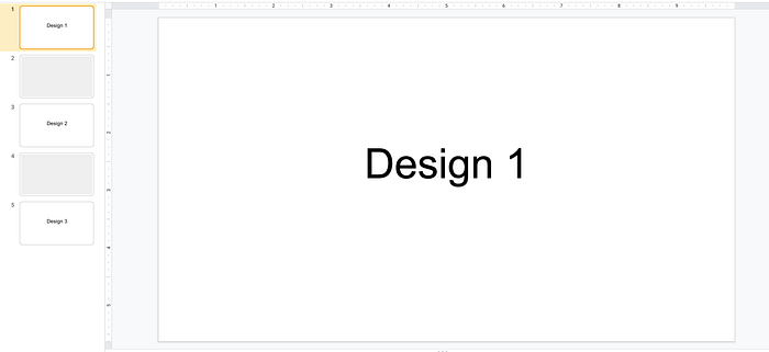
To run a 5-second test, there are a couple of ways. Here, I’ll highlight one of the ways that we used by using Google Slides and a remote control chrome extension.
Create a new presentation, place your designs with one version on each slide separated by a blank slide.
Now, meet your participant, and show each design for 5-seconds, move to the blank slide and ask a series of questions.
Here is a framework of questions we used to interview users during one of the tests:
1. What do you recall from the page that you just saw?
2. What do you think is the purpose of the page?
3. What is the most prominent element that you remember from the page?
Running it remotely:
It’s even easier to run this test remotely. Set up your slides the same way as a regular 5-second test. Hop on a call with the participant and share your screen. After 5-seconds move to the blank slide and ask questions.
Take notes as your participant answers these questions. Be sure to not prime your users that you would ask these questions. Instead, ask them that you’d be showing them a couple of designs of a feature and ask a couple of questions. This way the users are not primed to look for responses to the questions.
Depending on the design options you are testing, this test can be wrapped in 5–10 minutes.
Also, note that if you’re testing multiple versions of the same design, be sure to randomize the order of design options that each participant sees. This is to ensure that the order in which a user would see doesn’t affect the test results. [3]
How to analyze the results?
Huddle up as a team and share your notes. This is where you could discuss the Pros and Cons of each of the designs presented, what were more general themes that emerged out fo the 5-second test, and finalize on the design you’d like to proceed forward with.
As this is a qualitative test, an affinity map could also be a useful way to code participant responses.
Bonus:
I ran the 5-second test on my portfolio website recently and was able to make some key changes.
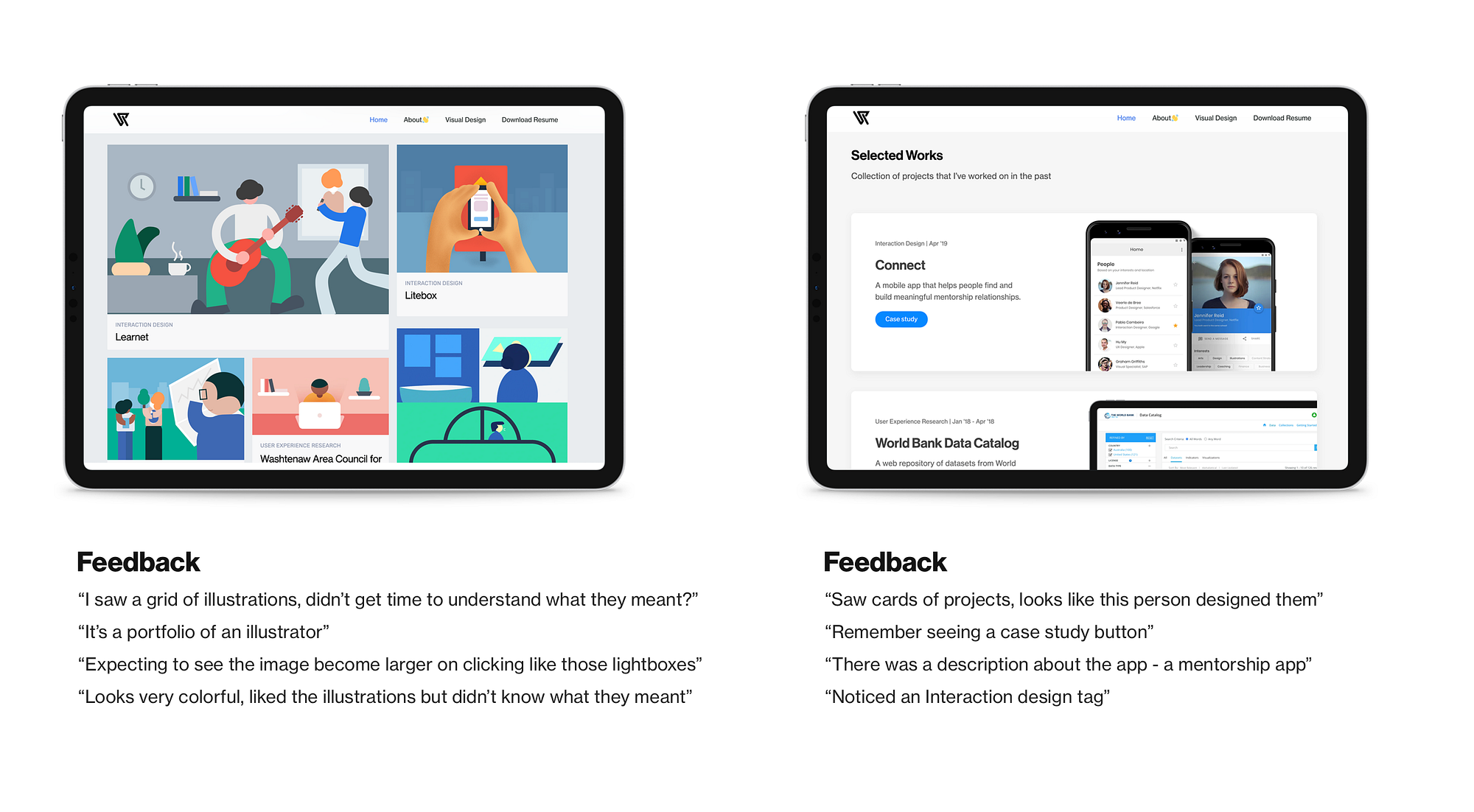
If you notice, even though there was a feedback that the earlier version (on left) was colorful, there were several miscommunications happening — Portfolio of an illustrator, clicking on the project leading to a lightbox modal, when in fact they would load case studies.
In the updated design, it was immediately clear to the users that they were case studies of projects that I worked on. It was interesting to see how the interaction designer tag was observed in the current design, which also existed in the previous version, but possibly was overpowered by the visuals.
Now if we look at the type of users who would generally see my portfolio, they might be visiting it with limited time in hand, especially, hiring managers and recruiters. Here, it is crucial for me as a designer to make sure they get what I do quickly.
Would love to hear if you have used this in design practice, or have any thoughts?
References:
- Gronier, G. (2020). Measuring the First Impression: Testing the Validity of the 5 Second TestJUS. Retrieved 29 August 2020, from https://uxpajournal.org/measuring-testing-validity-5-second-test/
- 5-Second Tests: Measuring Your Site’s Content Pages. (2007). Retrieved 31 August 2020, from https://articles.uie.com/five_second_test/
- How to Test Visual Design. (2020). Retrieved 31 August 2020, from https://www.nngroup.com/articles/testing-visual-design/

