What is this “shape design” thing?
A look at shape design applied to graphical illustrations.

This article discusses shape design as used in certain styles of contemporary illustration. Shape design is really a graphic design technique but it can be applied to any sort of image-making practice whether that’s graphical illustration, landscape oils, hand drawn pencil and paper, etc.
The TL;DR takeaway here is that shape design based on geometric shapes interspersed against more organic shapes is a design weapon that can be used to create eye-pleasing and modern images.
Warning. I’m going all-in with emojis today 😉
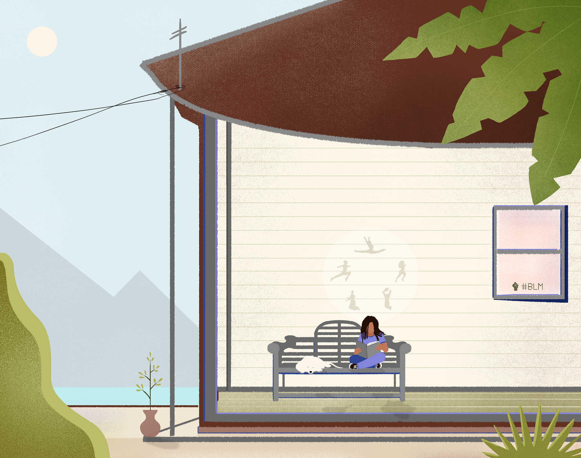
In the illustration below, I wanted to depict the power of reading and dreams in a child’s development while also expressing my support for the black lives matter movement. In terms of shape design, I utilized many triangular, rectangular, s-curve, and circle shapes alongside more organic ones:
Introduction to shape design by way of studies
When I use the term shape design here, I’m talking about the application of introducing some sort of geometric shape (or shapes) to a graphical illustration or image. I’m going to start right out by showing you an exercise you may find useful for figuring some of this stuff out.
Take an artist you like and find a particular shape from that artist that intrigues you, and try to figure out how you might duplicate it in whatever your favorite medium (by hand, Photoshop, AI, doesn’t matter).
Do note that this is a study, and NOT original work!
Here’s an example. I found the cloud on one of the later images in this article quite interesting and I wanted to see how to go about creating such a shape in Photoshop. When we draw or illustrate an element we understand it much better than just having a look.
Could I use the stock big round brush to cut this in from both sides? Nope, I tried! It seemed to require the pen tool to somewhat unfaithfully reproduce the shape which was:

Ok, so what’s the whole point of this!? Good question. Well, I learned that making this shape is hard with the “big ole’ round brush cutting in on both sides” technique (don’t worry there’s no such thing technique really), and that such shapes probably require the use of the pen tool (or perhaps you could do it by hand in AI with that auto-smoothing setting jacked way up).
When I ask myself: “why do I find this shape appealing?” Is it because it’s not just like other similar cliche cloud shapes and sort of has his own stamp on it? Is it because it feels like the momentum is moving towards the right? All these questions help me to grow.
In the end of this little experiment I walked away thinking to myself I need to try spending an hour with the pen tool just messing around to see if I can get “my own” little signature shape for clouds 😊
Btw, if while doing such an exercise yourself you don’t think the result is very compelling, go ahead and give yourself a chance to try playing around with it bit. See what happens; for example:
Yeah, nothing brilliant there, but we’re just playing around right!?
Ok, so now what should you do? Throw this away! It’s a copy of someone else’s work 😂 It was just an experiment and not something you should show or include as your own work.
Why are you showing me this exercise?
I think there are a lot of folks that think that the only way they’ll figure this stuff out in a classroom or by being told exactly what to do step by step—but the reality is at some point you have to get in there and do some self-sufficient experimentation to really learn how the fun stuff works.
Ok, with that out of the way, let’s move on to some wonderful examples of shape design from amazing illustrators on our planet…
Circular & Oval
Below you will find a lot of use of circles, half-circles, and ovals in the work of Febin Raj:
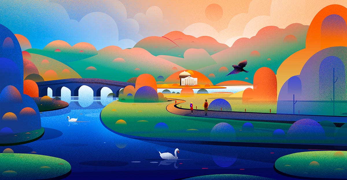
Look at the clouds in the back. I can almost guarantee he drew those by blobbing in the big ole’ standard round and then cut in on the hard corners to make it just a wee-bit more organic feeling. But maybe I’m completely wrong ¯\_(ツ)_/¯ — how do you think Febin Raj did it?
Another thing I find interesting is the sort of half pill buttons turned on their side. They feel pretty strong in their vertical solidness (is that a word?) Oh, did you catch the grain gradation fade he used on the very rightmost pill with the branch inside of it (far right)? I bet he used a layer mask with a black-to-white gradation to get that effect. The grain was probably just added noise, or dissolve or something else we can Google.
Is my assessment correct? I dunno—only the illustrator themselves knows, but it’s a good way for me to exercise my own illustrator muscles mentally while also appreciating someone else’s work and always asking myself, “why exactly do I like this and is there something I can learn from it?”.
I got this idea of mental study from a drawing book I once read that asserted that you should walk around and literally ask yourself “how would I draw that? how about that?” Once you’ve got some basic drawing experience, this sort of approach really works! So here it’s a similar aim, to be able to look at an image and imagine how you could reproduce some of the elements yourself.

In this bottom image, you could imagine the trees being blocked in with a sized up round brush (or vector circle, etc.), and then “cut-in” with the lasso or pen tool. Oh, that negative shape by the way, is a triangle which we’ll discuss soon.
As I look at this, it occurs to me another thing to purposely make a perfect circle shape more organic might be to try using the Liquify tool in Photoshop (I haven’t actually tried this but I’m having a 💡 moment 😎). Wait, hold up, lemme go try that…yup, it’s a kind of interesting result:

Pill
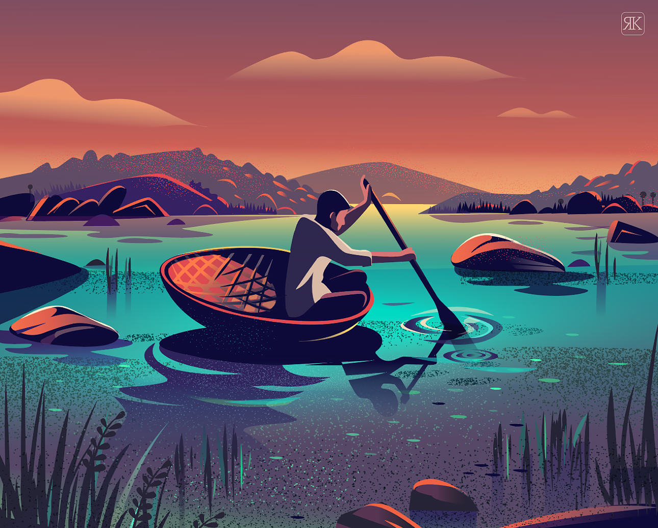
This shape is essentially what you see on a CTA pill button a.k.a. rounded button. By combining the shape in interesting ways, you can come up with, for example, an interesting graphical representation of a cloud. Here’s an example from Ranganath Krishnamani:
If you look at the illustration below, you can find a very thin long pill shape at the top:
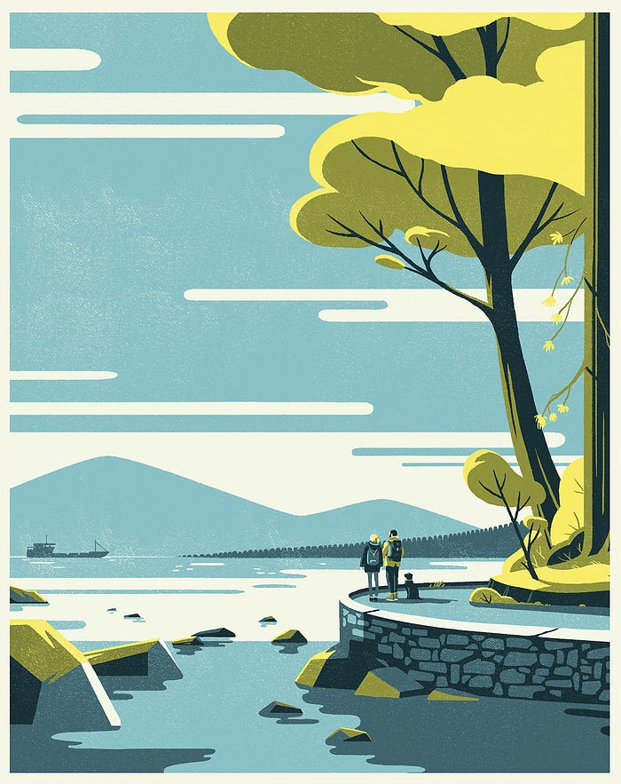
If you look carefully, you’ll also see half circle shapes used for the restaurant awning, rectangular shapes in the newspaper content, triangular angles in the background, ovals for the coffee cup top and the table (and even her fingernails). More geometric shapes combined in interesting ways.
Another illustrator who uses this shape in interesting ways is Tom Haugomat:
An interesting aside regarding above illustration—do you notice that he’s mixed a combination of pill (clouds and water), triangular (mountains), circular (trees), polygonal (rocks), and even some irregular shapes for the stone wall on the bottom right. I think mixing geometric shapes like this might be counterintuitive to the product designer who’s used to strict “rounding guidelines” like “we only do 4px radius on our buttons and prefer rounded shapes over angled ones to match our brand personality”. This is essential for things like a strictly branded application at times, but for illustration, the vibrance one gets from juxtaposing circular vs. angular shapes is akin to playing off warm colors against cool colors when turning a corner in painting. It adds vibrance and interest (of course only if done well), and becomes quite a useful device in the arsenal of an illustrator’s tricks.
Triangular
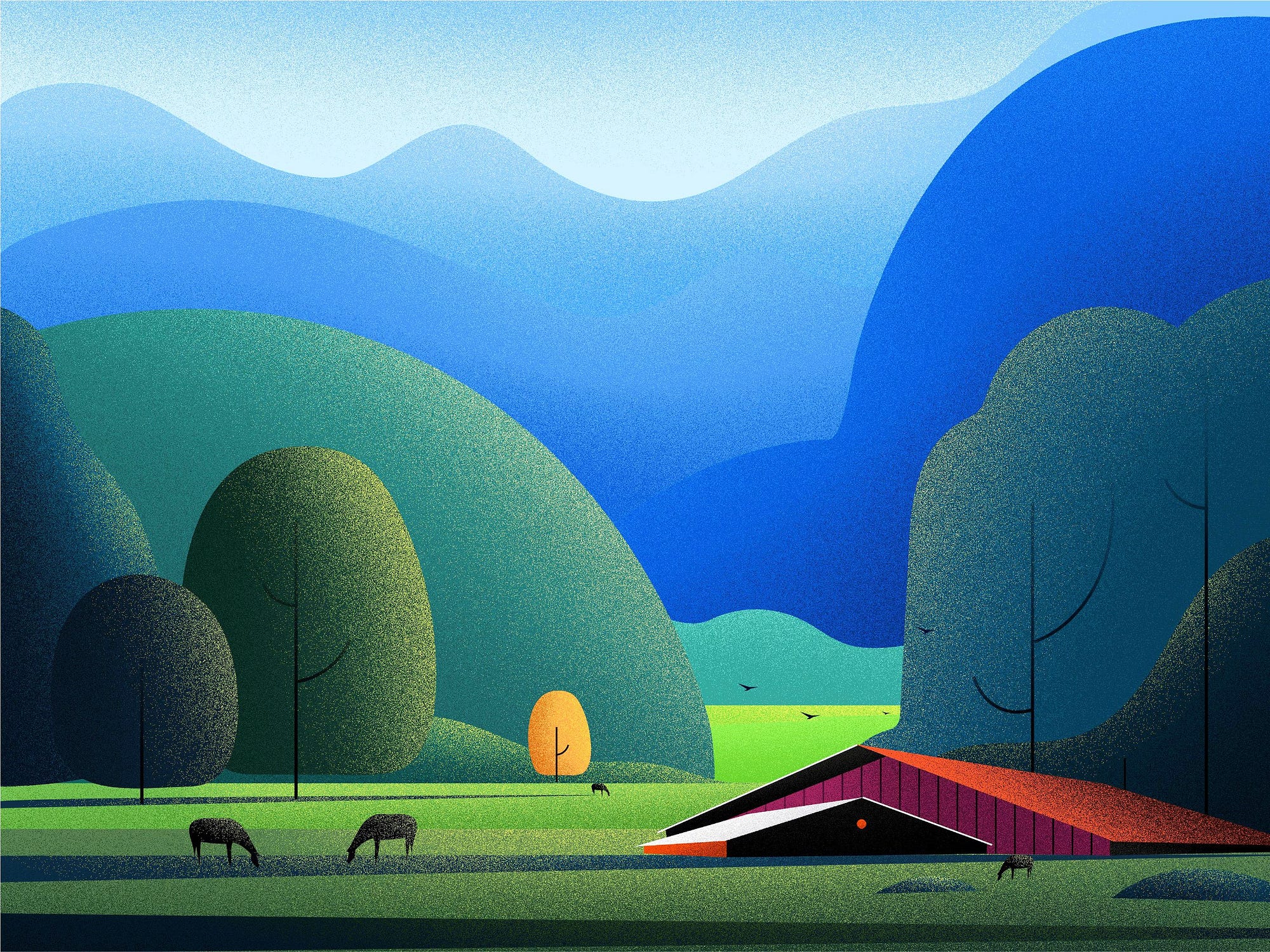
In the following illustration, you probably will immediately notice the circular, pill, and s-curve shapes. But, the barn on the bottom right is clearly a set of triangular shapes at the core (oh, well yes, there’s a red circle inside too):
Here’s another illustration by Febin Raj that utilizes tall thin triangular trees. Those shapes are further “cut out” with triangular negative space. This type of tree is a very prolific graphical tree representation you’ll find all over the place. Probably what makes these shapes interesting in this piece is how they work against the more organic flying birds, the s-curve of the imposing highway, the texture, color, lighting effects, etc. But the geometric shapes help to ground the illustration in such a way that makes us say “oh, that’s nice!”:

Organic Triangles
No one says any of these shapes has to be mechanically perfect. As an illustrator myself, I have one trick (oh-oh…should I tell you my tricks!? 🤔) is to start with a perfect geometric shape and then either warp it or not, and then use that as a guideline to hand-paint directly over it on another layer (then delete the guideline shape)—mwa-ha-ha-ha! I digress, so here’s a nice example of triangular but irregular too by HUA:

Again, I’ve placed this in the triangular, but, by now I hope you also notice the s-curves (for the river), and the s-curve (sun). These shapes work nicely against the more irregular ones. From a graphic design perspective, it sort of grounds the more organic shapes.
Polygonal
Polygonal shapes are quite interesting aesthetically, and give that lofi-poly vibe to a piece. Placed against nice use of texture and color, they can also add a sense of graphical interesting to a piece like this one:
S-Curve
Take a look at the clouds in the next few images. My almost certain guess is that these were done with the pen tool as they are either slanted forward, or just irregular enough to not be simply sprinkling in and out cuts from a huge rounded brush:

In all three of the above pieces, I would argue yet again that it’s the use of organic shapes against more geometric ones that make these all come alive…well, there’s the great drawing, color, texture, composition, focal point of interest, story—ok, this stuff ain’t easy and it takes more then one trick up one’s sleeve to get this sort of quality, but learn the principles one at a time, and then you’ll be able to start to combine them in interesting ways.
3D
I heavily favor 2D art so apologies if my articles under-represent 3D. Certainly, this stuff is certainly useful in 3D Stijn Orlans is an amazing 3D artist to study for that. This next piece (I think) may be a hybrid of 3D and 2D not sure:
But Stijn definitely has a lot of 3D art you should check out. He has an even possibly better example of using 3D spheres in a graphic image he did for Adobe which you should be able to find here.
Summary
Hopefully, you’ve seen and learned how geometric shapes placed against more organic ones are pretty much a winning device for modern graphical illustration. I’ve omitted some obvious shapes like rectangles and squares as those seem obvious. But, what do you think? Do you like the use of geometric shapes in image-making?
Rob Levin is a freelance illustrator. Portfolio: https://roblevin.myportfolio.com/ For illustration work inquiries, collaboration, or to say hi: roblevinillustration@gmail.com.
Also, you may like to read more of the illustration teardowns articles.

