What journey maps don’t tell can make a big difference
In human centred design we aim to make things work better for the people we are designing for. One exercise we often do to achieve understanding is laying out journey maps. We build journey maps to see the overall experience of a given persona as he works to accomplish something of importance to him. By documenting his current reality we can better emphasize with him and thus define where we should improve his experience. No wonder, the accuracy and completeness of how we represent the persona’s journey will define the potential impact of our design.
Or put it simply: the better we map journeys, the better our design will be. So the question arises: is there a way to make journey maps better?
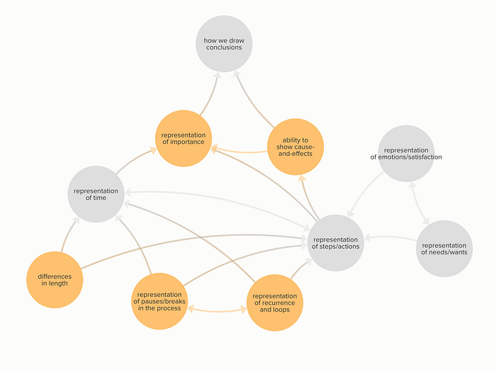
To answer the question I made a simple analysis of journey maps, the way we create and read them. What are the elements of the maps, what effects do they have on each other, what forces work within this system? Would adding, removing or changing these elements lead to a better outcome?

Journey maps are not complicated. And they are not meant to be. A simple visual representation of the actions taken in various channels as a response to the persona’s needs or wants with the accompanying state of emotions/level of satisfactions laid out in a linear fashion. In the order of their occurrence. That’s it.
Are we missing a thing here? What is the price of this simplicity?
The importance we attach to things is not always in line with their real significance
This bias is mainly caused by how we represent, and as a consequence, how we read time in our journey maps. We tend to forget that the events we see as a single chain are not necessarily continuous. There could be pauses or even breaks in the process, that if not marked, remain invisible to us. Also, since steps take even width across our maps, suggests that they last the same time. But the difference in length can make two seemingly equal steps completely different. The other signal of importance we miss is the lack to see the reoccurrence of certain actions. Not to mention repeating sequences or loops.
We only see cause-and-effects in neighbouring steps
Another bias preventing us from drawing the right conclusion is we look for cause-and-effects only in consecutive steps and not across them. Say, the user is happy when finishing the on-boarding. He is happy with his first and everyday usage. Only some steps further way will he suffer from the illy settings he made way back. Will we link the two events as cause-and-effect?
The Heat brothers wrote in their book, The power of moments:
Great service experience is mostly forgettable and occasionally remarkable. The occasionally remarkable moments shouldn’t be left to chance. They should be planned for, invested in.
You don’t need to reinvent the entire process, just to invest in a few moments of magic.
To be confident in our choice, we need to be more capable to see importance and cause-and-effects in our journey maps. So we might consider to include the followings in their layout:
- Distinguish the differences in the length of steps
- Indicate of pauses or breaks in the progress
- Make reoccurring actions and loops visible
- See cause-and-effects across steps, not just in-between
These changes might make journey maps a bit more complex, but it would pay for the information they deliver.
I am really interested in your opinion, so don’t hold back, share it in your comments below.


