Member-only story
What the Apple Newton taught us about UX 27 years ago
One of Apple’s biggest failures was years ahead of its time.
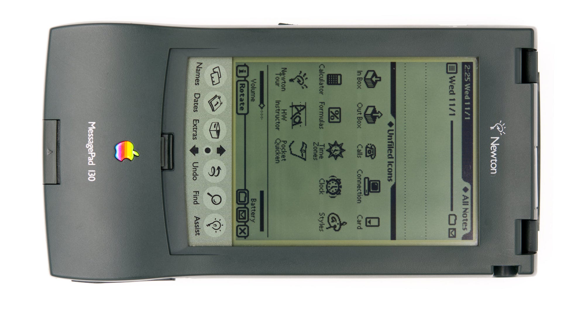
 I have always loved the UI of Apple’s Newton. Considering that nothing like it existed at the time, it’s incredible how well thought out everything was. Apple doubled down on the unique handwriting recognition, which eventually became the Newton’s undoing. Also, Steve Jobs famously hated the use of a stylus and, for a multitude of reasons, killed off the project when he returned to Apple in 1998.
It was the stylus. I killed the Newton because of the stylus. If you’re holding the stylus, you can’t use the other five that are attached to your wrist.
- Steve Jobs Movie, 2015
While there were multiple reasons for shutting down the Newton project, some of its more unique UX paradigms exist even today. Apple had a long history of building pixel-perfect UIs for black and white screens, so it’s no surprise they were able to pull off a simple design aesthetic that was consistent across all of the UI. The Newton’s OS had the personality of the original Macintosh and leveraged the hardware limitations the best that it could.

