What Tokyo’s metro taught me about progressive disclosure
My first-time commute in this mega city went really well. But I couldn’t remember why it went so smoothly when I got out of the station. So I decided to study the question during my stay in Tokyo and Osaka.
It’s 8pm in Tokyo. After landing for the first time in Japan, I finally arrive to my final destination: Shinjuku station.
Locals would know that it’s the world’s most busiest subway station, I didn’t. If you simply type “Shinjuku station” on Google you would see this:

Surprisingly, my first-time commute in this mega city went really well. But I couldn’t remember why it went so smoothly when I got out of the station. So I decided to study the question during my stay in Tokyo and Osaka.
Entering the station
In Tokyo, walking directions are inverted from the common pattern in Europe. Nonetheless, I didn’t realize this until I thought deeply about it. Why is that? Simply because the signs were clear enough while entering the station.

Being the most populated city in the world with it’s 13,000,000 habitants, signage must be really important to ensure a proper movement underground. And as you can see, they are not afraid to be bold enough so you don’t miss it.

You’ll find these arrows everywhere and you’ll be following the instructions without even noticing it.
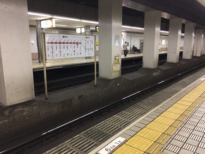
Waiting your train
I must say, Japanese people are highly respectful of the rules, spend a day in Paris to see the complete opposite (I’m from Paris, so trust me). It’s in the small details that Tokyo’s subway amazes me the most. Once again, clear signage on the floor to let you know where to queue and where people coming out of the subway will go.

One other thing caught my attention, on each side of the platform, there are clear indication of which way this train goes. To make sure you line up on the correct side and do not catch another train:
Is this not more useful than a billboard promoting the awesome new skin cream that reduces stress? I’ll let you decide.
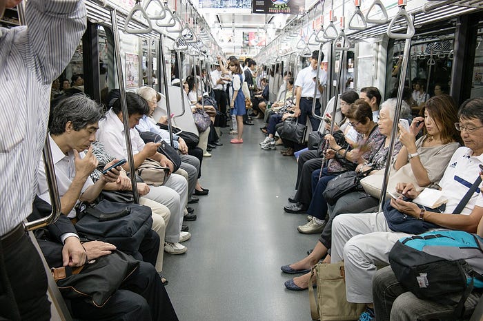
In the train
So in France we would call this «La cerise sur le gateau» (the cherry on the cake), which means, these following details were the moment where I fell in love with Japan‘s metro system.
1. When you enter the train

When entering the train, you’ll see wide screens showing the past and next stops of the train. Even better, showing how many minutes it will take to reach your destination. Europeans would say, this is a Citymapper killer, why bother taking out your phone when you have everything here right in front of you. But to be honest, you’ll be surrounded with this in the train:
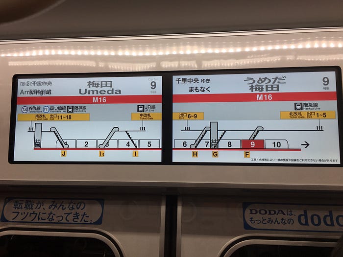
2. Announcing next stop
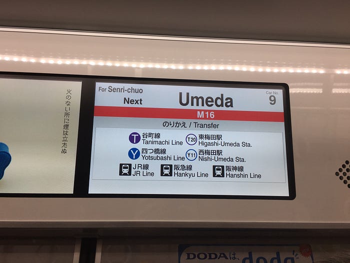
Ahead of reaching the station, you’ll see what is the next stop and what are all your transfer possibilities. This is great to first make sure it’s the right stop and double confirm if you have to switch to another train.
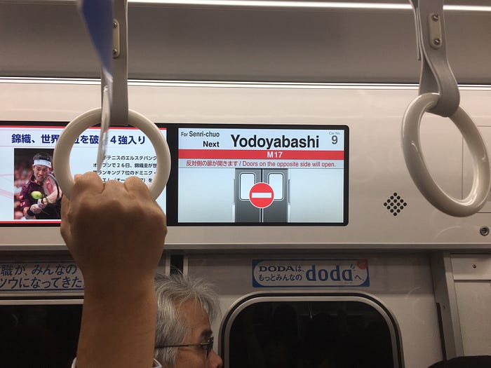
3. Preparing to exit
A few seconds before arriving to the next station, the screen displays on which side the doors will open. When being stuck in a crowded train, you can already start sliding yourself to the correct door. How many times did it happened that you’re standing on the opposite side of the opening doors and you’ll have to impolitely push everyone to reach out of the train?
4. Exiting the train
Wait, something more? As soon as the train starts reaching the station, the screen displays in which wagon you’re currently standing and where you’ll land on the platform. This is extremely helpful to avoid loads of travelers getting out of the train and being stuck on the platform trying to figure out if it’s to the right or left they should go.
Accessibility: Blind & Deaf
While some of us would call it a day, it‘s important to design experiences for everyone. Japan is probably the country I‘ve visited that has braille everywhere. In addition to this, everything mentioned above is clearly communicated by sound inside the train (in Japanese and English).

So what is progressive disclosure?
It’s an interaction design pattern. It sequences information and actions within time, so that users won’t feel overwhelmed with all the information at once. By disclosing information progressively, in context, it helps users manage the complexity of a product.
This is exactly what I experienced in Tokyo, by receiving each information at the right moment, I managed to reach my final destination without any worries. Everything went smoothly without even noticing how much I was guided.
Conclusion
It’s hard to reflect deeply on our environment and how it’s designed. Everything around us is designed but yet invisible to a lot of us. We get lost in our every day life without taking the time to look around us. Traveling is a great way to reset your eyes and explore new environments with fresh eyes. So here‘s the challenge, next time you go out, find something you‘ve always ignored because how well it works. Enjoy!