Member-only story
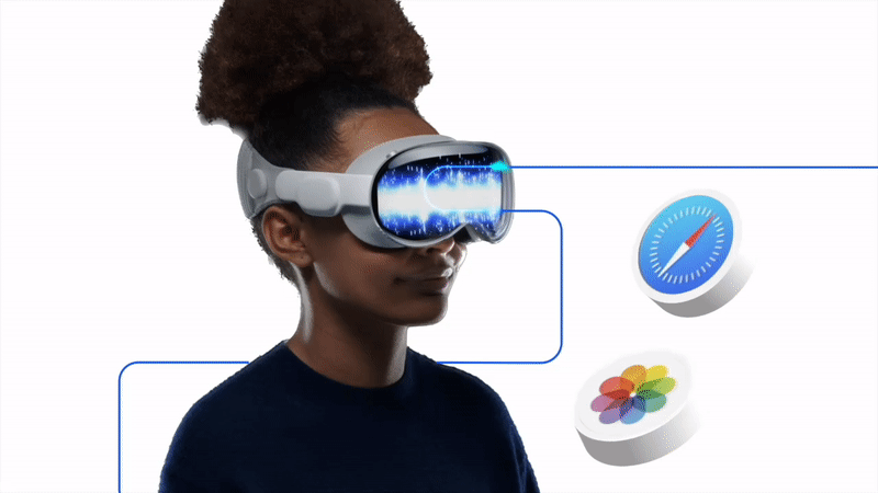
Apple Vision Pro
What’s so spatial about it?
A new world to explore for UX/UI designers.
Mixed reality headsets have been with us for a while. The experiences got progressively refined and made better. Titles like Half-Life: Alyx has proven that a VR experience can be truly immersive.
To this day I remember being so much IN this world, I ducked to get something from under a (virtual) bed and then tried to use that bed to push myself up. Of course in the real world there was nothing there.
That’s how immersive it got.
Say what you want about Meta (the jokes about Eiffel tower and legs come to mind) but their Oculus experience is actually quite well made and refined too.

Enter: Apple.
Apple is famously late to most parties, but their outfits usually outshine the whole event. Don’t believe me?
Remember designing for smart watches before the Apple Watch? Sure — they existed, but almost nobody cared. Apple came in and CREATED that category.
Remember designing for smartwatches before the Apple Watch came along?

What’s so Spatial about it?
I watched the presentation just like everyone else, but unlike most people I paid attention to some little, impressive details with how the interface was crafted.

Let’s explore a couple of the things that I noticed about the interface starting with:
Glassmorphism
Most of the interface chrome is made of a glass-like surface. It has gradiented edges with the light usually being on the top left of an object. That however seems to…

