When it comes to design, your eyes are way better than maths
A quick look at how mathematics is not the ultimate source of design truth.
I ventured into the world of design 6 years ago as a freelance graphic designer and made the transition into product design about a year later. Throughout my career, I have encountered hundreds of scenarios where the computer-generated output of a design intention differs from the expected outcome even when the maths was done right.
Let’s take a look at a few cases:
All logos are not created equal.
While working on a customer section page for a client, my initial direction was to create a grid that contains 256px * 200px boxes housing the customers’ logos and names.

While my computer says they are all 24px in height, my eyes say this does not look visually appealing.
Sketch enables me to convert my first box into a symbol for reuse, leveraging mathematics and modularity as a foundation to construct the layout. But I had to trust my eye to deviate from this repeatable module to achieve a more balanced and beautiful grid.

The bounding box is real
In the case below, my eyes tell me that the left and right side of this success page does not feel vertically aligned to the center but Figma tells me otherwise.

Well, the problem here is that the computer sees images differently than humans. We see the mass of the object, in this case, the football, but the computer sees something called a bounding box (which is an invisible box that encompasses every possible pixel in the image). In the example below, the bounding box is the blue rectangle.

Since the computer recognizes the tiniest or lightest coloured pixels that may be invisible to the human eye, mathematical equality and optical equality will remain unequal. Engineered geometry has failed us here again, so we need to move beyond the mathematical measurements to compensate for the optical distortion.
Here’s how to do that: Find the visual mass of the object, that’s where most of its presence is. We ignore the little shatters that have very little weight and that way we end up with this:

Even better, we can edit the bitmap by cleaning up some splatters at the bottom, so that the updated bounding box will now naturally be the visual mass of the image.
Different letters of the same type may disagree: Kern with your eyes
Here is a quick example of an experimental logo for an interior design firm. The entire type is set in Helvetica Neue 64points, kerning is set to auto and tracking is set to 60 points. The type baseline is set to the middle.
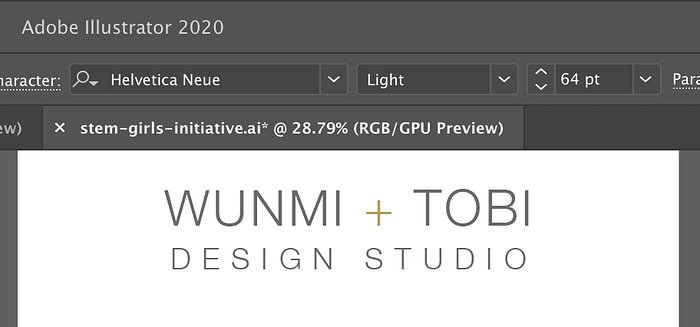
But my eye tells me that that there is more space between the I and + than there is between + and T. My eye also tells me that the + is not set to the middle.
So let’s fix this:
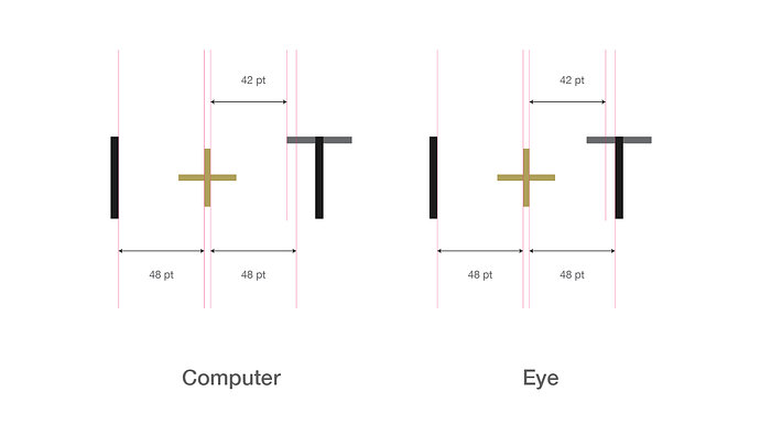
First the baseline. I would stroke the entire word and then vertically re-align the letters to the center.

Next, we trust our eye to adjust the kerning between + and T to match that of I and +. The default spacing has the + too far to the left. The I has a straight vertical stroke and the T has a crossbar. What we need to do is ignore most of the crossbar since it has very little presence relative to the verticals.
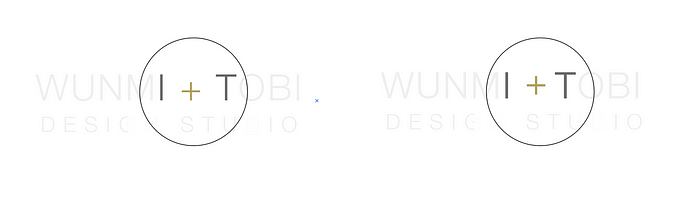
To make the difference more pronounced, this is what the final execution looks like side by side. I’m sure you can easily pick which one was done entirely by maths.
Type scale: You don’t have to stick with decimals
When starting a design project, I usually visit a site like type-scale.com to come up with my base type scale. But for most scales, you will usually end up with messy decimals in your font sizes.
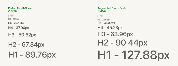
What you need to do is build out a few core pages with this type scale, and then manually adjust with your eye before deciding if to round down or round up. This is totally subjective and depends on the type of project you’re working on. Certain type scales are better suited to different site archetypes. Landing pages generally have more contrast between type sizes than blogs or product sites.
Note: There is nothing wrong with keeping the type scale in decimals (personally I do not like it, especially when I’m doing the CSS), the caveat here is to emphasize how your eye can help you move beyond measured conventions in achieving visual balance.
In the book “4 Hour Body”, Tim Ferris explains that your weight scale is not the single source of truth when it comes to weight loss. You may be 72kg last month and 72kg this month, but your fat may be more properly redistributed that you’re generally more fit than you were and your tight clothes now fit you perfectly.
The automated tools of our software help us save time as designers. But these tools are created with programming languages and are therefore very mathematical in their approach to interpreting design intent. Your eye is a great tool. Use it.

