When less is more: Minimalist personas in UX
Why fewer details in personas improve outcomes like clarity and alignment

Summary: Minimalist personas are brief, evidence-based character sketches that are specific, concise and based on psychographic user variables. They are used to simplify and highlight critical information about target users, leading to clearer communication, better design prioritization and more alignment among stakeholders. I provide 3 case studies and 8 ways to design minimalist personas so they are more believable, generalizable, compelling and resistant to stereotyping.
 Personas have long been a controversial topic in User Experience (UX). Many of us know personas by what they aren’t: aren’t used, don’t inspire our stakeholders and generally have been a deliverable that ends up in the deepest corner of the digital trashcan (2, 4, 7).
Like many UX designers, I dabbled in personas early in my career.
It’s an important UX deliverable, right?
And so I dutifully created personas. Painstakingly detailed, creatively written. Long. I congratulated myself on my ability to weave together the most subtle of details, as if I had just conjured the next great Gatsby.
When my carefully crafted personas met a resounding thud, failing to get my teams to understand (and more importantly, use) my oh-so-wise insights, I threw in the proverbial towel. Much later, a 2012 article understated my then-attitude:
“I’ve never been a big fan of persona… I haven’t found documenting a persona to be a needed or necessary step in my own design process.” (9)
Fast forward almost a decade: now, I advocate for a type of persona that has overcome all my original missteps. In fact, my current colleagues mostly know me as the one who unpacked my evidence-based personas shortly after walking in our startup’s door. Today, everyone from the designers to the developers to the executives can recite our key personas, as well as how we design to support them.
How did I ricochet from one extreme to the other? More importantly, how did I get everyone on board?
The answer is what I call “minimalist personas.”
Minimalist personas offer the advantages we expect, such as capturing the imagination of product teams and executives, providing a useful common language and producing empathy (11), while strictly limiting themselves to only the specific human variables most critical to a specific design. Minimalist personas are intended to break existing expectations about our users, so that we counter-intuitively provide better generalizability with just a few, well-chosen details.
With minimalist personas, less is definitely more.
What Got You Here Won’t Get You There
A designer knows he has achieved perfection not when there is nothing left to add, but when there is nothing left to take away. — Antoine de Saint-Exupery

The minimalist persona concept was born out of necessity: In the early 2000s, I was a new UX designer, struggling to design effective speech technology-based conversations, with only my knowledge of psychology and interpersonal communication to guide me. Frustrated by the lack of applied research, I focused my dissertation on user characteristics that led to increased usability of and satisfaction with automated self-service. My findings, with nearly 800 individuals, showed people who were more willing to take risks were also more satisfied with self-service interactions (10).
Over the next 15 years, I continued to study how the psychological trait of risk-taking impacted technology usage. Although the research started with conversational user interfaces, as my career moved on, I found risk-taking also played a role in how people interacted with websites, mobile applications and even physical products. It became clear that individuals who are more confident in their “do-it-myself skills” (how I came to describe a specific form risk-taking for colleagues and clients) were more likely to engage with self-service technologies, tended to be more persistent and were more satisfied with their interactions. It didn’t seem to matter what company provided self-service or the specific product, people with higher tolerance for risk-taking tended to perform better.
An interesting finding also emerged for lower risk-takers: under some circumstances, they were also willing to engage with self-service, persisted and emerged satisfied with their experience. This finding was in direct contrast to a dominant attitude among my client companies — and my own earliest findings — which showed that approximately 20% of consumers would not engage with self-service at all. They were the non-players, so it was said, and would always call a call center, a technician, or go to a retail location to get support.
Surprisingly, my work indicated inaccurate stakeholder generalizations about people were the core of the problem, not users’ willingness to engage.
Psychologists know these inaccurate generalizations about people by another name: stereotypes (1).
As I talked to various organizations during projects, I realized I needed to break the expectation that 20% of their user population could be written off, assuming they would never use self-service technologies in any form. I chipped away at my messaging about these groups, making it crisper and focused to get stakeholders to question their unexamined knowledge. I used additional research to clearly define how to design so each persona would engage, locking the persona variables to practical design guidelines.
Over time, three self-service minimalist personas emerged: Avoidant, Optimistic and Confident. Two colleagues illustrated and helped me further solidify ways to tighten minute details associated with the personas. I whittled the persona description to just four characteristics, all existing on continua:
Perhaps the most important early achievement of these personas was that they thoroughly broke those existing stereotypes, particularly about Avoidant users. Instead of stakeholders simply believing that self-service engagement depended on how “tech-savvy” a user is, I used technical knowledge as a way in, then countered existing beliefs with the critical variables.
My argument sounded like this:
“You already know people have different levels of technical knowledge, but that’s actually not what matters the most. In fact, you can be quite tech-savvy but lack confidence in your technical skills or have a very literal way of interpreting instructions… that’s what would make you Avoidant.”
Almost immediately, an audience member would tell a story about their grandmother, uncle or daughter and the behaviors they’d observed that made them one or the other persona.
And that’s when I knew the power of a minimalist persona was far greater than the sum of its parts.
Why Minimalist Personas Work
How can something so stripped down be a highly compelling UX artifact?
This counter-intuitive argument draws from the fields of literary fiction and psychology to explain how we interpret details about both fictional characters and real people.
Here, I’ll discuss why suspension of disbelief, Chekov’s Gun and the psychology of social judgment point to minimalism as a way through the confusion and inaccurate perceptions that result from over-specified personas.
Suspension of Disbelief: Use Few, But Realistic, Details
Let me take you back a bit, to the year 1817. An English poet and philosopher named Samuel Taylor Coleridge published his work Biographica Literaria, an autobiography that described his approach to poetry. Coleridge is perhaps best remembered for his well-known poem “The Rhyme of the Ancient Mariner.”

What’s most important about Coleridge’s approach for us is a phrase he popularized: “suspension of disbelief.” Coleridge’s view put the burden of believability on the creator. He said that writers must include elements of truth so that their audience can move past their disbelief in a fictional narrative. Moving past skepticism is what allows readers to become immersed in a story (8). Without it, audiences don’t engage.
Consider movies, books, plays you might have seen: the ability to forget the “fakeness” of the events and its characters is what allows you to lose yourself, and even enjoy, the tale.
There’s direct relevance here to our UX personas: they are also fictional characters. Our task as UX professionals is to suspend stakeholder disbelief, helping them to see a realistic person, and predict how that character will respond to a product we design for them.
As creators of a persona, we have an obligation to create believability for our stakeholders. So yes, elements of truth are critical. However, we must judiciously select details that allow stakeholders to extrapolate the character we have created. Our persona must not be so tightly drawn that it can’t also live in imagination.
Suspension of disbelief demands we provide details derived from reality to add believability to our characters. Not too many, though. The most believable details can only be uncovered through research, which directly contradicts the practice of creating assumption-based protopersonas (6).
Suspension of disbelief tells us to focus a persona on only the most critical, believable details we want to highlight for design purposes.
Which details, you ask?
Chekhov’s Gun: Key Characteristics That Dictate Design
Chekhov’s Gun refers to another piece of literary criticism: this one from the Russian playwright Anton Pavlovich Chekhov in the late 1880s. He advised writers that
“If in the first act you have hung a pistol on the wall, then in the following one it should be fired. Otherwise don’t put it there.” (3)
In other words, every detail matters and should have a role in the story to be told.
Applied to personas, this advice advises against adding as many details as you can dream up. Not only will excessive details obscure the important variables of users you’re designing for but also confuse stakeholders.
What typically makes the critical difference in how people use a product or service is an attitude, stress, or some other cognitive, personality or behavioral characteristic. My guess is you might know what that variable is right now, if you purposely exclude demographic characteristics (e.g., age, gender, length of experience, etc).
Chekhov’s Gun counsels you, the designer, to select only a specific variable that causes users to interact with your product, service or brand differently. This variable is the cause and how you modify your design is its effect. Select only the smallest number of critical user characteristics intentionally, since they are the issues that will drive your design.
Social Judgment and Stereotyping: Emphasize Psychological Details
Recent events in the United States highlighting the back-breaking outcomes of an ingrained culture of stereotyping have substantially increased the urgency of being thoughtful in how we discuss users. Like the previous advice from literary criticism, the psychology of social judgment offers a cautionary tale about overstuffing personas with demographic details.
In fact, our brains are wired to prefer simplistic, inaccurate but easy-to-process understanding of others. Personas are often a mechanism for codifying such thinking in UX (5, 13), so it is imperative on all of us that we counter such thinking.
Social cognition — or how we think about other people — teaches that we create cognitive structures to enable rapid information processing about humans (1). Rapid cognitive processing is how we’re able to take in a continuous stream of social minutiae about everyone we encounter and not become a motionless blob of brain-fried goo. These frameworks of information, or schemas, give us mental shortcuts galore but they also filter the information we take in about others and, in many cases, limit our understanding of them.
With the benefits of schemas come some decided problems. Schemas that overgeneralize about specific groups are known as prejudice or stereotypes. Once a stereotype is activated, research shows that our conclusions are often incorrect, we fail to notice contradictory details (and prefer confirming details) and generally have our thinking about others and their behavior hijacked by erroneous assumptions. In fact, studies show that we tend to view all members of “other” groups (those groups we don’t personally belong to) as overly similar, known as the illusion of outgroup homogeneity.
What does this all have to do with personas?
Personas that rely on demographic variables tend to reinforce existing stereotypes. Specifying our persona’s age, race, education, gender and most other demographic characteristics in our persona will be a second opportunity to activate a schema. Within milliseconds, the brain’s complex reasoning breaks down and with it, most ability to consider how an experience or design might best cater to this person.
Because personas are often accompanied by photographs of the prototypical user, we have just activated existing stereotypes stakeholders may have about the visible characteristics of that individual. In other words, if we add a stock photo of a white male, well… we already know what they’re like. Same with black females, Millennials, the elderly, someone who’s attractive and a million other visible characteristics. A tidal wave of “I already know about that type of person…” comes rushing forward, often without our conscious awareness.
This unexamined, rapid brain process is what we must break if our personas are to be effective and meaningful.
Crafting Minimalist Personas
You probably know personas by what you learned at design school, something along these lines:
Most personas are rife with details: details about what car the persona drives.
What he or she eats for lunch.
The fact she likes silk pajamas or has a secret habit of purchasing ice cream on Friday afternoons.
Now don’t get me wrong: if the product you’re creating is a car, packaged lunches, silk pajamas or ice cream, each of these details might be the single most relevant one to your design task.
But most of the time, these aren’t the details that help us articulate what impacts practical usage of our product, service or brand. Excessive details bog stakeholders down in a swamp of complexity, then cause them to shake their head wearily and hasten our personas to an early grave.
If we don’t provide an avalanche of detail in our personas, what exactly should we create?
Minimalist personas include only the most relevant, usually psychographic, details that can and should impact design. They purposely exclude those details, such as age, gender, education, and other demographic descriptors, that obscure the more important design-related variables.
The point of a minimalist persona is to communicate specifically, simply and succinctly, while also avoiding the complexity and lack of realism that characterize many personas. Their value lies in surprising stakeholders by upending what they think they already know about their consumers.
In contrast to their overspecified brethren, minimalist personas leave substantial portions of the user profile to imagination. This is what gives them life. Because minimalist personas don’t describe users by observable characteristics, the persona can be easily generalized to a more demographically diverse set of users who share a common attitude or behavior that does directly impact their product usage.
Let’s consider two more case studies where minimalist personas have been used to counter organizational knowledge and highlight critical design considerations.
Case Study 1: Fast Casual Restaurant Managers
A well-known and extremely busy fast casual restaurant was interested in improving their training of employees in local restaurants. The existing knowledge held that some restaurants were better than others at training and franchisee background in training predicted the quality of the training program.
Personas existed in the organization only for franchise customers, not for restaurant management. On request, they shared their quite well-defined customer personas, which were heavy on demographic variables (e.g., age, life circumstance, family makeup) and didn’t identify any associated design guidelines. I was told the personas had become so controversial that we should find an alternate phrase to refer to our deliverable.
The UX research project included observations in several restaurants and interviews with restaurant owners, managers and staff. In addition, we ran several usability testing rounds on a digital training platform that had been implemented by all restaurants. In all, over 60 employees and 30 restaurants were represented in 6 research studies.
We used minimalist personas to consolidate and simplify communication of the resulting findings. The central resulting insight was that a manager’s training needs depended on one key variable: the amount of time managers had to implement training.
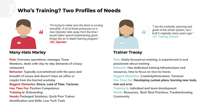
The variables that did not adequately describe design-relevant individuals differences were the managers’ age, tenure with the company, education, experience, staff characteristics, or the success of the digital training platform in the restaurant. The research showed these variables, while previously seen as important, were shown to be “nuisance” variables that simply distracted support teams from the key training needs.
As a result, design recommendations for the harried managers (Many Hats Marley) emphasized packaged, done-for-them training programs for onboarding new employees. In contrast, Dedicated Darla managers were interested in an expanded range of tools, resources, best practices and a peer community that would help them produce creative and tailored training programs.
Case Study 2: Large U.S. University
Another project where minimalist personas became a way of aligning and communicating with disparate stakeholders was a website redesign for a large university. At the beginning of the project, the client identified over 15 various user groups that the website needed to cater to (e.g., students, alumni, voters, government, parents, faculty, press and subgroups of these), which were as confusing to our project team as they appeared to be to internal stakeholders. Some of the persona groups overlapped and all were seen as roughly equivalent, interfering with consensus on even the most basic parts of the website (i.e., homepage design and site navigation).
The UX research project included participants from several of the constituent groups, with usability testing of the current site and interviews about their needs and desires for the revised website. Not only was user performance in finding desirable content quite poor (e.g., 35% success rate) and required an extended time, but well over half of participants belonged to more than one constituent group (60% of participants) and said the website didn’t convey their personal experience of the university (79% of participants).
Minimalist personas were used to focus subsequent design strategy across internal stakeholders. The research showed that a single variable that influenced users, regardless of group membership, was the strength of their relationship to the university. Three levels of this variable were used to collapse all the original constituent groups into three more manageable design targets. Subsequent efforts focused on creating a journey that tracked the content needs of users as their relationship strength changed over time, including all personas’ similar desire for more storytelling and compelling visuals.
How To Create Meaningful Minimalist Personas
For UX pros crafting minimalist personas, the perspective of a fiction writer is helpful:
- There’s a set of characters (personas), who engage in behaviors in their environment, that result in some consequences.
- When the audience (stakeholders) are given too many details about the characters, they’ll be overwhelmed and lose the plot.
- Too few or irrelevant details, the audience will be confused.
- Our creative task is to determine the most critical details of the characters to illuminate who they are to propel a product narrative.
But don’t be deceived: just because they’re minimalist doesn’t make them easy. I’d argue that creating an effective minimalist persona is difficult because you need to be extraordinarily clear about which human variables facilitate the action in your story. If you don’t understand the story (aka, user journey) adequately, you won’t know the character attitudes or behaviors that incite it.
Here are my best tips for developing effective minimalist personas:

- Study real users, continuously.
This one might be (hopefully) obvious, but in case it’s not, your personas won’t be injected with realism if you haven’t interacted with a lot of real, actual humans. It’s not going to be a done deal in a single study. Instead, consider user research to be a continuously ongoing effort, along with refining your personas. Don’t skip the real work here. As I mentioned, I’ve been researching the self-service personas for the better part of 20 years. In the other examples, the project team thoroughly researched the target user groups until we understood them, often over multiple studies.
2. Create a unique set of minimalist personas for each product.
There are lots of ways to scope your personas. Because minimalist personas are… well, minimalist, it’s going to be a challenge to make them apply to an entire suite of products or services. The best way to keep them as lean n’ mean as they need to be is if you develop a set of personas for each product. This way, you can focus on the key variables that influence these users’ interaction with this single product.
On the other hand, if you’re able to tap into a key attitude or behavior that governs your users’ interaction with your brand, it may apply to your company’s entire product portfolio, as well as your branding, marketing, communications and service delivery. It’s a tall order but not impossible.
Imagine your team is building a set of tools that supports solopreneurs as they scale their business. Your research shows the variable that most influences the solopreneurs’ business development is the priority they place on marketing versus product development. This variable will likely influence which of the product set they use first, their path to using other tools as their business grows and their understanding of your brand. How can you design for both the Marketers and Product Developers within each tool? How might you communicate the value and sequencing of each tool in the entire product set for these two groups? How could you expand beyond each persona’s “natural” business focus to other considerations needed for success?
3. Describe your personas using one to four key variables.
What I mean by this is minimalist personas require a whittling down of characteristics to no more than four psychological variables that are most critical. Resist the urge to say someone’s age, gender, race or some demographic variable is what motivates usage. The key motivation is far more likely to be an attitude, point of view, need or desire. Determining this small, prioritized set of motivators is quite literally the hardest part of creating a minimalist persona.
I’ve found the key variables often include stress and/or expertise in a specific topic area related to the product, service or brand. Both of these variables have been researched for a long time in the field of human factors (14) and they both impact how humans take in information and use it. The brain quite literally functions differently in conditions of high stress compared to low, meaning that humans don’t take in or process information effectively when they are under stress.
Similarly, experts think about problems and new information differently than novices. Aspects of both these variables underlie all the case studies and examples throughout this article. If you’re having difficulty identifying your key variables, I suggest you start with these two and see where it leads.
4. Define levels of each user variable, starting with the extremes, to create a range.
So you’ve got your one to four variables. Now you need to define the levels of each variable; in other words, what are the high, medium and low conditions for each? The easiest place to start is by defining the extremes.
Going back to the earlier two variables of stress and expertise, you could simply call the levels high, medium or low (3 levels). However, these labels aren’t especially descriptive. Instead, you might call the stress levels “urgent,” “pressed” and “relaxed” to better articulate each level. Two expertise levels might be called “complex and detailed jargon” and “non-specific terms” to better illuminate what’s different about people at each level.
5. Name the personas to promote generalizability and clarity.
After you define the key variables and their levels, the last item is to combine levels of each variable into a single persona, then descriptively name the persona. The names you select should convey each group’s essence quickly to stakeholders, and ideally, help break whatever assumptions are at play. You can see the names we chose in the case study examples, which were intended to be descriptive, yet expansive.
In general, I’ve increasingly started to resist naming personas with proper names, like “Tom” or “Mary,” just because names can activate stereotypes as much as photos or other demographic descriptions (this seems like a good place to point out how loaded names like Karen can become). If you do choose a person’s name, be thoughtful about choosing one that isn’t gender- or racially-specific or tied to a specific era (popular names change over time). You can see in Case Study 1 that we used descriptor-with-proper-names, including gender-neutral names. If I redid the work today, I’d be far more likely to select descriptive-only names.
The takeaway: a persona name should, like every other detail, reinforce only the most important human variables you want to highlight with your minimalist persona.
6. Communicate succinctly and strategically.
How to best convey the critical knowledge about your minimalist persona to stakeholders is another exercise in knowing your audience. Options here include a narrative description, illustrative quote, list of characteristics, short video or… use your imagination. Figure 1 shows continua of the key variables and the levels of each persona along them. In Figure 2, you’ll see a short description and archetypal quote. Figure 3 shows simply the name and an illustration. All of these were taken directly from deliverables that presented the personas to stakeholders.
Regardless of how you communicate your minimalist personas, please make them brief, carefully thought out and to the point. Your goal is to surprise, break existing assumptions and encourage bigger thinking (imagination) about real people than might have happened without the minimalist persona.
7. Create abstract or ambiguous persona images.
A special word here about the images you select for your personas, since they are instrumental in activating stereotypes. It’s better to design an image than to use a photograph. Everyone knows your stock photo isn’t this persona anyway, so don’t give in to that impulse. To the greatest extent possible, use an image that is gender-neutral, ageless, raceless and emphasizes your critical characteristics.
Or, use human characteristics in a surprising or assumption-countering way. For example, I used all-female personas for the consumer self-service personas initially, since that helped counter the stereotype that primarily men troubleshoot technology themselves. Later, my colleague Emily used body position as a means to communicate subtle characteristics about these individuals through illustration. When stakeholders see your imagery, they should be reminded of the important information you want them to understand about this user, not the extraneous details that get in the way.
8. Articulate the design implications of each key variable and level.
Finally, to make sure your personas take on a life beyond themselves is to carefully describe how each key variable influences UX design. Understanding the cause-and-effect relationship between human variables and design is equally as important as thoughtfully creating the persona itself. If you can’t describe the difference a variable or a level makes in an experience, well… you’ve completely missed the point of creating a minimalist persona. Each key variable and level needs to have an influence, or it should be excluded from the minimalist persona.
For example, the negative affect of an Avoidant persona (see Figure 1) means that self-service support must be short, less than 5 steps or no more than 7 minutes, and provide touches of delight and encouragement along the way. Because their affect is more positive, Confident personas can tolerate longer interactions and don’t need reinforcement because they aren’t looking for reasons to quit.
Here’s the most important thing you can do to really think through design implications: create a matrix of each variable and level, with each cell showing how you’d design to accommodate them (see Table 1).
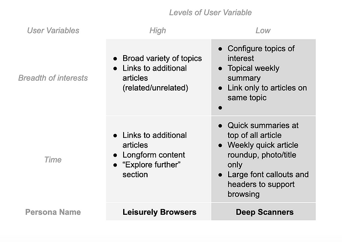
In this simple example, let’s say you’re working on a digital magazine and you find through your research that there are two key variables that determine how many articles someone reads: breadth of interests and time. Let’s also imagine that you realize that the “medium” level is unclear and you wouldn’t necessarily design for this third level beyond what you’ve decided to do for “high” and “low.” The matrix in Table 1 show some design guidelines for these 2 key variables, each defined on two levels, which are loosely based on a similar project I once had. However, I’ll caution that what goes in the cells of your matrix is best determined through UX research.
Such a matrix may help you speak with authority and clarity to stakeholders. When someone asks “what’s the difference among these personas?” you absolutely must be able to answer crisply, succinctly and immediately for each persona. Plus, a matrix is a great way to force yourself to whittle — when I’m not able to fill in a box, I know I’ve got more editing to do to get to the user characteristics that truly matter, because I don’t know how I’d design for a particular level. When in doubt, user research will help you validate your design guidelines and whether fewer levels or different variables are helpful.
Next time you’re considering how to communicate about your users, I hope you’ll give minimalist personas a whirl. They’re a great way to bring simplicity and clarity to your understanding of real human beings, while also using knowledge about how our brains process information to great advantage with stakeholders.
**Special thanks to several friends and UX colleagues, who made this article so much better and further inspired my own understanding of minimalist personas: To Emily Loughran for her illustrations throughout this article and the self-service persona illustrations. To McKellen Rattray, who illustrated the fast casual manager personas and provided feedback on an early draft. To Angela Niemi and Tara Odorizzi for their helpful feedback on later drafts of the article. I’m grateful to collaborate with them and many talented, strong women in UX.
References
- Baron, R., Byrne, D. & Johnson, B. (1998). Exploring social psychology, 4th ed. Allyn & Bacon.
2. Chapman, C. & Milham, R. (2006). The personas’ new clothes: Methodological and practical arguments against a popular method. Proceedings of the Human Factors and Egonomics Society Annual Meeting. Available at: https://www.researchgate.net/profile/Christopher_Chapman5/publication/253427652_The_Personas'_New_Clothes_Methodological_and_Practical_Arguments_against_a_Popular_Method/links/02e7e53441dc2729ac000000.pdf.
3. Chehov’s Gun: What it is and how to use it like a pro. Now Novel Blog. Available at: https://www.nownovel.com/blog/use-chekhovs-gun/.
4. Flaherty, Kim. (2018). Why persona fail. Nielsen-Norman Group. Available at: https://www.nngroup.com/articles/why-personas-fail/.
5. Hill, C. et al. (2017). Gender-inclusiveness personas vs. stereotyping: Can we have it both ways? Proceedings of CHI. Available at: https://dl.acm.org/doi/10.1145/3025453.3025609.
6. Jacobs, A. (2016). UX: Creating protopersonas. Available at: https://uxdesign.cc/ux-creating-proto-personas-76a1738401a2.
7. Matthews, T., Judge, T., & Whittaker, B. (2012). How do designers and user experience professionals actually perceive and use personas? Proceedings of CHI 2012. Available at: https://groups.cs.umass.edu/nmahyar/wp-content/uploads/sites/8/2019/01/reading15-optional2.pdf.
8. Mueller, Michael. (2014). What brain activity can explain suspension of disbelief? Scientific American Mind. Available at: https://www.scientificamerican.com/article/what-brain-activity-can-explain-sus/.
9. Polkosky, M. (2012). Reports of persona’s death have been greatly exaggerated. Speech Technology Magazine. Available at: https://www.speechtechmag.com/Articles/Columns/Interact/Reports-of-Personas-Death-Have-Been-Greatly-Exaggerated-82161.aspx.
10. Polkosky, M. (2005). Toward a social-cognitive psychology of speech technology: Affective responses to speech-based e-service. Available at: https://scholarcommons.usf.edu/etd/819/.
11. Pruitt, J. & Adlin, T. (2006). The persona lifecycle: Keeping people in mind throughout product design. Morgan Kaufman.
12. Salminen, J. et al. (2020). A literature review of quantitative persona creation. Proceedings of CHI 2020. Available at: http://www.bernardjjansen.com/uploads/2/4/1/8/24188166/3313831.3376502.pdf.
13. Turner, P. (2011). Is stereotyping inevitable when designing with personas? Design Studies, 32, 1. Available at: https://www.sciencedirect.com/science/article/abs/pii/S0142694X10000451.
14. Wickens, C., Gordon, S. & Liu, Y. (1998). An introduction to human factors engineering. Longman.