When polish gets in the way
I learned the hard way that presenting a prototype at the right fidelity is critical to getting the right feedback.

When Aalap Doshi and I entered the prototyping stage of our project that aims to form partnerships between academics and community members around health research, we wanted to begin by testing the edges.
How would users react to a passive experience where they had to do most of the partnership-finding? And how would they react to a highly personalized experience where a partnership match was found for them?
We knew our final product would likely land somewhere in the middle, but we wanted to expose our users to the extremes to teach us where along the spectrum we should be targeting. This question set up the infrastructure for our first round of user feedback.
Choosing the tests
I decided on three different experiences to test the range of how much hand-holding the users wanted in the partnering process:
- A directory model to represent a minimally-catered experience
- A matching model to represent a moderately-catered experience
- A chatbot model to represent a highly-catered experience
The first two models were rather straightforward to build since they were made up of a collection of screens that could easily be approached with traditional paper prototyping methods.
However, the third model of a chatbot was trickier to mold into a classic paper prototype. The contents of the single screen would be changing constantly, and since there was a huge number of possible directions the chat could take depending on the user’s input, it seemed a little ridiculous to create a separate screen for every single permutation.
Digitally prototyping the chatbot
I scoured the internet and found lots of sites that compiled lists of chatbot prototyping tools. They were all much higher-fidelity than my paper prototypes, using digital UI to mimic a polished phone app. While this looked more polished than what I was envisioning, I wanted to get my idea in front of users and this seemed as good of a way as any. I settled on a tool that seemed the most popular and figured, what’s the harm?
It turns out, I did myself — and the project — a great disservice by ignoring the nuance of different prototyping tools, though it wasn’t obvious right away.
During the session, the chatbot demo seemed to go smoothly enough. The user was good at talking out loud and expressed her thoughts toward various parts of the chatbot. And yet, when I looked through my notes later, I found most of her reactions weren’t useful.
I did myself — and the project — a great disservice by ignoring the nuance of different prototyping tools
I was hoping to garner insights on the high-level differences between the three partnership models, yet her chatbot comments were targeted toward specifics of that prototyping site and the very narrow conversation I had scripted. She had offered thoughts that may have been interesting if I were tweaking the details of a chatbot UI, but weren’t actionable at this exploratory stage of the design process.
The problem of high fidelity
There was a dissonance in the way I presented my chatbot prototype. I had a rough mockup of a conversation alongside a very polished-looking screen, like serving an amateur home chef’s latest concoction at a fancy French restaurant. Dining at a restaurant with elevated, upscale ambiance puts a patron in a very different mindset than if they were eating the same food at a friend’s humble kitchen. And the experience of a prototype fidelity is no different. Presentation matters.
I had put on too much polish too early on in the process, and as a result I had distracted the user and limited the usefulness of her feedback.
There were real consequences for presenting my ideas at a mismatched level of fidelity:
- I spent my time in the wrong place.
The chatbot prototyping site had a pretty steep learning curve, requiring the user to define all manner of elements in order to make the branching conversational structure that lies at the heart of a chatbot. I kept thinking it would only take one more tutorial to get what I needed, but I kept having to refer to more and more resources to build out my conversation. In the end, I spent too much time building the prototype infrastructure instead of more carefully crafting the prototype content. And as a result, the user got a lopsided prototype experience. - The user felt less inclined to make critiques.
When I walked the user through the two initial ideas using paper prototypes, she was very comfortable with questioning the screens: she’d wonder why certain elements were included and offer suggestions for experiences she’d prefer. But once we introduced the chatbot on a realistic phone interface, she made far fewer critiques. She seemed to accept the experience as it was, focusing more on her reactions to the flow rather than questioning why the flow was set up that way in the first place. More polish on the screen seemed to signal we had locked down many of our decisions, which left the user little room to offer her input. - The user paid attention to the wrong things.
We were hoping to get feedback on the overall idea of a chatbot, especially when compared to the other versions of the experience that were less-catered in the matching process. But because the digital chatbot looked more “real” than the other versions made out of paper, the user didn’t seem to evaluate them equally. She was happy to speak more broadly about the paper prototypes, but chose specific elements to comment on with the chatbot. And since those specific elements were particular to the site’s prototyping style rather than components we had input intentionally, we couldn’t act on most of those comments.
Because of the high-fidelity of the chatbot prototype’s UI, I had put on too much polish too early on in the process, and as a result I had distracted the user and limited the usefulness of her feedback.
Getting the fidelity right
Bill Buxton, principal researcher at Microsoft Research, considers choosing the fidelity of a prototype as a core skill of an experienced designer. He emphasizes the role of the prototype in getting the right feedback at the right time, balking at the “low-fidelity” label given to more rough versions of a design:
I hate the term ‘low-fidelity’ prototype or interface. Why? Because when the techniques referred are appropriately used, they are not low fidelity; rather, they are at exactly the right fidelity for their purpose — Bill Buxton, Sketching User Experiences (295).
He highlights the value of sketches in particular, which invite user reactions that are critical in the beginning phases of a project:
The designer made this sketch with the clear intention of inviting suggestions, criticisms, and changes. By conveying the message that I was knocked off in a matter of minutes, if not seconds, the sketch says, “I am disposable, so don’t worry about telling me what you really think, especially since I am not sure about this myself” — Bill Buxton, Sketching User Experiences (106).
A prototype is not primarily for creating a nice model; it’s for presenting an idea in just the right way to garner the most useful feedback.
I made the wrong choice about prototype fidelity because I had lost sight of what a prototype is supposed to do. A prototype is not primarily for creating a nice model; it’s for presenting an idea in just the right way to garner the most useful feedback.
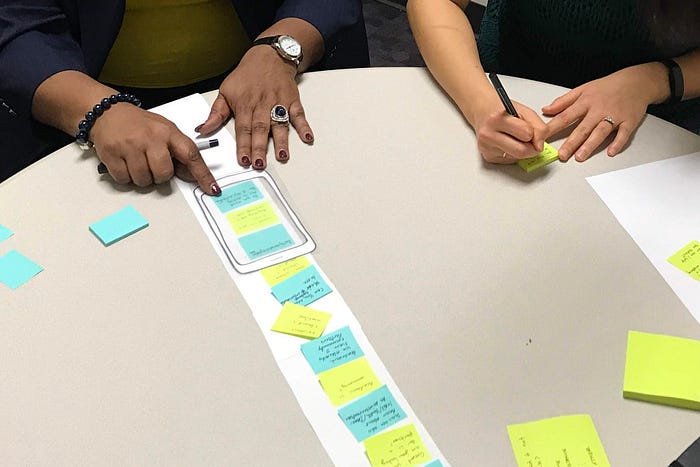
Upgrading to paper
For the next user feedback session, I ditched my digital prototype. I spent time experimenting with different ways to create a paper prototype for a chatbot, landing on a scrolling-ticker method (as seen in the image below).
This paper prototype took significantly less time to create, and because of the time I gained I got to focus more on the conversational flow and experience. When I tested it with a user, she gave incredibly valuable feedback about the high-level flow that she likely wouldn’t have thought to give if the experience was more polished. Because our goal was to compare the different partnership models, presenting them all as paper prototypes helped bring our ideas front-and-center while making sure details of the presentation didn’t get in the way.
As designers, it’s imperative to choose our tools with intention. Even with the growing arsenal of fancy digital tools at our disposal, at the end of the day the best prototyping tool may be made out of paper and post-its.