When Simplicity Isn’t the Answer — Designing for Vastly Different Audiences
The design process of Bindo POS 3.0

The first version of Bindo POS, an iPad register app with advanced business features, came out back in May 2013. By then it had already gone through a few iterations by several designers, including the talented Sean Farrell. Soon after iOS 7 was launched, I was tasked with a redesign to fit the new look. In January 2014, version 2.0 was released and as you’d expect from any hasty work, it was… unremarkable.

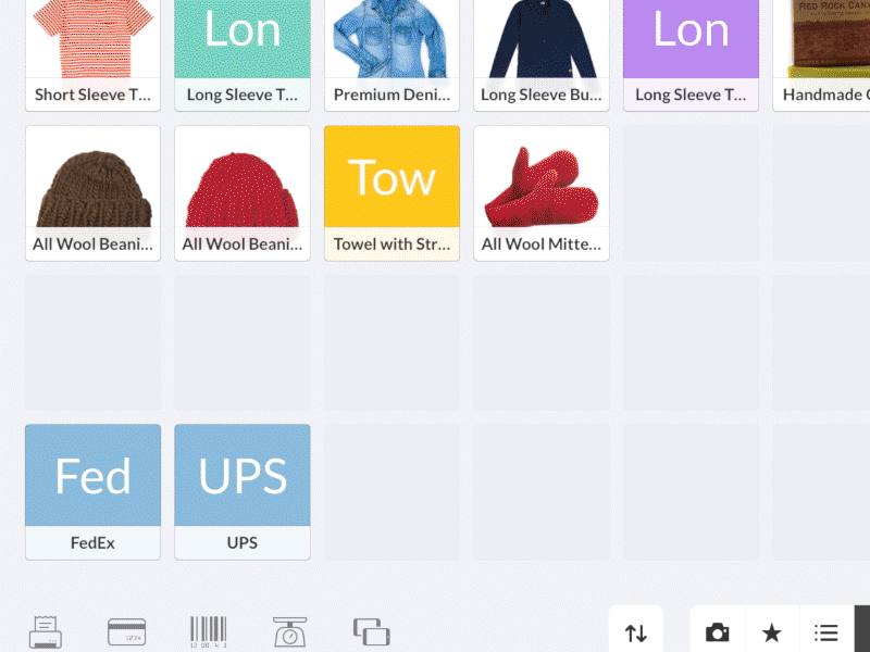
Lots of features are packed into our products. We get tons of feedback and feature requests from customers on an ongoing basis. Because of how varied our customers are, the requests can be very specific to their industries. Often-times, these are not niche features that can be ignored. They are generally things that could render the whole product unusable if not included. In addition, the slew of hardware we support makes it even more complicated. Every model of receipt printer has a slightly different pairing method, for instance. Sometimes it seems as though we are designing a standalone operating system.
We couldn’t focus on the majority of the users or pick one best solution for everybody. This was the exact opposite of building a minimal product and focusing on a core feature. As more and more functions were added, the number of buttons grew and the app got bulky. We needed an elegant solution to accommodate as many use cases as possible.
A housecleaning was in order.

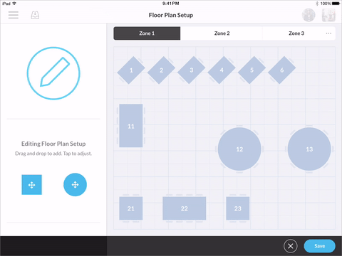
Wireframes
We started by questioning the choices we made in previous releases, and by gathering as much customer feedback and feature requests as we could. All possible use cases were listed and sorted by priority. This is usually the point where things get simplified and only a few use cases are deemed essential. However, since we were catering to all kinds of businesses, we took a lot more into account and aimed for high flexibility. User research played an imperative role during this phase.
OK. I sort of lied in the click-baitish title.
Simplicity is still something we strive for. It’s just that we couldn’t eliminate most of the constraints right off the bat. That didn’t mean we couldn’t make the UI smarter and easier to use. With this upcoming update, we sought to be contextual, even predictive at times. If noon rolls around, you probably want to see the lunch menu. If you are ordering something from a supplier, chances are you would like to have access to your inventory that’s out of stock. The number of buttons was minimized to reduce clutter and avoid having too many options on the screen. Sadly for us, users likely won’t notice all of the effort that has gone into this simplification unless we show them the alternatives. ¯\_( ツ )_/¯
When is something considered too complicated? How many customizations should be allowed and how many use cases considered? These are problems we had to address at the beginning. Wireframing is an incredible tool for mapping our proposed solutions without committing too much time.
Everything is designed — either it’s a conscious decision or a careless mistake.
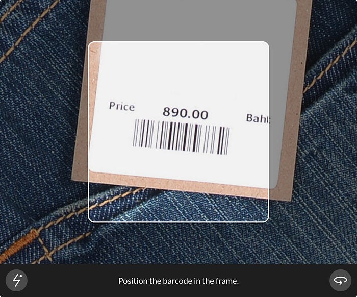
I truly believe I became a better designer when I started to contemplate the design intentions behind all things. Everything is designed — either it’s a conscious decision or a careless mistake. Take the UI of barcode scanning as an example. It may look pretty standard, but once you begin asking questions it becomes apparent that nothing about it should be arbitrary. There is a frame in which to position the barcode, but the frame doesn’t actually limit the scanned area; rather, it’s designed to serve as a guide for how far away the camera should be for the barcode to stay in focus. The square shape is also no coincidence. A rectangular shape would suggest orienting the barcode in a certain way and we wanted to convey support for barcode scanning in any direction.
Prototypes
The prototyping space has been insane lately. There are so many options to choose from, each with its strengths and weaknesses. We started prototyping with wireframes, and kept doing so as work progressed. But why did we bother?
- It allows you to confirm an idea or identify its issues early on, so you don’t run with something from the get go only to have the ugly truth that it won’t work revealed after coding has been done.
- Previewing your design on the designated device is important. A gesture may be harder to complete than you imagined, and a button may appear smaller than what you saw on your laptop screen.
- Your development team will love you for not being a pain in the ass and asking for help all the time.
- No more back-and-forth changes with the engineers. You can tinker with the variables all you want until they’re perfect.
- Instead of writing paragraphs of text that no one understands, you can share an interactive prototype demonstrating exactly what you have in mind.
- It’s dead simple these days with a dozen amazing tools out there. Why not?
Not everything requires high fidelity prototyping, though. For quickly testing user flows, Marvel is our go-to. Coupled with their new user testing feature that lets you record both the screen and the person using the prototype, it’s incredibly valuable for usability tests.
We require all custom animations to be prototyped and tested thoroughly. They should serve a purpose in informing users of interface transitions and guiding them to achieve the intended outcome. Take for example the animation for our checkout flow. The checkout button would originally invoke a distinctly different screen even though a part of the interface is shared with the previous screen. With the update, the two screens were combined into one continuous screen, animated to explain their connection. The animation also works in tandem with a swipe gesture which quickly activates the checkout process.

Animations can also be added to delight the audience. How much should be added is down to the designer’s capability in exercising self-restraint. Prototyping helps tremendously too. We would prototype the animations and trigger them repeatedly until we get motion-sickness. (Masochistic, I know.) It makes empathizing with the users easier and answers the question of necessity. A great deal of them ended up being abandoned or sped up. We used Origami and our new favorite, Principle, to simulate the effects. Making fully interactive prototypes that feel native is just so simple with Principle. Recording screencasts and sharing them is a snap as well.
An unexpected benefit of prototyping is that the team can start preparing marketing materials and videos even before it goes into development.

Visuals
For some reason, people have come to accept that business-facing products are supposed to be hideous. We beg to differ. No matter if it’s business-facing or consumer-facing, we aim to make it as aesthetically pleasing as we can. After all, any customer will have to look at the interface constantly. A great product presented in a less-than-stellar packaging is still undesirable. It sends a message of carelessness. Who the audience is, is irrelevant.
We explored numerous directions for the visuals after settling on the UI flow. Most initial attempts were vibrant and bold, and some were more muted. We took the best ideas from them and decided on one that sat somewhere in between. We wanted to inspire confidence and friendliness without being too playful. Vibrant colors remained, but were applied less liberally.

Consistency
A handful of screens were picked to be designed first and served as reference for the remaining ones. A rough style guide was created describing the structures of different elements and how they were layered, typography, shadows, primary action treatment, etc. Additionally, it included a standard color palette and a shared icon sheet.
One of the goals was to nurture a family of products that were at once coherent and clearly ours. Balancing consistency and creative freedom was especially tough. Another challenge was determining how the branding translates to different platforms with varying constraints and form factors. It was a trial-and-error learning experience.

More pieces were discussed and added as we went along. By the time we were finished with the redesign, the style guide had become much more comprehensive. This guide will go on and shape all of our other products across various platforms.
Design Reviews
We have design “critiques” daily under informal settings. It is unusual for us to go to the conference room, put someone’s work on the wall and discuss it. While the team understands we are critiquing the work itself and not the person who did it, it is difficult to separate your feelings entirely and not be discouraged when your work is being criticized. That’s why we try to make the process as comfortable as we can. We share our progress whenever we have something we are unsure about. We almost never send out invites or set specific times and venues for this. The spontaneous nature of it encourages us to speak freely and openly. There’s only one rule for these conversations — “Don’t be an asshole”.

Usability Tests
It’s easy to shift the blame on the users and resent them for their inability to accept new ideas; it's much harder to listen intently and see from their point of view.
We have been conducting usability tests from the outset and beta-testing the update. The most common response we got was just genuine shock. People are inherently afraid of change and sometimes that prohibits any attempt to make significant improvements. The responsibility falls on us, then, to communicate what has been changed, why, and how users can transition to the new version as seamlessly as possible. It’s easy to shift the blame on the users and resent them for their inability to accept new ideas; it’s much harder to listen intently and see from their point of view. We must ensure the radical changes are justified.
The most valuable feedback came from beta-testing. Luckily a small number of merchants were kind enough to be guinea pigs and let us observe how they were handling the beta. Real-world tests are the cruelest, yet the most insightful. Needless to say, some seemingly ingenious ideas were sent straight back to the drawing board.

Implementation
The implementation stage was not as simple as some may think. It didn’t end with exporting assets and preparing documentation. The design team worked alongside the development team throughout the whole process, and was also heavily involved in internal testing and quality assurance. The engineers were extremely helpful in figuring out little details of desired behaviors. They were the ones who had to think about real-world execution, asking technical questions, like “What happens if the privacy permission is denied?” and “What if the internet connection is spotty?” Documentation was partial. Communication was critical in order to execute everything as envisioned.
That said, no one enjoys asking/answering questions in 5-minute intervals. Everyone involved with UIs has a copy of Sketch. Developers love the fact that they can look up CSS attributes, coordinates, dimensions, distances, and those 16 color codes you forgot to include in the specs.
A lot of effort went into making actions appear “snappier”. There is this feature that takes a photo with the front-facing camera when employees clock in and out. In previous versions, users had to wait until the photo was uploaded to the server before they could get past the lock screen. Now, we upload the photo in the background so that users don’t have to stare at the loading spinner for ten seconds.

Iterations
Design is an iterative process. It pains me whenever I hear someone making hasty judgements about a product and disregarding the work behind the scenes. In my opinion, the real value in design is not determined by the final product, but by all of the ideas that went into it — including the designs that don’t make the cut. It takes a truly legendary design team to get to the end result in one swift motion.
The 3.0 update is now in its final phase of development. Naturally, we are already working on the next release. The design process is not complete after the product has been shipped. We are constantly receiving more feedback and making tweaks of improvement. Problem-solving, complex or not, requires patience.
There’s no one single way to design a product. The opinionated, focused strategy is great, but it doesn’t work for everything. We are really happy with how this project turned out and we can’t wait to get it in the hands of our customers.
🔥 Follow me on Twitter and Dribbble for more unsolicited opinions on design! :)
Thanks to my lovely coworkers Nicole and Jillian for proofreading this article.

