When to use loaders & empty states (and when not to)

Long story short… there’s always a time when you’re working on this massive project and… well you need to think about how these pages will load, how things would transition and inform people about what they’ve done. The questions that you’re asking yourself at this point are a lot, but just to name a few…
- How quickly is that going to load?
- Is there a DB request that we need to wait for?
- What about any other scenarios? Bad connection?
- Is this giving me enough information about what’s going on?
Well these are the ones you might start with and these are usually the loaders or skeletons you need if there’s something big to load… but on the other hand you might also start asking questions like:
- Hmm was that too quick?
- Did that actually send the email… not sure…
- Was that successful? How can I tell?
Well these might come up with user testing or just from experience. Most importantly you have to find the balance and make sure you don’t animate or load anything for the sake of making it funky or cool. Just as any other design, motion and visual feedback should serve a purpose. If your page loads in less than a second, you don’t need a fancy skeleton loader for sure. But if you do have to load a lot of data then you might need it.
Enough talk… let’s look at some examples… and for good or worse some of these are going to be examples I’ve been working on in the past.
Loaders
So let’s say you had a streaming service like Grabyo which I happened to work on 😲 and you had to load a stream. Well in this case you can’t really predict how long that’s going to load for. It might be few seconds but it might be the case that the video is really high quality or you just can’t reach the stream. In this case you have to prepare for the worst option and give a clue to the user about what’s going on.

Another case is that you’re about to go live with a stream. Nobody wants to go live unprepared, so giving you enough time to prepare is essential… in this case we might need to add some time for the user to prepare for what’s about to happen… also if something is not working quite well, give them an option to do something (in this case abort the action).

Back to my earlier point… sometimes actions are just too fast and it feels like you haven’t done anything. In this case you might need to show a quick loader, just so the user gets some feedback that the task has been completed. In real life the action shown below takes less than a second…

Another good example is progressive image loading. If you’re here you’ve already noticed how images are loaded on here… speaking of that…well done Medium!
What not to do?
Basically just avoid anything like that below… it gives zero indication of how much I need to wait, but it also doesn’t give me the option to abort or do anything really.
Skeletons
Another good example is when you have a large list of files that need to be rendered on a screen. In this case we could be talking about a list of files, surveys, videos… anything really. The worst thing that could happen is to get a spinner or a loader that’s not giving you any idea about what’s going on. In this case, rather than putting a spinner, it’s much better to show a skeleton of the page, which indicates where the content would load. Also this usually feels as if it loads quicker… just a perception, but still better. I needed something similar while working on Attest. You could have a lot of surveys and some of them can become quite big and might load slower…

What not to do?
A spinner that indicates nothing might get really annoying, especially if your connection is bad. If you load music or a video that might take even longer. Give some feedback to the user, or at least use a skeleton instead of the empty box… Also a lot of people add loaders to their websites before they load for the first time. Most of the time, there’s not much to load really. In that case that animation, no matter how great it is, gives zero value to the user and slows down the experience. In my opinion that never has to be the case. You should always go for usability over design.

Progress
Indicating progress is important. What many people do though is that they make it either unclear, or not accurate. I hate when I go to the next step and there are three sub steps. Or I click next and the progress bar has barely moved. Be honest with people. Show exactly how much effort it takes to finish the process. If you can be specific with time, do that too. Time is precious and it’s one of the things you can’t buy. Users will appreciate your honesty!

It’s also really good to show a visual indication when you’ve accomplished something. Gamify the experience, make it feel like you’re building a Lego starship and reward the user! In the experience below you can clearly see how I’m building up my profile and there’s a clear four step registration process.

Same applies for filling out information, surveys, forms… you name it. Make sure you show how many steps or questions you need to answer…

What not to do?
Well that should be easy… just be honest with the user. Show the exact steps needed to complete the journey. If they are 10… then show 10 and think about how these steps can be reduced to at least 5, but never put additional steps inside steps.
Empty States
Empty states are just as important as normal screens. Having a good idea about why something is not displayed is just as important as displaying it. So if you ever have an empty screen, just explain why that’s the case. If you can, give a clue about what they need to do.

This can be anything really. From a 404 page to an empty messages screen. Here’s another good example from Naveen who is showing clear actions on what to do next.

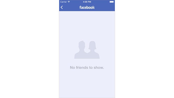
What not to do?
Well, just don’t leave that empty screen empty… it’s a good opportunity to make something interesting, add a nice illustration… and most importantly, give a clue and a clear action on what to do next. Probably the below is an old screen, but why don’t I have friends to show… what am I supposed to do here?
Onboarding
That‘s a bonus and probably not much to do with loaders, but something we often forget about. Most of the time we try to make an experience easy to use. But sometimes you just need a good starting point. If somebody tells you to build a bicycle, you wouldn’t know where to start from. Although probably anyone could do a good job on that, no one can do that without an instruction manual. Give some instructions to people when it’s clearly not that easy… maybe even when it’s easy.
Probably one of the favourite onboardings I’ve seen is the one of Slack Design. Great job… and one of the best places to see what’s great and what’s horrible about onboardings is useronboard.com.
Here are some examples…

What not to do?
Basically, just don’t forget about it… as simple as that. It might be the difference between someone falling in love with your product or hating it from the first minute.

So “what‘s the takeaway here” I hear you say… I’d say, try to Marie Kondo your designs. Keep only the things you need. Don’t keep or do something, just because you can. Label those boxes, so you know what’s in them. Everything needs to have a purpose and should be on the screen for a reason. So pull up your sleeves and start tidying up your designs 🧹 as that’s the difference between a good and a great product. 🎉🎉

