Member-only story
When you cannot run away from using tables on mobile
Inspirational ideas to design tables you will want to bookmark
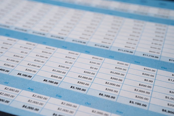
Let’s be honest, the spreadsheet format sucks even seeing on a big screen. Looking at the information in a table using a mobile device is much worse.
When I need to insert tables into mobile interfaces I feel discouraged. This is a part of the work I try to postpone. I always look for another way to display the table information. Why not create an infographic to show all this information?
But in some cases, a simple table is required, so here are the solutions I’ve been mostly using to accommodate the information in the best way possible.
1. A horizontal table can become vertical
A horizontal table on mobile doesn’t fit well since the vertical position is the most used for this type of device. Even though it’s possible to rotate the screen, it can be annoying since it is not typical behavior. And being a small screen probably the scroll will continue being necessary creating an uncomfortable use.
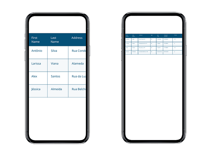
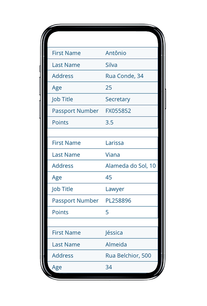
Solution
Group the related data of each line and display it vertically. Here is the front-end resource to help you build it: Responsive Data Tables
2. Divide into 2 lines
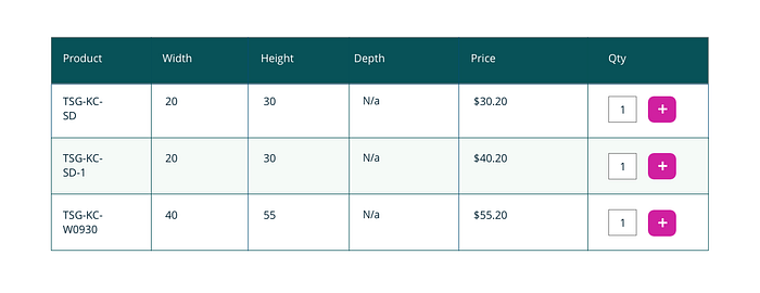
For tables that don't have too much information, it's possible to divide into 2 lines and based on the information discovered, prioritize the most important information for the first line.
Solution
The product code, price and quantity input were defined as most important.


