Where to put the primary button?

Where do you place the primary button in a button group? left? right? When does it go fluid? When does it stack on top?
There is no right or wrong answer to this. It is more about making a call and sticking to it. Having worked in multiple large-scale design systems, this is my take.
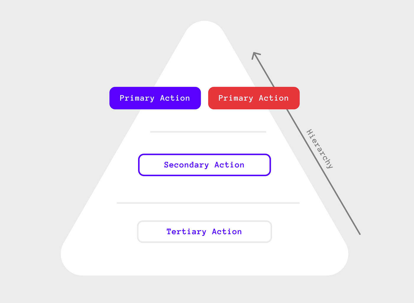
Hierarchy
Usually, the primary action the user can take in a given interface is declared using a primary button from a set of buttons. This provides a visual hierarchy among the available buttons.
Placement in button groups
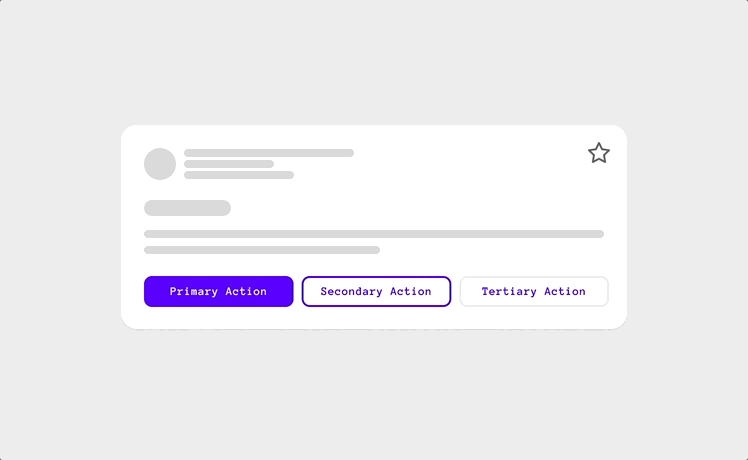
If the buttons within a group are aligned or pinned to the right, the primary button should be placed on the far right, followed by the button with the second most important action in that group, followed by the third. Modals, Action Bars, Multi-step interfaces, and most page forms use this type of alignment.

If the buttons within a group are aligned or pinned to the left, the primary button should be placed on the far left, followed by the button with the second most important action in that group, followed by the third. In most cases, this creates a visual alignment with the content above and below the button group.

If the buttons are fluid (extend to fill their parent container), the primary button, or the button highest in the hierarchy within the group, should be placed on the far left, followed by the button with the second most important action in that group, followed by the third. In most cases, this creates a visual alignment with the content above and below the button group.

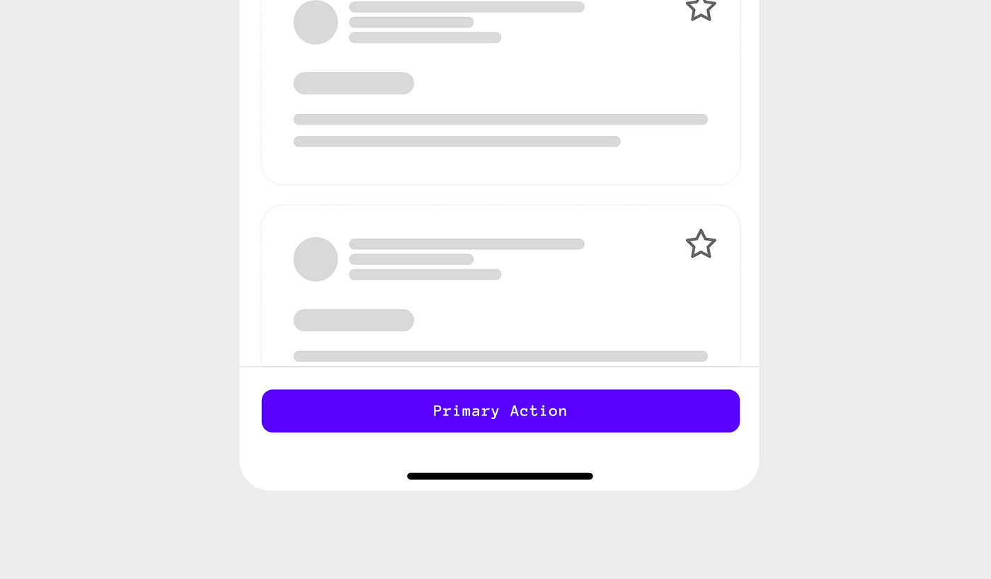
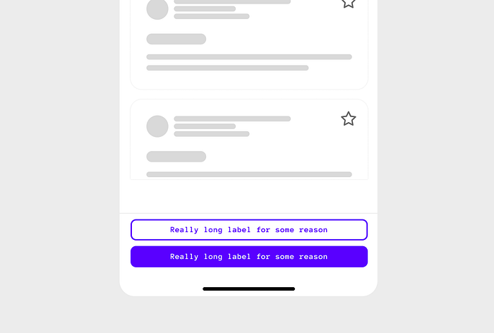
If the buttons within a bottom-sticky container are fluid, meaning they extend to fill their parent container, the primary button, or the button with the most importance, should be placed on the far right, followed by the button with the second most important action in that group. Particularly helpful on Full-Screen modals and multi-step flows considering ergonomics.

Using only one button as your primary CTA within a bottom-sticky container should be fluid (extending the parent container’s width). The bottom should stay in view as the user scrolls the page so that the element is always available.
Fluid vs. side alignments
Making buttons fluid, meaning they extend to fill their parent container, makes sense when used on smaller screens since it provides additional prominence and better ergonomics when reaching for that element. However, it makes sense on larger screens to pin or align the buttons to one side and follow the same rules as above.

Stacking Buttons
In tight spaces or when you, as a designer, are concerned about the length of a button’s label (especially when it gets translated), it makes sense to stack the buttons vertically.
Overflowing actions
In cases where you have tight spaces and multiple actions, you can also overflow actions into a Menu triggered by a button.
The guidelines included in this post are just one of many out there. The important thing here is to make a call as an established pattern for your Design System and stick to it. There is no right or wrong answer here.
Stay safe,
If you have any feedback/comments/suggestions, please share them in the comments. I would love to hear your thoughts.

