Why Aldi’s store design is everything we learn in design school
If you like this post, don’t forget to 👏👏👏👏👏👏👏👏👏👏👏👏👏
I’d like to start by clarifying that I don’t work for Aldi nor am I affiliated to the store in any way.
I was introduced to Aldi relatively late, considering the fact that it’s one of the most popular grocery chains globally and boasts of a very unique USP — cheaper in-house alternatives of everyday grocery items.
The first time I visited the store, I was, like everyone else surprised by the low prices. But then my UX designer instincts kicked in and I couldn’t help but notice the way the entire store was designed and how it functioned.
I feel Aldi is the perfect example of all the UX principles learnt in design school put to practice. Here’s why —
Minimalistic yet complete, Less is more
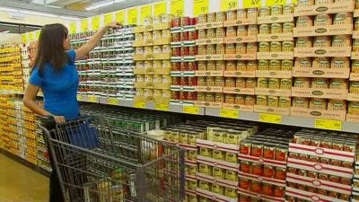
Their stores have a very minimalistic design. Products are stored in the boxes they came in, on very basic, unornamented shelves. The layout of the stores is also pretty homespun.

Aldi uses efficient, minimal lighting that helps cut operating costs and puts this benefit in the hands of the consumer, in turn reducing pricing on their products. Some stores even have glass roofs to use natural light instead of artificial lightning in the day.
They also have a lesser workforce as compared to other grocery chains. By having lesser brands (but a product variety comparable to other chains), an efficient cart-rental system (explained later), reduced store working hours they manage to function with a very limited store personnel, thereby reducing overall store operating costs.
Understanding user needs

According to this pew research study, 79% of the American population belongs to the middle and lower-class group and for most people, price becomes a dealbreaker when deciding what products to buy.
The folks at Aldi understand this. Like Costco, Aldi has its own in-house brands — and that together with the reduced operating costs, helps reduce product pricing making them attractive to a large populace. There’s an Aldi alternative to almost every everyday item you’d find on a Safeway or Giant shelf. They’re about consumers, not profits. Basically, prioritizing user needs over business needs.
However, I wouldn’t say they all match up to the quality of the best items found in other stores. I never buy milk, bread and eggs from Aldi — I prefer Giant or Safeway, but then, this is subjective and depends on peoples’ preferences, but there is something for every one here.
Incentives / Instant Gratification
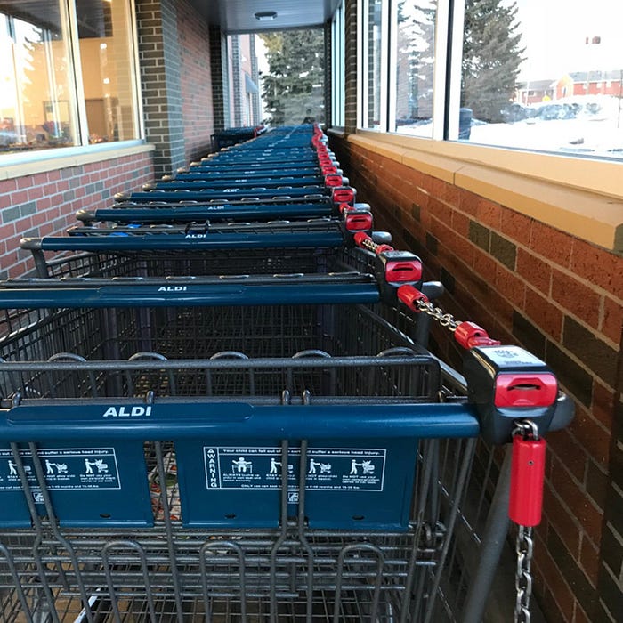
Aldi boasts of an efficient cart rental system — wherein you have to use 25¢ to unlock the cart from the queue. This gives people the incentive to return the cart back to the queue to get their 25¢ back and helps them save costs on having store workers to manage the cart. So here you have a cart system that is — by the consumers, for the consumers.
Minimize the learning curve
There are no self-checkouts, no auto-scan RFID items, no price check kiosks. Not saying they are not helpful, but Aldi focuses on cutting operating costs and not overwhelming consumers with too much tech.
Reduce noise
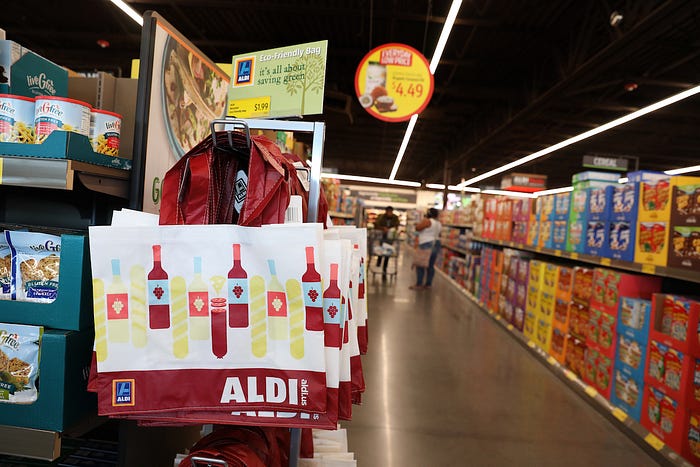
Aldi expects customers to bring their own bags or you can buy one from them (like Trader Joes’)— again, cutting costs and keeping things minimal.
There are limited varieties for every product type (well, that can sometimes be a disadvantage), but helps them run in a space much smaller than other grocery stores and makes maneuvering your cart from aisle to aisle easier.
They don’t have ads, handouts though they do have a huge social media presence. That’s just marketing done right.
Also, unlike Costco, you don’t have to buy in bulk, you can only buy as much as you need and works great for bachelors like myself.
Consistency
Much like all large grocery chains out there, the Aldi experience is pretty much the same all across the U.S. Same layout, process, similar pricing, similar products and way of working.
Summing it up, I feel this is great example of a brand that’s not too tech savvy like the Amazons and the Walmarts of the world , not too ubiquitous like the Safeways and Giants of the world, and yet managed to keep up with the times while following the basic, traditional grocery shopping process.
Let me know what you think of this and/or you see things differently. If you liked this, don’t forget to applaud.
Designing a design system, this article from my channel might be helpful to you.
Starting on a new project, these questions can help you hit the ground running.
Many more, exciting UX articles coming soon. Thank you!


