Why Android’s gesture navigation fails (and how to fix it)
Let’s face it. Google’s new form of global navigation is just not very good. After having some time to really live with it and sit on it, I decided to write this so I could stop explaining to people why I thought it was so unsuccessful.

Gesture Navigation Itself
So for some basic understanding, I’m going to explain the ideology behind gesture navigation and why it is used from a UX standpoint. From what I’ve read it is generally believed gesture navigation’s main purpose (in the Android sphere, anyhow) is to save some screen real estate by moving three buttons into one. While this is a benefit, the reality of the matter is far more psychological. Gesture navigation, when done correctly, changes how the user interacts with their screen.

The way the current navigation system works is you press a button which triggers an action. That can be the home button — which one taps to go home, the back button — which one taps to go back, and the recents button — which one taps to go to the recents overview menu. Gesture navigation in it’s purest form is supposed to change this interaction. Rather than the user completing an action via another action, the user should get rid of the middle man and complete the end action itself. So in essence, instead of tapping the home button, the user should just go home. In perhaps more straightforward terms, why should the user trigger the animation via a button when they can do the animation itself with a gesture?
Let’s start to think about the psychological effect of doing this. A really good way to go about it is going back to the old school (but still cool school) technique of paper prototyping. Say you have your basic horizontal scrolling recents screen. There are five apps, each represented with a piece of paper. You are in one of these apps, so how do you get out? Do you expect to press a button and for the paper to move, or do you simply move the paper away yourself and get another piece? This is somewhat of a simplification, but I feel it gets the idea across. In a digital sense we can complete these actions while scaling and morphing our paper as well. The combination of these things is what gestures give to the user. It makes the different apps and screens feel like their own interactive objects, and further adds an extra sense of dimensionality to the screen.
The Problem with Android
So let’s actually start talking about Android’s gestures. Rather, I suppose, gesture. Because, in reality there is only one main gesture in the gesture navigation. This is the first problem. The problem is not that there aren’t enough gestures to appease me, but actually the fact that there are actions that aren’t gestures at all. If you are implementing gestures, you have to go all in. Why? Is it because I’m being anal and am really into the idea of gestures? No (well maybe partly). It is because it is bad UX. The user is going to interpret the pill in completely different ways depending on whether they can tap, swipe, or in fact do both. With the old system of basic buttons, that’s exactly what the “pill” (not really the pill at that point, but you get the idea) was — a basic button. There was no room for interpretation and it was incredibly clear. Of course, this is how it should be. It’s global navigation, the most important piece of UX in the whole system, so it is safe to say it needs to be clear. The button was a button. So what is it now? Well… I don’t really know. We’ve all been calling it the “pill”, which is a very vague term as it is purely a visual observation. Is it a button? I mean, the user can indeed tap it to go home. Or rather is it bar that we use to manipulate things on the screen (like the iPhone X, which is a really good implementation of gestures by the way. Not perfect, just really good)? After all, a swipe up does sort of throw the app one is in into the recents scroll. What I’m trying to get at is this mixture of actions is detrimental to how we think about global navigation. We, as the user, do not intuitively understand what this thing is and what it can do. It seems like there are all of these pre-ordained actions that it can do, but it is not an organic object we can manipulate ourselves.

I’m going to try and attack this from a different angle. Specifically, I’m going to attack it from the iPhone angle to further explain my point of organic manipulation. So looking at the iPhone, there is a singular bar (with no contextual buttons! Looking at you, back button. Don’t you worry, I’ll get to that) at the bottom of the screen. Firstly, it doesn’t take up the bottom part of the screen with an unsightly bar. This seems like a fairly obvious implementation, but it is apparent it is not, as Android still has the bar even with gestures. Secondly, and really the main point I’m going to get at, is the bar has only gestures. However, the gestures on the iPhone’s implementation are special. I mean, yes, it shares the same basic gesture that Android has with a swipe up (despite that triggering different actions), but there is one specific difference. On Android, a swipe up will bring the user to the recents menu, which is fine, that’s not the problem. The problem is the animation. When swiping up on Android, the screen moves up seemingly on a straight track on the y axis, without any freedom. On the iPhone, on a swipe up the app shrinks into its icon back to the home screen. However, the app is not on a predestined track. The user is controlling the app, and is able to drag it wherever they please.
I understand this may seem pedantic, but in reality this is huge to UX and the psychology of the user. The ability to truly manipulate the app screen changes how we start to think about the visual architecture of the OS. When the user is given the power to manipulate and rearrange things like the iPhone allows, it gives a much better understanding of layers and hierarchy. This is because the home bar is not simply seen as a bar that triggers gestures, but rather a window for the user to interact with the higher level actions of the OS outside the app they’re in. This helps put the user in a mindset to understand the layout of the system, and is actually very intuitive. There is a reason that everyone with an iPhone X says you get used to it after a minute — because it’s an intuitive implementation (not to mention, also really satisfying).
This is one of Android’s biggest problems with the current gestures right now, which is incredibly ironic. Material design is the system that really popularized this way of thought about digital design, yet has an incredibly weak application. However, this is not the only weakness. Let’s talk about the back button.
Not only does the inclusion of the back button go against pretty much everything I’ve just written, it is also extremely lazy. Did Google seriously not think of a way to implement a back gesture, even if it was a crappy implementation like they have now? I cannot believe they have a contextual back button. On a UX level, it’s appalling for very similar reasons as to having the home action be a button. On a visual level it’s just plain ugly. To be completely honest, the back action on Android is archaic as it is. Many apps have a back button separate from the global one, and it becomes incredibly confusing for users. The global back button is, of course, a true back button whereas the per app back button is more of an up action. Nevertheless, while it might make sense to those of use who are perhaps more knowledgable on navigation systems, to the average user it presents an interesting UX problem.
Unfortunately, I’m not writing about the back button, which I could go into much further. While I might personally believe it could be removed, I’m going to continue this article under the assumption it will not be.
But I digress, I feel the back button is a perfect example of the bigger problem with the current gestures, and I have mentioned this a few times already. Every action should be a gesture. While I think it is integral to gesture navigation to have the special gestures the iPhone has, Android doesn’t even have a full set of gestures. So I’m going to think about how these gestures would be implemented.
Let’s Fix the System
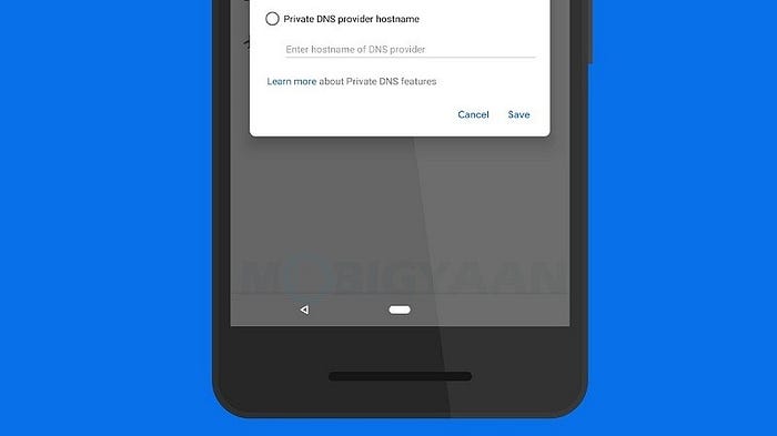
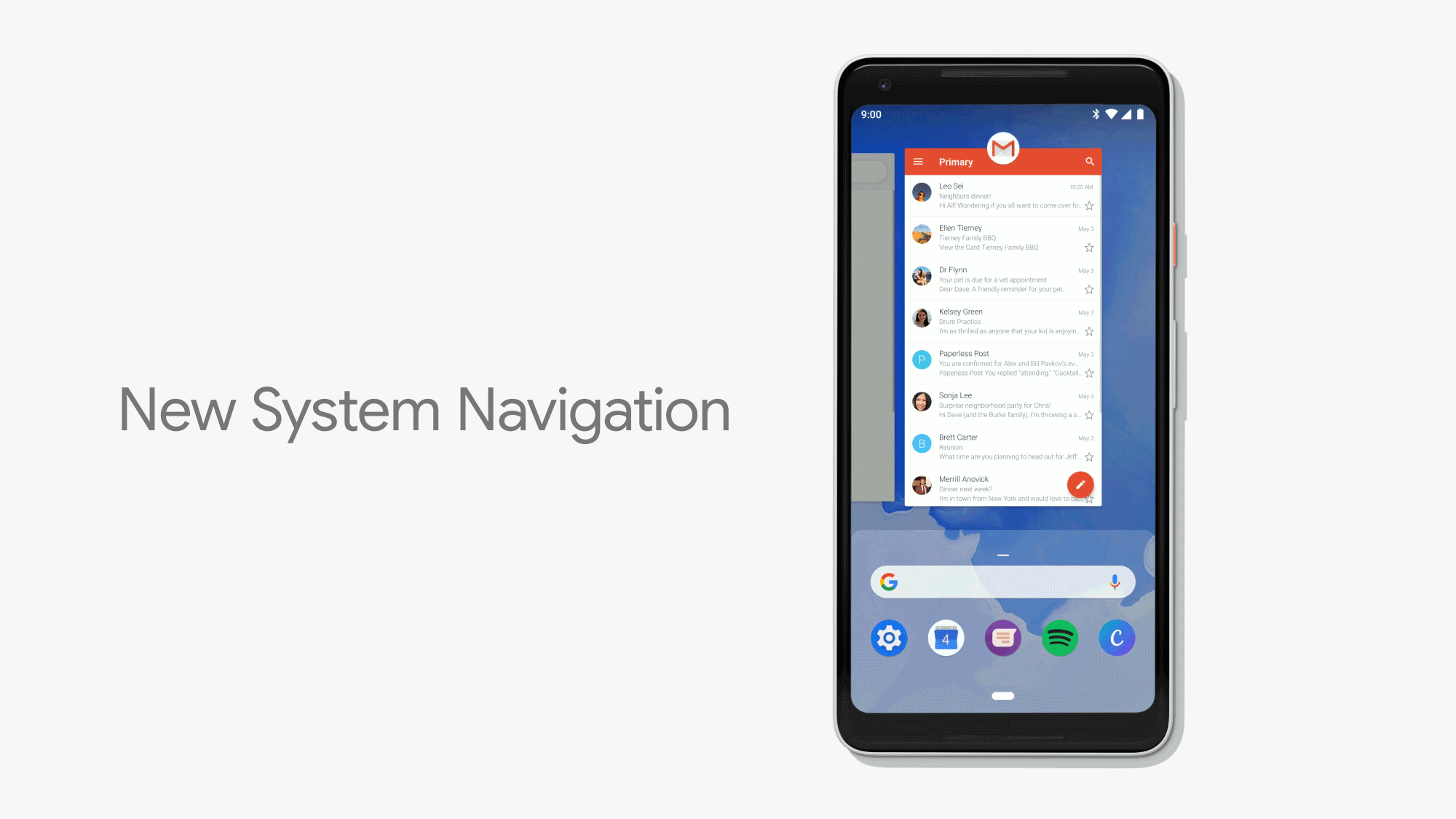
Before I get into the solution, it seems like Android is moving in the direction of not having a home screen anymore — or at least the home screen is no longer the true “home” of the OS. With the Android P beta, it looks like the recent screen is taking that role, with it having the hero gesture as well as an app drawer implemented in it.
As a side note, it’s fucking annoying that I have to swipe twice for the app drawer on the home screen. Seriously?
Considering this, I think having the hero gesture of the swipe up is fine as it is. Having the recents screen become the new home screen has some interesting implications, which I won’t get into now. All I’m going to say now is this works. So how do we implement home and back? Home, it seems, is a simple fix.
I posit it should be and up and to the left motion. For this motion to make sense, there would have to be a change in the launcher. This change being the removal of what used to be Google Now (which, let’s be honest is a shadow of it’s formal self, now just feeding us useless news), and having the recents be the new left-most screen in its place. So now in the recents screen, a simple swipe left will just swipe you back to the home screen. If the user is deep in the recents screen, a longer/faster swipe will also take them to the launcher. With this new layout, the up and to the left gesture makes a lot of sense. The user is taking the app, putting it into the recents and then swiping the recents away, all with one quick gesture.
Having the recents become the “anchor screen” is quite a big shift. At first, it can be hard to realize how it fits into the idea of a home screen. To use another real world metaphor, I think this turns the home into more of a table-top. Whereas the user can swipe around and explore every relevant main action on their device. In a more literal digital sense, it almost becomes a hub, rather than a straightforward home. The new “table-top” now has customized home screens, all the user’s apps, and now all the user’s open apps as well. I feel it is a somewhat elegant solution that would conglomerate all the OS’ hero actions into a singular place, rather than have the user go into various screens that have seemingly no relation.
As a fun side note, this home gesture, by the way, is basically completing the current home animation as it is. This plays to what I said before about the user completing the animation themselves rather than tapping a button to complete it for them.
Before I continue, there is a gesture that I haven’t touched on yet. It is the right slide of the pill which accesses the quick app switcher. This gesture is also not good. It goes against what I was saying about the iPhone special gestures as well as having a similar problem in giving the pill an identity, now adding a slider into the mix of a button and pill. Back in the old implementation, a double tap on the recents button accomplished this (it only switched between the two most recent apps, however). In this new theoretical implementation, this gesture does have a place. It would become a simple swipe up and to the right. The user throws their app into the menu and then goes into their previous app, once again, all with one quick gesture.
That leaves us with the back button. To Google’s credit, this is probably the most tricky implementation, as it is not truly a global action because it changes the app’s state rather than any global state. So how do we implement a gesture through this pill which is supposed to be a window into global interaction? Well, no matter what we add to the pill, we are going to be cutting a corner, so what I’m trying to do is cut the smallest corner possible. This, in my opinion, is the optimal way of going forward and is at least going to be better than just adding a contextual button. So my idea is to turn the current gesture we have now for quick app switching into the new back gesture. Now, I’m not saying it should still be a slider, rather just a simple swipe right on the pill moves back a screen.
The logic behind this is the user would be pushing the screen to the right, revealing the screen behind it that the initial screen animated in over. The difference between this and the new quick app switch gesture is of course the lack of an up action. The up action represents the app being pushed up and out, so the user at that point is now in a global state. The idea with the back gesture is that it lacks the up action, so the user is no longer taken into the global state, rather just the app state. As I said before, it’s not perfect, but unfortunately it is the best I can think of considering the anomaly of the back button itself in regards to global navigation.
In Conclusion…

A lot of people I’ve talked to think gesture navigation is a fad, and perhaps something that isn’t totally a necessity to mobile operating systems. We should remember, though, that global navigation is the crux of the user experience. Without a clear and intuitive navigation system, the user would have no way to move around from screen to screen. The ability to make this movement easier and more understandable should always be a priority, and this is why gestures are a big step forward in this area. When done wrong, they can be confusing and annoying. When done right they can be beautiful, quick, and satisfying. Let’s try to get them to be beautiful, eh?
While writing this I had neglected how the Google Assistant would be implemented. It is a curious case as to what would become of it. Newer devices are starting to ship with a dedicated hardware button for this interaction, but saying that this solves the problem would be lazy (albeit much easier). It seems the most straightforward way to go would be one of two options: a long press of the power button launches the assistant and a longer press launches the power menu, or simply keep the long press on the home pill (if this second option were in place, obviously the home pill would have to stay on the launcher screen as well, unlike my mockups). Each of these options has their ups and downs, but still I feel neither are better than having a dedicated hardware button. Ah, yet another compromise! I feel like Henry Clay.

