Why are we so fascinated by letters?
When I tell them that I make fonts, my non-designer friends are truly curious. Everyone has had some exposure to fonts, most commonly through the font menu in apps. They see how a different font can make your document longer (if you’re trying to reach a certain page count), or shorter (if you’re trying to fit it onto fewer sheets of paper). They might have a favorite font to use. Many people also know something about typography from popular culture — maybe they’ve seen that documentary about Helvetica, heard how much Comic Sans is reviled, or enjoyed that SNL sketch about Papyrus in the logo for James Cameron’s Avatar.
Even if they haven’t put too much thought into what goes into designing a new font, most people will be interested, because type, and letters, are interesting to so many of us.
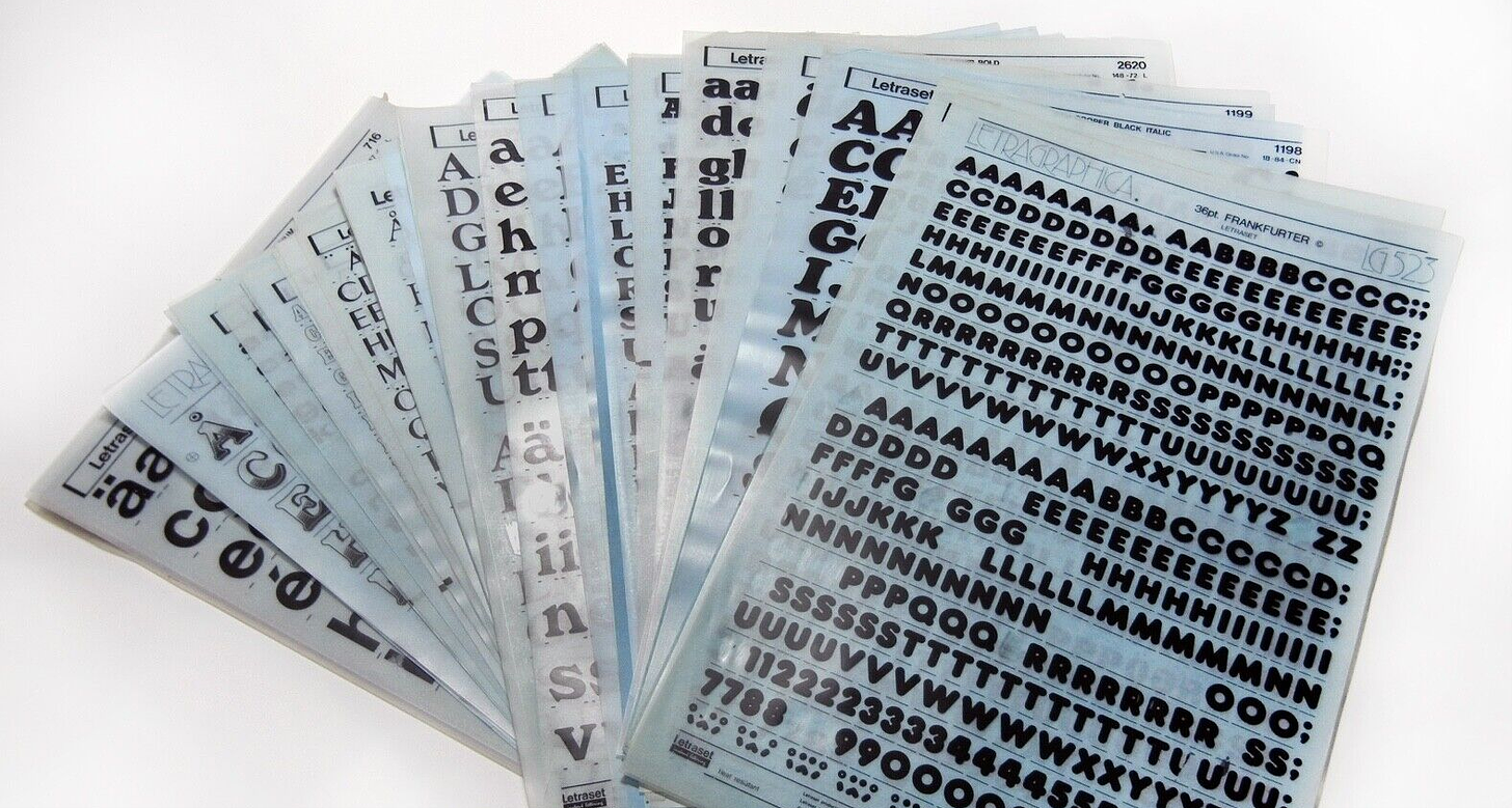
As a youngster, I was fascinated by letters: calligraphy, swashes, and ornamentation; ambigrams, lettering that you can read upside-down, or upside-up; Letraset, dry-transfer type you could rub letter by letter to compose a flier or zine. I explored type and computation as a grad student and worked in the design field for many years, using type every day. My lifelong interest in type culminated in learning type design, and I’ve been developing my craft over the past few years. I launched my first typeface Peasy this summer.
Lately I’ve been thinking about letters in all their shapes and sizes and why they’re so fascinating to us.
Why letters draw us in
Letters have a talisman-like quality. They’re connected to childhood, these brightly colored blocks and magnets. You learn your letters and learn how to read and write over a formative period of your development. They’re ingrained into us at a really early age when we’re impressionable.
Humans are pattern-seeking machines. We seek to make sense of the world, and patterns help us learn and remember what’s important. In pre-historic times, this meant knowing which plants were good to eat and which would make you sick. In literate societies, pattern-seeking is what allows us to learn how to read and write. We teach these patterns to our children.
Typography is a system of patterns nested in patterns, nested in larger patterns.

Letters are made of shapes you can write with your hand — repeated straight and curved segments that join in specific patterns. You string letters together into words, then sentences, and paragraphs. Letters contain a whole universe of language that let you express ideas and tell stories: it’s magical.
Written language then allows you to broadcast your words out to many others through various technologies, from the printed book to the web. This ability to reach so many people is yet another kind of magic.

In Thinking with Type, Ellen Lupton writes: “Typography is what language looks like.” Typography is usually invisible. But the choice of typeface also conveys another layer of meaning that a reader may or may not notice — it’s a vibe or a feeling. The typeface can evoke an emotion.
We like letters because they contain many kinds of shapes and come in so many different shapes and sizes. They come from a long tradition of writing and tie us back to history. There are many kinds of scripts across time and languages. As we get better at seeing letters, we begin to recognize how the same letter can be expressed with a wide range of shapes.

For instance, all of the characters above are easily recognizable as the letter a.
But there are some mysterious rules to how our recognition of letters works. For instance, the two main lowercase roman ‘a’ shapes seem they might be connected to each other like this.

But if you try to make an a like these intermediate shapes, rarely would you be able to read these two shapes in isolation as an a — they look more like the lowercase d.
Rationalizing the alphabet
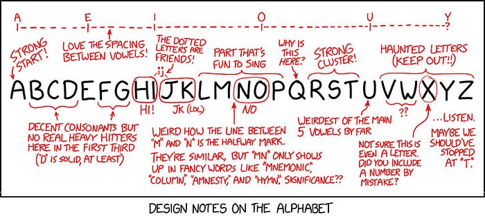
This XKCD comic deeply resonates with me as someone who designs letters. I agree with how the alphabet start out strong, how the dotted letters are friends, and how V through Z are 100% ‘haunted letters.’
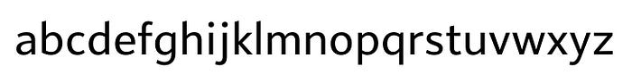
When you design a typeface (like Peasy shown below), you’ll start with an idea, and the lowercase a through z, since those are the characters that get used the most. You often start with n & o as control characters, and a handful of letters you can use for the basic shapes.
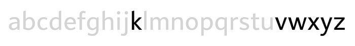
A bunch of the round shapes are related to each other. The curves of the lowercase b, d, p, and q are often designed to match each other.

These letters all relate as well.

And these characters that contain diagonals are often your problem children. The lowercase s is often hard to get right too.
As you add more characters you can express more things with your type. Punctuation lets you convey emotions, asides, emphasis. Diacritic marks or accents are important for writing in languages that use the Latin alphabet other than English. Numbers and symbols, too: they all have meanings that are helpful in expanding what you can say with your type.

Type design is a paradox
The goal in type design is a paradox. You want to make letters as unified as possible while simultaneously making them as distinct from each other as possible. You’re making each letter the closest to the platonic ideal of what that letter looks like, while following the overall structure and rules you’ve set up for your typeface.
And in the background, you’re keeping in mind the history of type, the long tradition of typographic conventions that inform many things, like: what letters in that style are shaped like, where the thins and thicks go, and where serifs should appear.
Type is a complex system of nested patterns. We love seeing the complexity, even if we’re not always aware that it’s there.
Check out Typotopo.com to test drive Peasy or download a type specimen.

This post is based on part of my lecture at the MIT Media Lab last month as part of the Computational Typography lunch lecture series. The lecture recording is available on YouTube now: