Why designs to accommodate people with autism are better for everyone

According to a 2016 CDC study, there are staggering 1 in 54 children in the US has been identified with Autism Spectrum Disorders (ASD). While significant efforts have been made in the area of visual, hearing, and mobility disabilities, much less attention is paid to designs to accommodate for ASD.
Before addressing designs for people with ASD, first, we must know a few things about ASD. ASD s not a disability, many famous personalities who many consider being in the spectrum had great success in life [4] such as
- Albert Einstein
- Bill Gates
- Comedian Dan Aykroyd
- Britain’s Got Talent singing sensation Susan Boyle,
- Actress Daryl Hannah
- Oscar award-winning actor Sir Anthony Hopkins
- and the list goes on
People with autism are not ill or broken; they do not need any treatment. They are just different and perceive the world slightly differently, so they need others to understand them. They may get hypersensitive to everything in their world: light, sound, color, textures, shapes, movement, emotions, and the emotions of those around them. Everything hits them like a scary storm, and it can take a moment to process and adjust [5]. Some may be less sensitive, and others may be susceptible to different things and situations around them.
Here is a beautiful video by Alex Amelines an introduction to autism that aims to raise awareness among young non-autistic audiences, to stimulate understanding and acceptance in future generations.
Individuals with ASD respond to visual stimuli entirely differently than someone without ASD. Due to their hypersensitivity, they prefer things that are simple and quiet. This is why great Architects like Le Corbusier’s designs were very simple using pure geometry.

Nikolay Pavlov ( Associate Professor of Mathematics and Informatics at Plovdiv University, Bulgaria) [1] as done significant research on User Interface designs for people with ASD. Most of the recommendations in this article are from his research findings.
Color
WCAG level AA requires a contrast ratio of at least 4.5:1 for standard text and 3:1 for large text. To check the color contrast, you can use the online tool by WebAIM. Having good color contrast is in general better for everyone and it will significantly improve accessibility. To make it even better for people with ASD, use soft, mild, and light unsaturated earth tones when possible.

Graphics
People with ASD could get easily distracted with information that they do not like, and they may try to avoid them by even not looking at them. This is also true for any other users, but it may be less severe. Therefore, use simple graphics to enhance readability.
Avoid using background images and with text on top of it. Instead, use a solid color.

- Use simple graphics and avoid using abstract images
- Avoid the use of background image
- Eliminate elements that “stand out” too much on the page
- Use graphics along with text to communicate messages
Typography
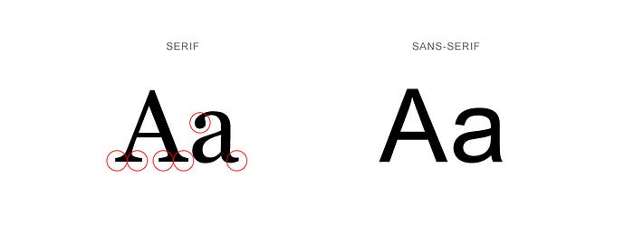
Use Sans-serif fonts which give s a modern, clean, and friendly feeling. Serif fonts have little feet-like strokes called “Serif” that extending from letters. Sans-serif fonts are more readable than serif fonts on a screen. And for people with ASD, the serif could add more distractions.
- Present text in a single column
- Do not overlap transparent images and text
Icons
Researcher Bar and Neta [2] found that amygdala a gray matter inside each cerebral hemisphere, involved with the experiencing of emotions was significantly more active for everyday sharp objects than their curved ones. So use icons and graphics with soft edges. Soft edges will also make your product look modern and friendlier.

Do not use multi-colored or complex icons. Keeping icons simple will make your site look clean by removing distractions.
Whitespace
Make white space as your best friend in your design. White space provides breathing room to the user and gives defined spaces for different sections of the interface. Elements of whitespace are
- Margin, padding. gutter
- Space around graphics and photos
- Letter-spacing, line spacing, space between the column
- Space between form elements and different sections of a page.
Navigation
Symbols and coordinated colors or distinctive landmarks can improve navigation, (Mostafa, 2008 [3]) because individuals with ASD are better at navigating spaces when there is a clear objective.
- Strive for simple, clear navigation methods
- Indicate on each page clearly where the user is located
- Support navigation with mouse or keyboard
- Avoid the use of complex hierarchical menus
Call to action
Keep your interface clean and straightforward. Give short, easy to follow instructions of use.
Interface
Keep your interface simple and clean, Give short, easy to follow instructions of use at every step.
Recover from error
If something goes wrong such as a 404 page, an error, or if it is taking too long to load the page, provide clear messaging. People with ASD may be susceptible to such situations, so it’s essential to treat these cases with empathy.

Progress
Use visual progress indicators for time-consuming actions. Also, consider providing feedback


Reconfigurable interface
ASD is a spectrum disorder that means these individuals have a wide variety of likes and dislikes based on their sensory levels. Therefore, it is essential to let them personalize the site.
Allow personalization of
- font type and size
- line-spacing,
- themes for text
- background and foreground colors
While good UI design is important for any product or site, it’s even more important when designing for individuals on the autism spectrum.
Listen to them
In the video below listen to children sharing their unique experiences of the autistic spectrum in their own words. Again, thanks to Alex Amelines for this beautiful video.
Reference
- https://file.scirp.org/pdf/JSEA_2014022510055814.pdf
- Bar M, Neta M. Humans prefer curved visual objects. Psychological Science. 2006;17:645–648. [PubMed] [Google Scholar]
- Mostafa, M. (2008). An architecture for autism: Concepts of design intervention for the autistic user. Archnet-IJAR: International Journal of Architectural Research, 2(1), 189- 211.
- https://www.psycom.net/autism-famous-people
- https://uxmastery.com/researching-designing-for-autism/