Why do we hate brand redesigns?
Most brand redesigns immediately evoke a strong negative reaction — what does this tell us about humans?
✍️ This piece was originally published as part of my new Substack newsletter, the Marketing Mind Meld. Subscribe there for weekly marketing reads!
I was a Smuckers kid.
A strawberry jam addict.
Smuckers become a regular part of my formative years, something as ubiquitous in my routine as biking to school or cursing out the Red Sox.
Even years later, I can see it in a grocery store and immediately feel the warmth of home, the excitement and sense of calm that came with finishing up the school day.
Naturally, like many others, my eyes perked up at the news that came in late September.
The J.M. Smucker Company decided to adopt a new style for its corporate logo, swapping out the “Smuckers” arch, font, and familiar strawberries for something… a little more abstract.

According to CEO Mark Smucker, it was a much-needed change for a company that has evolved far beyond spreadable fruit products. The design itself reflected that change — a red strawberry-like element to pay homage to company history and other bright, colorful leaf-like figures clustered about to represent the spurts of growth, reminiscent of a plant.
There was only one problem: people hated it.
Tweets piled up criticizing the new logo for its miscalculation, over-aggressive minimalism, a departure from familiarity, and lack of visual appeal.
Some people called it plain terrible.
Some criticism was even a bit more pointed than that.

So it begs the question for Smuckers — could this have been avoided?
Should they have done a brand redesign in the first place?
Should they have expected this natural backlash from consumers?
Will any of this actually impact their company and sales?
It’s a conundrum for any company looking to do a brand redesign — and much of it has nothing to do with the strength or vision of the designers.
It has everything to do with human psychology.
When I first started researching brand redesign, I found a number of perspectives from brand marketers celebrating brand redesign: Why brand redesigns are important, how they can be successful, or even just simple signs that you need a brand redesign.
I found very few perspectives on why brand redesigns absolutely suck.
In this Medium piece, former Zendesk VP of Design Ryan Donohue lays it all on the table:
Rebranding stuff is typically a nasty and thankless task. It will cost a ton of money, it’s incredibly time consuming and it will take your creative team away from far more lucrative goals for a long, long time. As your reward for this expensive and shitty undertaking, you will likely receive a backlash of trollish outrage when you first roll out your changes. Ironically, you should count yourself fortunate if anyone gives two shits about your rebrand at all.
Ryan called out the elephant in the room — you will likely receive a backlash of trollish outrage.
The most straightforward hypothesis here is that we all hate change. Change means disruption, and disruption means effort.
But is it that straightforward?
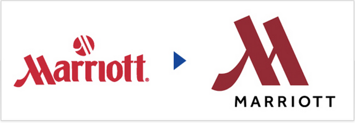
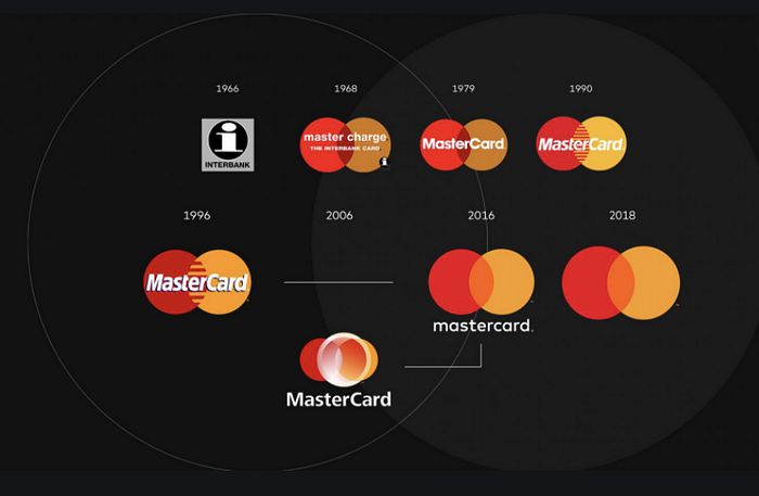
There are some brands that avoided the backlash altogether — brands that got praised, including Marriott, Mastercard and Netflix.
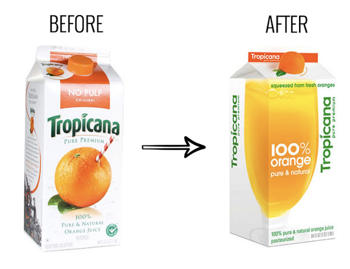
Some brands like Gap and Tropicana got such strong backlash that they reverted the rebrand back to the original place.
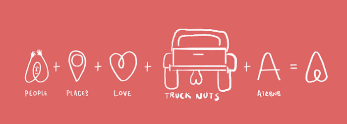
Then there are some brands in the middle. Brands like Slack, Airbnb, and Instagram got shredded by the Internet for their redesigns.
Memories may serve us short — but these were real quotes reacting to these new logos:

Today, these are some of the most valuable companies of the last decade — and they still could not survive the guillotine of consumer-fueled internet rage.
In exploring the outcome of typical backlash, we can look at two large factors.
- Visual Disruption: How different is the logo from the old logo? Does it pass the internet maturity test?
- Identity Integration: How integrated is the brand to our own identity?
We know from the examples above that backlash does not always lead to the same outcomes — for the sake of simplicity, let’s separate the above groups into three main categories:
- Thrivers — Brands that got a positive first reception to a redesign (i.e. Marriott)
- Survivors — Brands that managed to hit a harsh chord but survived (i.e. Slack)
- Returners — Brands that scraped everything after the backlash (i.e. Tropicana)
What does each group have in common? Let’s explore each root one by one.
Visual Disruption
The visual disruption test helps us easily separate the Thrivers from the other groups. Take a look at the Marriott redesign below for example — small change to the color but still keeps the familiar M in the Marriott logo, and even makes it more prominent. There is some value here for the modernist group and some value here for the old logo lovers.

Mastercard is another good example — they were celebrated for the simplicity of their redesign — it served for little visual disruption, a simple transition into a new color hue for a logo that power users were still familiar with.

But not all redesigns have to stay similar to pass the visual disruption test — Olive Garden is one example below of a redesign that would likely fall into the thriver group by virtue of its fairly positive reception. While the old one had some familiarity, the new one is not too shabby — much more simple, and with an actual olive instead of grapes. (Seriously, did anyone question why Olive Garden has grapes?)

Thrivers capitalize on something we know in psychology as the familiarity heuristic — a well-documented shortcut our brains take that makes us feel calm with the familiar, and apprehensive about novel experiences — regardless of their advantages.
Can we assume Airbnb, Slack, Tropicana and others did not have advantages or good intentions behind their brand redesigns? Probably not.
That’s the catch with the familiarity heuristic — it’s irrational. It doesn’t read into the “why” behind brand redesigns — new is just automatically equivalent to scary.
You can imagine someone calm with the familiar would not necessarily love this.

Identity Integration
So we know that brands who do not elect to visually disrupt usually thrive and others face backlash — but visual disruption alone is not enough to explain why we react so much stronger to some brands than others.
Another root of the backlash mentioned above is identity integration.
In a study at Pennsylvania State University by associate professor Karen Winterich, Winterich attributes “identity” to a large portion of consumer backlash:
Consciously or not, we internalize the brands that we admire (and want to align ourselves with) as well as the brands that are a part of our daily lives. In general, the stronger our associations with a brand, the more negatively we react when its logo changes.
Psychologically, the team coined this as the Starbucks Effect — a tribute to the negative reaction by the company’s self-described most loyal customers to the new Starbucks logo here.
In Winterich’s study, 632 college students respond to logo redesigns for Adidas and New Balance athletic shoes created by professional graphic designers. For participants who expressed weak ties to the brands, the refreshed logos went over smoothly. Those who expressed a strong connection, however, tended to react negatively to the redesigns, which affected their attitude to the brands as a whole.
Tropicana, Gap, and Smuckers are all tied to different parts of our identity — growing up and drinking juice with your family, the warmth of an after school snack, the adrenaline of back to school fashion sales. While none of their new logos were necessarily terrible (it’s not like Tropicana displayed ambiguous genitalia), it was enough to trigger a disruption in an emotional relationship.

I talked in a previous issue about brain shortcuts called somatic markers, that we build over time to associate feelings with brands. When we see a brand that we’ve built an emotional relationship with modify its logo or design, our somatic markers short circuit. We panic.
The flow diagram in our brain that evokes happiness from seeing a Tropicana logo suddenly has no idea what to do. Do you look for a new juice brand? Work harder to find Tropicana in the grocery store or Gap in the mall? It’s a disruption that leads to work — and that work makes us mad.
Much easier to force Tropicana to change their logo than inconvenience ourselves for one second in a grocery aisle, right?
So Tropicana reverted. Gap reverted. Starbucks didn’t revert. Neither did Slack, Airbnb, and Instagram. These are also a big part of our daily lives and tied to different parts of our identity — so how did they remain survivors without reverting?
There is one key that separates the survivors from the reverters: cost of constraint.
It’s perfectly summed up by a quote I found while researching this piece:
“You’re not going to stop using Google just because the logo changed.”
There are a ton of clothing brands and a ton of juice brands.
While we would love to continue shopping at Tropicana or Gap, we are at no shortage of options. We can shop locally for orange juice or buy one of ten brands at a Safeway.
AirBnb, Slack, and Instagram paint a different story — there are few alternatives to any of these products. Eventually, we’re forced to use them regularly and just get used to the logo over time, backlash be damned.
The cost of constraining is high for a lot of these products — if we don’t use Google, where do we go to search? If we don’t use Slack, how are we going to communicate at work?
There’s a fun pattern in psychology called the escalation of commitment — that describes how humans will continue to align with previous actions and decisions, despite negative emotions or outcomes.
If your commitment to something is high, you will continue doing it regardless of how much you hate it.
It’s largely used to explain why people stay in jobs they hate but can also be easily used to describe why we willingly go out of our way to laugh about a company’s new logo looking like genitalia, only to wake up and keep using that company’s products.
In sum: If you can introduce any friction in a potential boycott, you might stand a chance to survive.
What can brands learn?
Hundreds of companies explore a brand redesign every year — and there are many factors to consider.
Redesigns take time, effort, and an investment into an identity and visual cue that will stay with the company for the foreseeable future. They’re rarely done on a whim and rarely done without a conversation that spans many layers of a company.
Despite how we feel, there are lots of common reasons for a redesign:
- Company Expansion: If you expand to new markets or a new audience who won’t identify with your brand’s cultural significance, it may be wise to have a redesign.
- Market Repositioning: If you reposition with a new product, place, category or portfolio, it might be wise to pivot your visual brand accordingly.
- Philosophy Shift: If your business’s mission, vision, and values change, it may be time to understand how new MVV positioning integrates with your visual brand assets.
- Mergers and Acquisitions: This one is a bit more obvious — if you’re fusing with another brand or forming a new entity altogether, that entity might need a new identity, separate from the brand as a whole.
Of course, there are redesigns that stem at their root from boredom, desire for attention, or ego, but these are few and far in between.
What we’ve learned above is that there is an atleast one easy way to avoid backlash altogether and thrive: Make your logo changes simple. Focus on colors and symbols that your customers recognize. Remove ambiguity.
But this isn’t necessarily the path many companies want to take — a redesign is an opportunity to take a big swing and do something different. Many companies entertain and maybe even expect the backlash — but how can these companies survive?
- Explain your why: We talked above about reasons to rebrand — new positioning, new purpose, or even simply a new market offering. Gap had none of these — and failed to explain why it needed to evolve.
- Find a unique value proposition: Airbnb, Instagram, Slack, and Google. All companies that have a strong unique value proposition. If you can’t offer something unique, you will see the second-order effects (i.e. diminishing sales) quickly.
- Talk to customers: Winterich’s study has taught us that the most committed customers won’t automatically love what you do. Solicit input — or even simply notify them before bringing it live.
- Pair with familiarity: Keep products people are familiar with away from the corporate logo redesign — especially if your reason for a brand redesign is repositioning as a portfolio company. People who use Google don’t want to see that damned Alphabet logo.
While I don’t ultimately know what the fate of Smuckers will be, I find myself understanding multiple points of view — the brand redesign was well-intentioned, backlash is healthy and the existence of backlash is not always indicative of a company’s future success.
When Visual Objects ran a survey in 2019 to see how people felt about logo redesigns — researchers found a whopping 73% preferred Slack’s new logo.
As predicted, the initial backlash had little to do with the strength or vision of Slack’s design team.
But it had everything to do with human psychology.
I’m currently a growth marketer at Livongo based out of the Bay Area and enjoy sharing insights around growth, careers, and personal anecdotes. I also like meaningless controversies (check out ranking of the best fast food fries) and spending my days finding the best Super burrito in San Francisco. All opinions are my own. Get in touch here or via @kushaanshah on Twitter.

