Member-only story
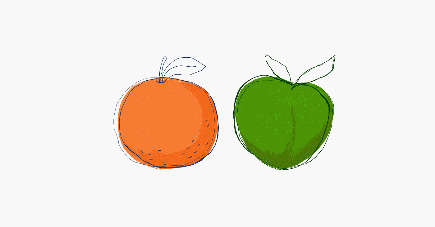
Why does mixing apples and oranges work for juice but not for a chart?
#27: Providing the right aggregation level
If data cleaning is the most time-consuming part of the data analyst’s job, understanding the chart’s purpose is the most important one. Before we design the visuals, we must know what question the chart should answer and why it is relevant. We need to know ‘What’ and ‘Why’ to choose ‘How’ — which is selecting the most efficient chart for the job. Easy as it sounds, it’s way more complicated than one might think.
I’ll use the Eurostat chart related to EU trade in goods with Russia as an example. At first glance, the graph seems fine — the line chart shows change over time (which is correct), the design is neat (also desirable), and the layout supports the analysis. But somehow, after looking at the chart, we are left with — ‘wait, what?’. After closer examination, we notice that the charts don’t optimally present data. Showing data on two different aggregation levels is like comparing apples to oranges. Or I should say — apples to apple pies. Technically we can do this but with much additional and unnecessary work. Let’s see how the small formatting changes will make data coherent and comparison effortless.