You're unable to read via this Friend Link since it's expired. Learn more
Member-only story
Why Google’s new search results design is a dark pattern

Humans are self-training machines, and in the context of the internet, we’ve trained ourselves to ignore the intrusive adverts which increasingly clutter our screens. If something looks vaguely like an advert, we don’t even make eye contact with it — a behaviour known as ‘banner blindness’.
In the context of Google results, often we skim past ad search results because they are the least likely to be relevant on the page (they’re having to pay to be there, after all).
But what happens if you can’t tell which is which anymore?
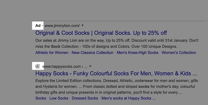
The latest Google search UI redesign sneakily tries to hack that behaviour by subverting how we quickly scan to see if something is an ad or a genuine result. Where once only adverts had an icon to differentiate them, now there are favicons in the equivalent slot on all other results.

Why do this?
By putting something visually similar in every slot which previously signalled an ad, it becomes impossible for a user to tell them apart without taking care and effort. Google can still say they label adverts, but that info is now buried under more visual noise.
The real outcome? Increased advert density in search — ads can now be scattered at various positions in the results, and Google can substantially boost the number of paid results per page… without it being obvious.

In this one example where I just searched ‘socks’, the ratio of adverts to text results was ~3:4. Now, considering that Google once differentiated itself with a clear, minimal UI, it seems that user experience is taking a hit here in pursuit of deeper monetisation of search results.

Google claims that the new format “puts a site’s brand front & center”. But if that was…

