Why our ballot designs need to undergo user testing
The Florida Department of State has indicated that 26,000 Broward voters failed to vote for anyone in the Senate race.

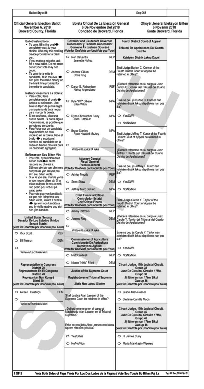
Ever since the 2000 election and ballot fiasco in Palm Beach County, our team has incorporated an image of the actual ballot into our capabilities presentations. As practitioners of qualitative and usability research, we like to highlight the pitfalls of not conducting sensible research. It seems as if I may need to add another image as the Broward County ballot design of 2018 may be the culprit for what’s shaping up to be an enormous problem in this year’s Florida election.
As the numbers are reviewed, the vote counters at The Florida Department of State have indicated that 26,000 Broward voters failed to vote for anyone in the Senate race but did complete the rest of their ballot. This only occurred in Broward County and the folks at FiveThirtyEight put together a great chart to illustrate the numbers. In my opinion, this is pretty strong evidence that users missed the area below the instructions and just went directly to the Governor’s race.
What went wrong?
When looking at the left side of the ballot, users see instructions and then the area for Senate voting just below that. To the right, the Governor’s race is presented and subsequently, other state offices and candidates are listed. This is a poorly designed layout and not separating the instructions into a separate stand-alone column seems to be the culprit.
This particular ballot design could have incorporated some straightforward visual cues that might have helped voters. You’ll notice everything is in the same type size — not great if you want to highlight key information. This is why print and web headlines are larger and bolder than body text — to grab your attention. Another issue is that the spacing is inconsistent for the Governor’s selection area, which could be a visual indication that voters should start on that part of the page. There’s also nothing that says “Start Here” to focus the user's attention on where the voting begins and how it’s separated from any instructions.
Given the importance of getting ballot design right and improving faith in our electoral system, ballot design should undergo usability testing for the following key reasons:
· It provides an objective benchmark
· Paper ballots and those on touch screens at polling places may look different
· Many people are in a rush to vote and want to finish quickly
· Lots of people just don’t read instructions or directional copy — we’ve seen this in many of the usability testing projects we’ve completed
· Older voters make up a larger portion of the total ballots cast and are likely to be less tech savvy. In Broward County, 16.2% of the population is over 65 according to the latest census data.
How to Plan & Execute Ballot User Testing
Right after any local, state and federal election primaries, the final candidates should be solidified. It shouldn’t take more than a week to design the ballot for both paper and touch screen usability testing. The county or state can then recruit 500 registered voters to test the ballots in a real-world style environment. Every participant would vote as they normally do and then provide a brief five-minute post voting interview to offer any qualitative feedback. This can all be accomplished in a three-week window of time. If a $20 incentive was offered, plenty of people would show up and spending $10K to ensure that a fair election takes place is a drop in the bucket. Its probably costing the folks down in Florida a fortune in legal fees right now that will ultimately have to be covered by the taxpayers.
This is a solvable problem and those who are UX and/or ballot designers should want to have their work tested by users to ensure the ease of cognitively processing all the details on a ballot. Adding to the list of cynical people who crow that “your vote won’t count” or that the “system is rigged” is not good for democracy whichever side of the issues you may be on. Let’s get this right and incorporate some user testing into each new ballot design exercise.
Lon is the Founder & Principal UX Researcher at First Insights. Thoughts, questions or feedback are always welcome @lontaylor or www.FirstInsights.com


