Why Samsung’s OneUI is a piece of art
From a hardcore critique to head over heels in love ❤️

Why did I hate Samsung soo much?
Because Samsung had soo less to offer in their budget range compared to other brands. All of their budget smartphones were slow, not so user-friendly, looked boring and offered fewer specifications (like RAM, storage, camera megapixels). Well, that was 2014, and since then Samsung has come quite far offering a tough competition at each price segment. Not just because of their specs, but also because of the experience.
And since every brand is offering competitive specs for a price range, the decision to buy boils down to usability, aesthetics, and after-sales service. With One UI, Samsung is killing it. It is a huge improvement over its predecessors, Experience UI and TouchWiz. It is simple but interesting. It is accessible, but not boring. It is the same android but fresh. It is just pure beauty! Give it a try and you will know what I am talking about. Here are a few things that I loved in One UI, which may help Samsung take over the market again or at least make the experience better for users:
1. Everything is accessible from your thumb 🖐️
So you don’t have to exercise your thumb trying to reach the top left corner of your phone while drinking that coffee. We are just using a phone, not doing some yoga duh! Common action should be within the reach of your thumb. And One UI doing that in the best possible way. As the name suggests “One”, it’s meant for one-hand use. Even the navigation bar, when scrolled, drops its icons down to thumb level. This makes even the 6.5-inch brick easy to use.

2. Everything is in text 📜
Sometimes, what seems obvious to the developer may not be for a normal not so tech-savvy user. In the settings menu of most the phones, you will generally see things that don’t make any sense. For example, what does the “do not disturb” settings do? Will my alarms still work? What about notifications from important apps? How would I know if you don’t spell it out for me? This was for a fairly straight forward setting. For some settings, I have to turn it off and on again and again to see the effect.
But that’s not the case with One UI. You will see a brief description even for things as simple as “flight mode”, it says “Turn off calling, messaging and mobile data”. So you don’t have to do the guesswork and you know what to expect. This also helps increase the accessibility.

3. Visual Clues to guide you 🧩
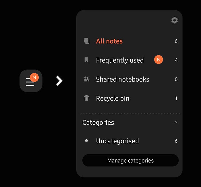
There are small clues hidden within the UI to guide you through any process. The one thing I liked the most is the “N” symbol which shows up on new features, that a user might want to explore.
By showing the N symbol, it guides the user as to where to click. And if the user likes the feature, he will connect more to the experience. People from customer success background will know the value this holds.
Then there is this flash of light something like a ripple. I am not sure what to call it, but when you go to settings from somewhere else, there is this ripple effect which lets you know where to look next.
Another good use of visual clue is that if your auto-rotation is off and if you rotate your phone 90deg, an icon shows up at the bottom right of the screen (Did you notice the placement? Cool right?). Which when pressed rotates the screen. So you don’t need to disable your auto-rotation again and again.
4. No Advertisement 🚫
Yes, I know it’s an obvious one. Since you have already paid for the device, why would there be any advertisement in between the experience? It is annoying to see these things pop out of nowhere. But some companies have been notoriously pushing advertisement in their UI, just to make a little more money out of you. And that is almost like you are paying to use your phone. For example, Xiaomi started slyly pushing advertisements in its MIUI. You can see advertisements while installing a new app or creating a new folder.
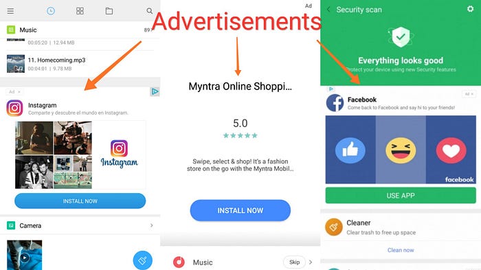
This is one of the reasons I switched from my old phone.
5. Aesthetically pleasing 🍭
Small beautiful experiences that made me smile inside:
- It uses some really sick color combinations to show up against your contacts if you haven’t saved their image.
- Micro animations are on a whole new level, making the experience very smooth.
- You can set multiple lock screen wallpaper, so it’s never boring to look at it. Also, there is “lock screen stories” by Glance, which I am not particularly a fan of but it's good to know it’s there.
6. Some lit Features 🔥
Which you may not use or notice, but they help build the usability:
- A list of Bluetooth devices pops up when you tap the Bluetooth icon in the navigation bar. Same with wifi. So you don't have to go to the settings to connect to a device.
- You can swap the position of your back button and multitasking button. So that you don’t go nuts while switching from a different phone.
- If some app is spamming you with notification, you simply have to swipe the notification from the navigation bar and disable it. Easy-peezy.
- The keyboard is amazing, you can change the size, position, layout and what not?
Other android features like dark mode, digital wellbeing, at-a-glance, battery saver are also seamlessly integrated (especially the dark mode it’s beautiful).
What I didn’t like?
Almost all of the themes in galaxy theme app are paid. And even the paid ones don’t look so good. So you are stuck with out-of-the-box themes (unless you are planning to make one of your own, which by the way I am).
Is there something else you didn’t like about One UI? let me know in the comments. It’s okay to criticize, but it is also important to notice the good.
That’s it.
Done and done. That’s my review on Samsung One UI. And like every iPhone users says “you have to try it out to feel the difference”, same is the case here, just that it will cost you half the price.