Member-only story
Why some designs look messy, and others don’t
Use this incredibly simple rule that is, somehow, never mentioned in school or design courses.
Humans like boxes.
We love boxes so much that they are central to both our visual and conceptual world. Stereotypes, music or art genres, religious or political views — all of them are boxes, or at least attempts to put stuff into them. But also in the physical world, 2D or 3D, we love boxes.
Here’s a neat little trick to show you what I mean: ask anyone to draw a circle on a piece of paper. Then ask them to draw something to contain the circle they drew. Guess what? Most people will draw a box around the circle.
This is remarkable, because a triangle, a hexagon, a wiggly-ass diamond, or even another circle would have sufficed just fine. But no: we like boxes. To put stuff into, stack them, align them, and stuff our attics or garages with them. Boxes feel solid because they are. In three dimensional space, a box is made up of six 2D boxes. Parabox. They’re almost like magic.
Now, before you get ahead of me: no — the ‘box’ is not the mystery design-rule I’m talking about. But boxes do have something to do with it; otherwise, I wouldn’t bore you with this introduction.
Let’s get to it. A two-dimensional box is made up of four lines. And, as we’ve seen with the circle, we are tempted to visualize boxes around everything we perceive in 2D space — e.g., UI and visual design.
This is very apparent in the act of wireframing and rough prototyping: we conjure op a composition of wired boxes that represent the entire user interface, and this works remarkably well.
Meet the Extendabox-rule
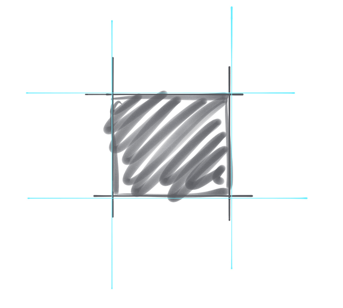
Yes, I made that up myself. It’s not super catchy, I know. Let’s stay on-topic. The four strokes making up a box end at each intersection. But in our unconsciousness, every one of those lines draws out an imaginary line much further, through the entirety of your design. Like this:

This also applies to a circle, or any other shape, like this:
