Why your tab bar needs text, not just icons
Unless you’re Pinterest, Facebook, Twitter, or selling hella ads on your own news feed.
There’s been a recent trend to take away the helper text beneath the tab bar icons. This subtraction unnecessarily makes users more hesitant to tap on icons they don’t recognize and reduces unguided exploration within the app.
There are very good reasons to take off that text and gain an extra 1.8% of info feed real estate, but most apps that take out this text simply make it harder for their users to navigate and explore.
An example of unnecessarily taking out his helper text is in the Google Wi-fi app where there are cryptic icons and nothing to indicate what features are where except blindly tapping around searching for new app functions.

This copy is especially vital for apps related to hardware or internet of things where there are many useful features to the app the user would want to tap to, but not necessarily know what to look for.
Interestingly, many of the biggest tech companies in the world enhance their apps by taking out this tab bar helper text. Apps like Facebook, Twitter, Pinterest, Snapchat, Evernote, and Instagram all take out this tab bar copy…and their business is better for it. For those apps, the primary driver of their company revenue is the user’s time in the info feed. The more ads they can show you the more money they make, so having up to 1.8% more news feed real estate can be the difference between a user seeing that last hint of interesting content that keeps them in-app or getting bored and closing out.
Pinterest goes so far as to hide the tab bar entirely while you’re scrolling which gives them an extra 10% of screen real estate. Facebook hides the search bar at the top as you scroll.

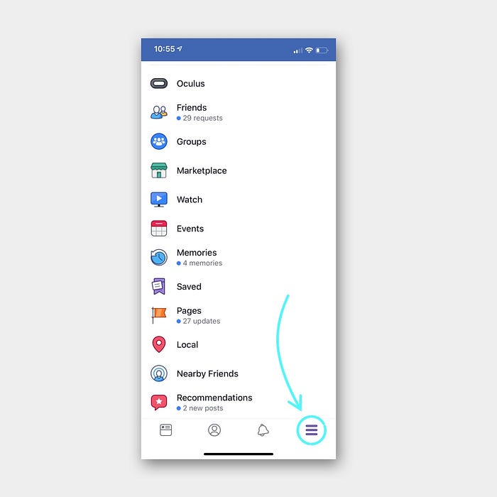
In Pinterest and Facebook, the additional core features besides the feed are not even stored in the tab bar. Those features like Pinterest boards and Facebook groups are stored in their side menus: account in Pinterest’s case and hamburger menu in Facebook’s case. The features you can access in their tab bars are relatively minor like seeing your notifications or seeing your profile page. Neither of these is a core feature of the app that drives revenue.
Google Wifi and Robinhood apps both put core functionality in their tab bar. These feed-based apps, put that additional core functionality in a hamburger or account menu.
In my own experience of user testing various app designs, whenever I’ve tested the tab bar without copy, I see the user far more hesitant to tap the icons and explore the things they do not immediately recognize. Specifically, the user readily taps on the search and account buttons presumably because they recognize those icons easily. But when you start adding more ambiguous icons like Google wifi’s comment with a star in it to represent the Home feed users are more hesitant to tap those icons.
Personally, I’m a huge fan of the aesthetic of tab bars without the helper copy. Every time I’ve tested it out, however, I’ve seen users hitting roadblocks or just not touching the icons. My observations could be unique to the apps I have designed and tested with users, but every time I take out the text I see users more hesitant to tap around to get to other sections of the app. Other times user tap and go somewhere they didn’t expect “oh, I thought that icon was a map” when it was a notebook for writing.
But, if you’re selling content in an info feed, like Facebook, Instagram, or Pinterest, and the only thing that matters is more eyes on then every pixel of real estate is worth some amount of ad revenue.
If you’re not selling ad space on your feed, then put that helper copy in the tab bar and help your user out. Help them explore and see all the fantastic features you and your team have made rather than being hesitant to leave their comfort zone for fear of the unknown.