Member-only story
Words matter: 18 meaningful descriptors when talking about design

 As designers, many of us think we’re just visual creatures. But creating visuals is only half of the job. The other half is verbal communication — actually talking about design. Whether we’re showcasing our own work, giving or receiving critiques, pitching to a client, or trying to understand a brand’s visual language, it’s so important that we have the vocabulary to communicate effectively.
Lately, I’ve noticed the same words used to describe design over and over again, and I know I’m not the only one. There’s a running joke among designers about how clients always say “make it pop!” It’s a common frustration because “make it pop” is very arbitrary and it essentially carries no meaning anymore.
Our clients aren’t the only ones who default to overused words without much thought. I see it all the time from designers and I’m totally guilty of it myself. So I wanted to take some time to really think about a few trite descriptors and find better, more effective ones.
I think of it like I’m developing my vocabulary toolbox.
Bold
Right off the bat, this word is a doozy. Bold could mean so many different things. It could refer to a heavy typeface, a high contrast in color, making an element HUGE on the page. Or it could take on a conceptual, personified meaning, making the design feel fearless or unapologetic.
Let’s look at some alternatives that can help us dig deeper into what a design is actually communicating.
Striking
attractive; impressive; noticeable; conspicuous

Something that is striking calls attention to itself because it’s a little different than you’d expect it to be.
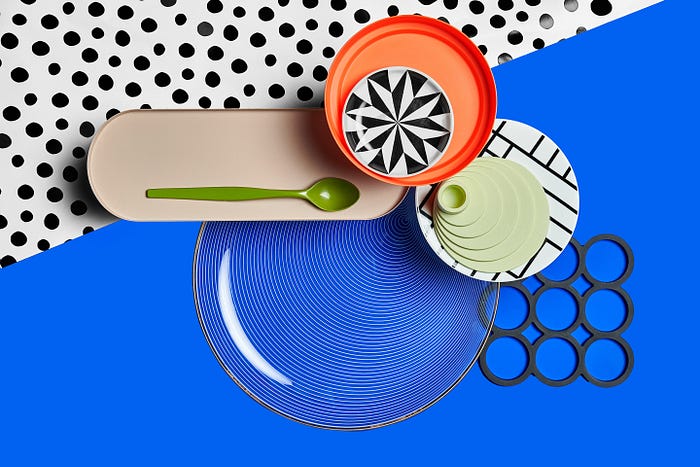
Geometric
resembling or employing the simple rectilinear or curvilinear lines or figures used in geometry

