Member-only story
Working with breakpoints in Figma: Testing and documenting responsive designs
How to set up and test truly responsive design components
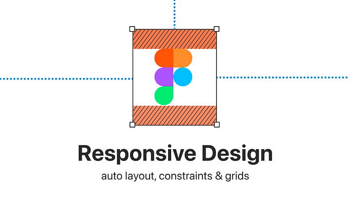
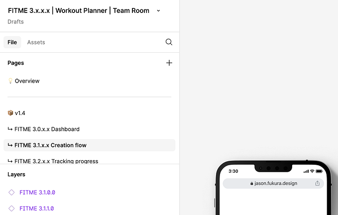
So we can set up responsive pages Figma
With the help of auto layout, constraints and grids, we can set up almost any responsive behavior we want in Figma. Knowing those Figma features in and out and when to use which one is crucial. If you are still unsure about them, here is an article explaining them in depth.

The problem: One design will not work for all screen sizes
Ok, so you know how to set up responsive pages and components. We are, however, still stuck with one issue: The same design will not work from mobile to large desktop with one setup. It will only work within a specific range. How can we deal with this?

We need to set up different ranges for our design; this is where breakpoints come in!
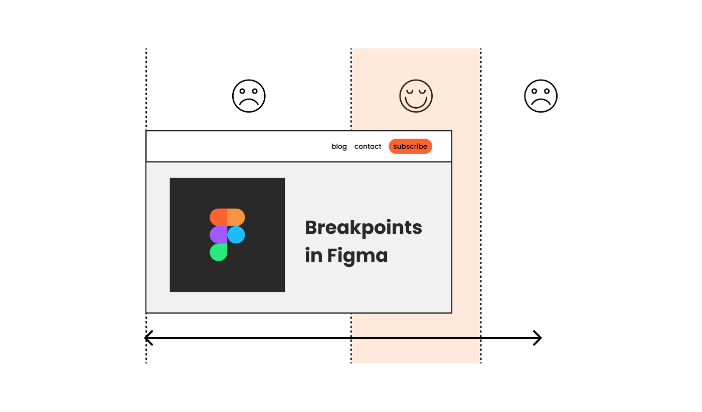
What are breakpoints?
A breakpoint defines a certain point where the design (may) adapt. So while we still use responsive behavior between the breakpoints, we re-consider the general layout once entering a new range. And as a gif says more than a thousand words, this is what our page would look like from small to large now:
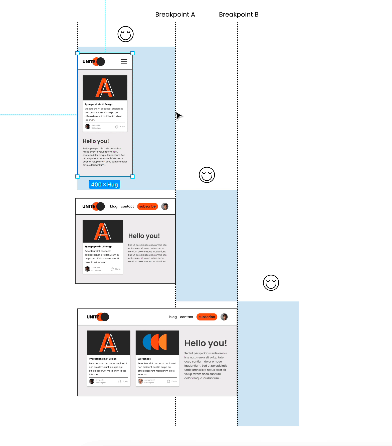
Think of single components adapting, not entire pages!
It is not about setting up a page per breakpoint. Remember, we work with the component-based design approach. So it is about considering at which breakpoint a component needs to change or adapt in which way.


