Writing clearer error messages
A short guide to helping users fix errors

Error messages. Let’s face it, there are a lot of bad ones out there. But when they’re good, they’re wonderful. Why? Because they enable users to get stuff done.
Things don’t always run smoothly. Our systems can fail us. And sometimes we’re to blame. So it’s super important we craft clear, logical and accessible error messages.
Understanding the error
Question and define
How do you expect users to know what the heck is going on and how to fix it, if you don’t? Before writing anything, make sure you know the answers to these questions:
- what’s happened?
- how has it happened?
- how do you fix it?
- is it a user or system error, or both?
- can we even change the damn thing?*
*The Operating System (OS) might control certain error messages.
Writing the message
Set a basic structure
To fix something, you need to know the error first. A basic form error message might go something like this:
[The error] [How to fix it]
It’s as simple as that. Let’s see that in action.

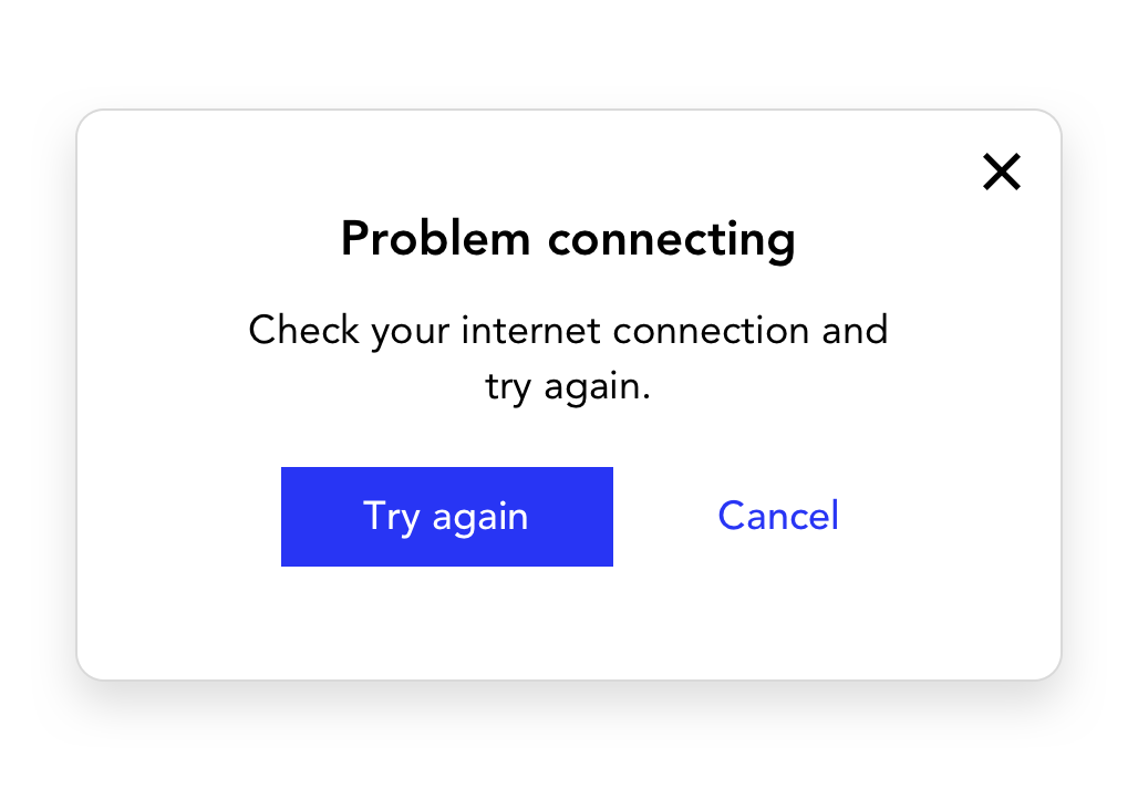
There are times when the system can’t place the specific error. In the example below, we’ve been deliberately vague. The best we can do is tell the user how they might fix it.
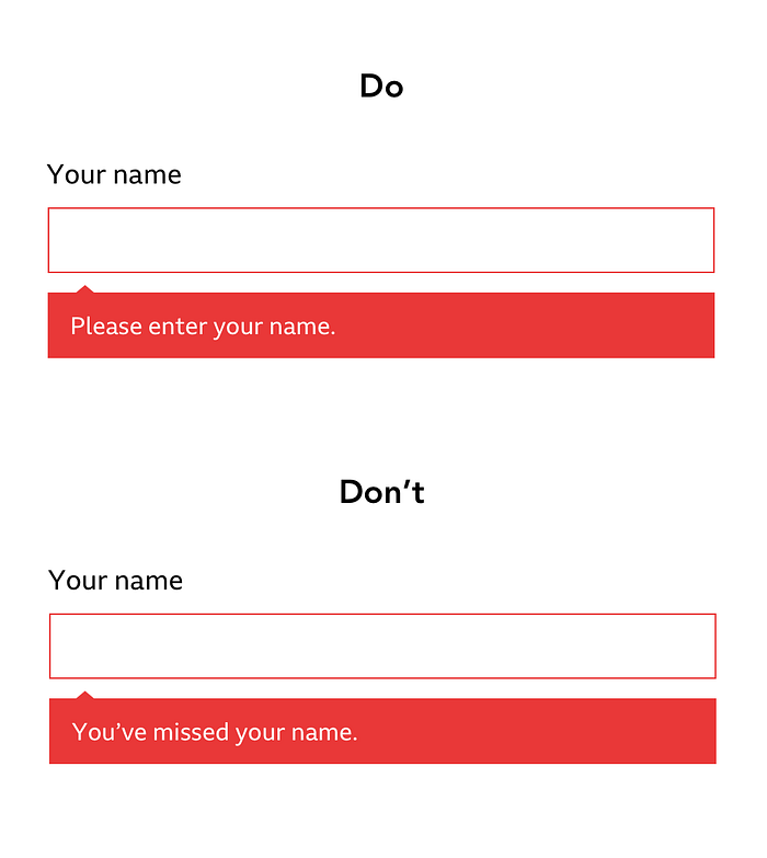
Keep it short and simple
We want to help the user fix the error quickly so they can get on with their day, stress-free.
Your message should be concise and succinct. Strip out waffle to stay on point but never compromise clarity. Keep detail if it’s relevant.

Consider etiquette
System error
Say sorry when it’s the system’s fault. But if it’s not, be careful not to overcompensate. Apologising where it’s not due can sound insincere. It can also imply the user isn’t at fault, which might be confusing.
Use an active voice to accept responsibility. For example, “We couldn’t save your changes” rather than “Your changes couldn’t be saved”.
User error
Ok, so sometimes it is the user’s fault. But, there are ways to tell them without sounding like you’re pointing the finger.
In the example below, we’ve focussed on the desired action rather than telling the user they’ve messed up.
A passive voice can work to your advantage for user errors. It can help soften an unsavoury situation, such as “This card was declined”.
Use the right tone
Tone is how you say something. The tone of your message will depend on how serious the error is. Warmth is great for less serious errors. But for more critical errors, steer clear of anything too lighthearted.
Avoid mechanical language and jargon, opting for plain language at all times. The aim is to make your user feel like you’re there, walking them through it. We’re talking to humans, remember.
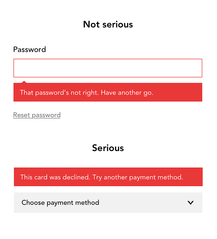
And please, don’t try to be clever. This isn’t the time to be creative or make jokes. This will only muddy your message and add to your user’s frustration.
What happens next
Buttons and links in error messages
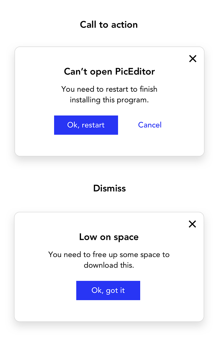
Some errors might need a Call To Action (CTA) button or link to fix the error. Depending on how you choose to show your message, you might need a dismiss button.
Always say what happens next. Your buttons and links should always make sense if read in isolation. This helps screen reader users navigating through interactive elements, and anyone scanning the page.
Avoid just using “Ok”. Ok, what? Be clear to the user what they’re saying “Ok” to. “Ok” can be used to dismiss a message or take an action.
Timing and placement
Error messages need to take the whole journey into consideration. Timing and placement help give context. And providing context makes it as easy as possible for the user fix the error.
- what triggers the message?
- when does the message appear?
- where does the message appear?
- is it clear what it’s related to?
When asking these questions, ask them for all types of users. This might prompt more questions such as:
- how might we help all users navigate to a solution?
- might the timing be distressing or intrusive for some?
- how might we connect the message to the relevant section visually and non-visually?
Remember, error messages aren’t barriers. They exist to empower, reassure and guide your users.
Key takeaways
- understand the error and how to fix it
- tell your users in a clear and succinct way
- use the right tone and etiquette
- make any buttons or links descriptive
- consider placement and timing for all users


