Why and how you should standardize the UI patterns in your pattern library
Let’s start from the basics first
What’s a design system?
A design system is a living, breathing document that helps you define a seamless brand experience for your product or ecosystem of products.
It’s a place where all the components a.k.a building blocks of your product are documented — UI patterns, color, typography, language( brand voice and tone), design components (buttons, page layouts, menus, navigation). Most design systems nowadays also contain code snippets and design tokens to help developers bring consistency in code and help ease the replication the same behavior for components across products.
This document serves as a single source of truth for creating new products from scratch or rewriting existing products to create a consistent, homogeneous user experience that reflects who you are as a brand and company.
So the main purpose of a design system is to bring standardization in design and code…
But too much standardization may also kill you product.

So how do you strike the right balance, between standardization and customization?
Here’s the solution → By defining the reach each standard will have
Depending on how complex your product is, you can define the reach. I’m currently working on a design system that strings together an array of products that are web-based forms with 1–2 pages — so each product is a form with 1–2 pages and we have 7 such products in our ecosystem.
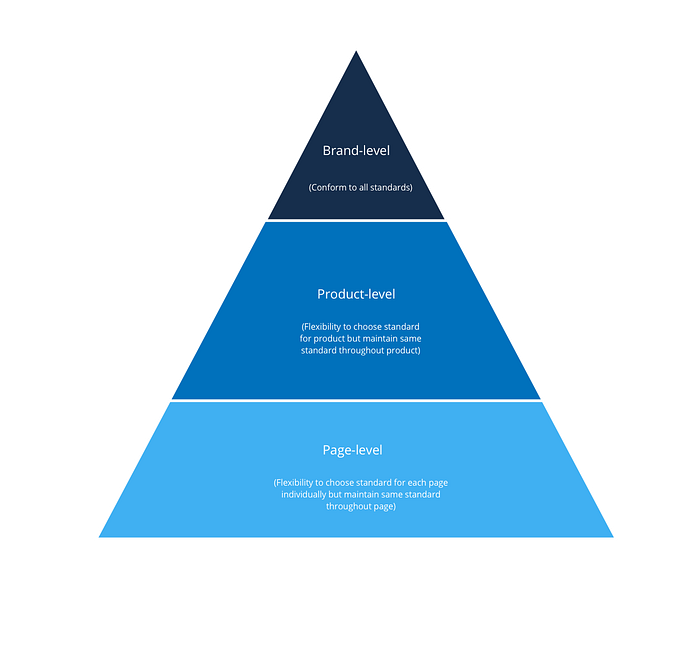
So I defined three levels of reach for them -
1. Brand-level
Standard cannot be changed or tweaked once defined for the brand as a whole
2. Product-level
Can be tweaked for each product to align with product needs
3. Page-level
Can be tweaked for each page to align with page/information-needs

This is not a cookie-cutter solution and you can define more levels depending on how complex your product is — like module-level, section-level, feature-level etc.
Mapping reach to standards in the library
Now that you have defined the reach levels map them to the standards in your design system

In our system, buttons have to look and work in a particular way throughout the product but the standard may vary, (have a different color) in a different product. So this pattern or standard has a product-level reach.
However, it is important to note that we only have 3 different variations for a buttons and the product owners/clients have to pick one of them. They can’t use colors, interactions or fonts other than the ones we have listed in the design system. And the UX team has the final say on this.
Did this help? Have more questions? Let’s talk.
Follow me Adi Shanbhag on Medium for Design System tips and tricks. And @design.husky on Instagram.


