Your Closet Is Your Personal Design Style Guide
Have you ever noticed the relationship between a closet and a design style guide?

Your closet reflects who you are and shapes your style. A design style guide determines how a product is going to look. Don’t you want to stand out with a strong personality and unique style? You may say no, but companies wouldn’t turn down this opportunity.
The Needs
We need closets to store things we use every day: clothes, shoes, hats, socks, accessories and more. It’s the place I go to every day before I leave the house. We need a design style guide to store UI components: typography, buttons, forms, toggles and more. We can’t design a product without them.
Here comes the tough questions:
Is your closet well organized by category? Can you easily find what you are looking for? Can you decide which pair of shoes should go with your recently bought new dress right away?
Is your design style guide well labeled by category? Can you efficiently grab a component you need? Can you quickly decide whether all the different buttons, forms and colors go well together?
If all your answers are yes, then good for you! Unfortunately, it’s still a bit of a game for me to master both my closet and my and UI components.
In Comparison
So what’s the relationship between a closet and a design style guide? Let’s take a look.
1. Color Swatches
- Primary Colors
- Accent Colors
- Greys
- Whites

2. Typography = Personal Style
Typography defines product character and page hierarchy, your closet defines your style and personality.
- Font family: Your own choice.
- Header: H1, H2, H3, H4, H5.
- Content: Paragraph, Label, Link.
- Font weight: Light, Regular, Italic, Semi-bold, Bold, Extra bold.

Here is an example of personal style vs. Typography (see image below):

3. Iconography = Accessories
Iconography is like accessories. Who doesn’t like eye candy? They are optional, but they add value to a product (or a person) and make them more interesting and enjoyable to look at. See example below.

4. Buttons = Shoes
I see shoes as buttons, they all trigger actions and service different purposes.
- Primary Button: Triggers primary action on a page.
- Secondary Button: Triggers actions secondary to the primary action.
- Tertiary Button: Optional actions that are not necessary for the user flow, but enhance the experience.
- Quaternary Button: Used for exit, reset, cancel, etc. functions.
See an example of my type of shoes vs. product buttons below:

5. Drop-down = Bags
Drop-downs are often used in products, they contain a menu of options. When you have more than what you can display upfront, you need to hide the choices within a drop-down. They function similarly to bags (purse, backpack, clutch, etc.). You can put many items in them and take them out one or many at a time (see example below).

6. Forms = Scarves
Forms are usually used when registering online or when filling out shipping and billing information. They often come in 3 states: default, focus and error. Like scarves, variety of materials serve in different seasons: spring, summer, fall or winter (see example below).

7. Others
There are UI components than what I listed above, including tooltips, toggles, checkboxes, etc. They assist the product and enhance the experience when people interact with it. As with the different shapes and functions of hats. They keep your head warm/cool and signal things such as temperature, atmosphere or personal style.
The Theory
I am going to quote a few paragraphs from “Universal Principles of Design” to explain my theory.
1. Aesthetic-Usability Effect
Aesthetic things are perceived to be easier to use than ugly things. Aesthetic things are more likely to be tried, accepted, displayed, and repeatedly used than ugly things.
A nice, elegant and clean look gives a good impression to people, no matter if it’s at work, social events or home. I spend money building a closet that makes myself look presentable. companies invest money developing products in the hope that they can attract and retain many users. It’s a competitive world. If you don’t make a good effort, others will. See attached examples below: the nicer it looks, the more enjoyable it is to interact with.


2. Consistency
Usability and learnability improve when similar things have similar meanings and functions… Make things functionally consistent to leverage existing knowledge about functionality and use.
Consistency is often mentioned in design principles and UX guidelines. It takes time and effort to establish consistent patterns and functionality. So does your closet. Take Dribbble website as an example (see attached screenshot below). The user experience there is consistent across pages. I don’t need to re-learn patterns and can find the basic functions at any time.

Similar to a closet (see attached image below). If you organize your closet and categorize them, you’ll find your closet a lot more charming.

3. Comparison
Comparing things within one eyespan means presenting data side by side so that differences are easily detectable. Comparing things against benchmarks means providing context so that the significance of differences can be understood.
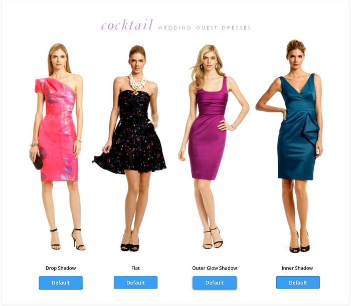
I like the idea of comparison. I sometimes have trouble making decisions when there are more than 3 good choices. It happens to my design variables, too. For example, which button style should your team use for the product? Flat, Drop shadow, Outer glow shadow or Inner shadow? Which dress style should you pick for an upcoming wedding? Comparison helps you make a decision! See example below.
Cost-Benefit
Cost-benefit does not just refer to finances. It refers to all costs and benefits associated with a design, including physical costs (e.g., effort), emotional costs (e.g., frustrations), and social costs (e.g., status).
You’ll need a budget for most of things you do. Some companies prefer taking time to build design style guides in house. It costs more money and effort in order to have a consistent and better product that generates more revenue. Some companies use online style guide services such as Frontify, where you can create a nice yet shareable style guide for free (see screenshot below).

There are also online closets. Some people may have trouble defining your style or don’t want to spend a lot of money owning nice clothes, bags and accessories. Some people don’t want to make the effort to create a clean, beautiful and organized closet. Rent the Runaway seems to be a good alternative choice. I haven’t personally tried the unlimited plan which only costs $139 per month, but I’m tempted (see screenshot below).

The Goals
If the closet is your style guidebook, then the design style guide is a guidebook for designers. So what should be put on yourself? What should be put in your design style guide? How to design the layout for convenient accessibility?
Closet
- Categorize your closet. Divide the closet space and place your clothes, shoes, bags, scarves, hats, ties, pants in their individual spot.
- Define your personal style. Are you formal, casual, dressy or sporty? It can vary depending on your preference. But you should know what impression you want to give to people and which style represents you the best.
- Understand your shoes, they reflect personal style. What’s your shoe size? What style of shoes do you have? You may choose heels for work, flats when shopping, sneakers when running. Make sure your shoes are consistently used across different events. People won’t expect to see you wearing high heels when running on a treadmill in the gym.
- Matching game. You’re not finished until you understand the matching game. You may have everything in the closet, but how about the skills of matching? You won’t want to wear your fancy leopard boots with yoga pants on when going to a job interview. You could, but it might not be as appreciated.
Design Style Guide
- Build UI toolkits for design tools that reflect the same styles and components. Document the styles, components, and patterns somewhere accessible to everyone in the company.
- Choose a typography. Which typeface represents your product the best? Is it serif, sans serif, modern, script, or decorative? What kind of impression do you want to deliver to the users when they use your product?
- Specify the buttons, they reflect your product style. What are the buttons sizes and styles? Is your primary button big and bright? Are your secondary buttons big but lighter, and small white outlined buttons for others? No matter what you decided to do, make sure all buttons are consistently used across different pages. You wouldn’t want to use the big and bright button for “save” on one page and use it for “cancel” on another.
- Matching game. You’re not finished until you understand the matching game. You may have everything in the design style guide, but how about the skills of matching? You wouldn’t want to throw 10 big bright primary buttons on a page and with icons in every button. You’ll need to highlight the important elements and understand the page hierarchy.
Time and Patience
- It takes time and patience to build a beautiful and organized closet.
- It takes time and patience to build a clean and usable design style guide.
- It won’t happen overnight. Keep trying, keep testing, keep improving.
- One day you’ll achieve mastery!
If you like this article, please kindly tap the ❤ button below! :)


