Microsoft’s new font: Your work will soon take on a new character
A seemingly trivial choice by Microsoft will determine it.

I was 26 years old when I learned the word trebuchet.
It is both a medieval catapult and the name of a font — and my client had decided to use it throughout their new website. That summer, I learned a lot about .css — and the myriad legal disclaimers, page titles, and help menus where non-trebuchet text could hide —along with a lesson about how a very-specific font choice (and accompanying hex-code for a very specific shade of blue) could create an instantly-recognizable brand identity.
No, the company didn’t think their clients would see a piece of copy and immediately hire them to lay siege against some business competitor — but they did believe that the rounded, quirky letter shapes would make them seem approachable, interesting, and — with that shade of blue — also stable and reliable workers.

When I read Microsoft’s recent press release announcing that they were choosing a new default font for all Office products, then, I knew it was a big deal.

For years, Times New Roman was the workhorse default font across your desktop apps. Originally designed for the British newspaper The Times in 1931, the solid, upright block text gave an aura of authority and formality to millions of school reports, workplace memos and personal correspondence typed with it in the early days of MS Office.

By 2007, however, the internet had taken hold — and demanded something more crisp and modern than this old-media workhorse. Microsoft defaulted to Calibri — a sans-serif font (one that doesn’t have the little embellishments or flourishes at the ends of strokes) that would render more clearly on the many websites that people were increasingly using to consume information. And just like that, millions of worker’s emails, reports, and PowerPoint presentations had also taken on a minimalist, modern character — even when the text itself hadn’t changed.
Contenders for your “New Standard”
When Microsoft announces that there will be a new default font across their products, then, it has a fundamental impact on how we will feel and experience work communications. Sure, it’ll be possible for individuals to change their personal defaults — but for the vast majority of folks, the Microsoft default will be the one they use and see most often.
In their announcement, Microsoft indicated that they’ve commissioned five possibilities.
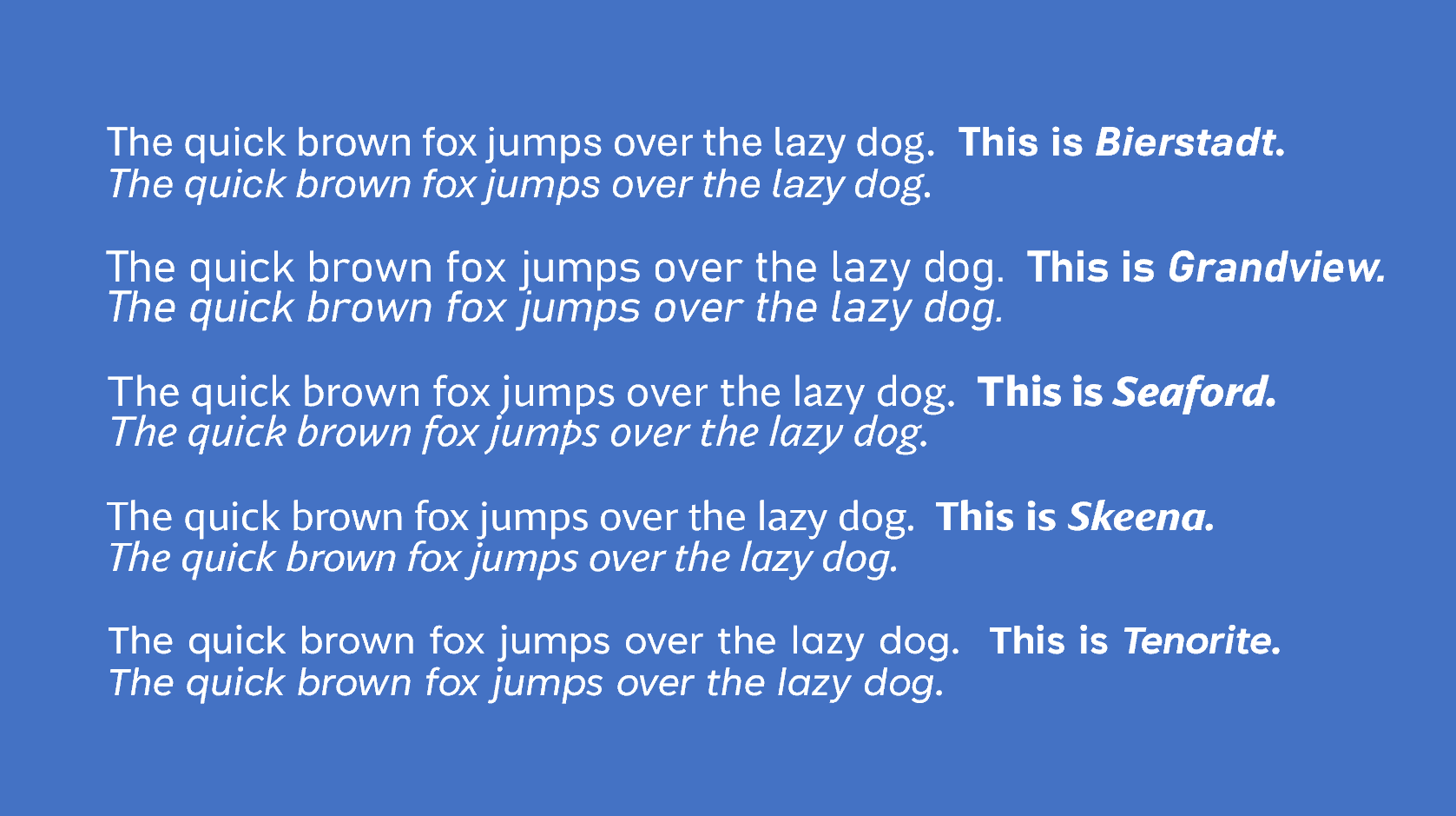
Bierstadt, by Steve Matteson
Inspired by mid-century Swiss typography, this font is named after the mountains of Colorado. There are no jagged peaks in this font, however — it’s got a very uniform plateau across mundane sample text.
To my eye, the only visually interesting letters are the lower case a (with its full potbelly that actually seems to hang lower than the line it rests on) and the lowercase e (which is practically an o with a line through it, or a Greek theta, standing in for the most-frequently-typed letter in the English language). Perhaps these were what Matteson was referring to when he said “Bierstadt’s systematic design contains organic touches to help humanize digital environments and soften the regimented order of grid typography.”
Would a Bierstadt-default world be one where we struggle to express unique identities in otherwise-regimented jobs and structures?
Grandview, by Aaron Bell
Derived from old German road and railway signs, this font is particularly crafted to be readable from a distance.
Indeed, Bell says he wasn’t sure it was possible to create a font that retained the spirit and personality of the German Industrial Standard (DIN), but believes he’s “preserved the voice of the original … I’m excited to see how the community engages with it, particular because the mechanical style of DIN is popular across a wide range of design implementations.”
Looking at the sample text, I do see German industrialism at work — sparse, straight lines, little waste to artistic flourishes, and text that stretches wide across train track-like swaths of the page. But I’m not sure this bleak outlook is the one I want in my workplace for the next decade.
Seaford, by Tobias Frere-Jones, Nina Stössinger, and Fred Shallcrass
Stössinger says that in designing their font, they were looking for a sense of familiarity — so “we looked at pictures of old armchairs … we were going for a practical interpretation of a beautiful family heirloom; durable upholstery, nothing overtly plushy or nostalgic.”
For me, the lowercase italic k evokes more of a folding chair or stepladder, while the flabby lowercase a does remind me of my grandmother’s couch that has lost its springs after being sat on too many times. Comfortable, perhaps — and in a work-from-home world, maybe that’s where we’re heading, but I’d find something not serious about work written in this font (especially with that italic lowercase p!).
Skeena, designed by John Hudson and Paul Hanslow
And as we are talking about not serious, we arrive at Skeena. The designers “wanted to create a humanist sans serif with generous proportions and higher than usual stroke contrast” — which means the variation in weight between thick and thin parts of the letter will be a bit more notable and quirky than usual (perhaps reflecting our increased awareness that beautiful people in the world comes in all shapes and sizes).
The “diagonally sheared terminals” (cutoffs at end of letters) also create personality in the letters (I’m particularly aware of them in the lowercase j — which would make sense to me if I worked in a comic book store, but doesn’t seem terribly applicable in other work settings).
Tenorite, designed by Erin McLaughlin and Wei Huang
“We didn’t shy away from going large and circular,” say the designers. When applied in text, accommodating those big looping “a”s and “o”s makes words stretch longer across a page (that lazy dog in the sample text stretches wider than all the others).
Perhaps they were inspired by the six-foot social distance bubbles of our time. In any case, I can see this font (or Grandview) being the choice of students who’ve been given homework assignments to write “at least X lines long” since they will fill the page with the fewest words.
How Microsoft will decide
The company’s press release doesn’t give a specific date for making the change, but is encoraging you to tweet your thoughts about the five new fonts (already available for use) at them. While it’s categorized as a “vote for your favorite” kind of thing, it’s doubtful that the choice will come down to popular vote.

