Member-only story
Zoning in on grayscale for data visualization
Getting it Right in Black & White before Colorizing
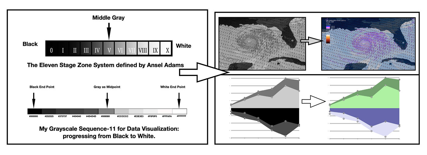
A Grayscale is an achromatic color harmony that ranges from pure White on the lightest end to pure Black on the darkest end, its opposite. Depending on how the shades and tones are combined, a sequential or a diverging color scheme can result. In this writing, I discuss how to work with Grayscale as a preliminary test to colorize your data visualizations. I cover how to build an anachromatic Gray sequence and convert it into a diverging color scheme with Adobe Color, a free Web app. The concept of color Hex codes and how to find them is introduced as well as a general overview of color deficiency issues. I also briefly note my process of colorizing a data visualization. Finally, I share with you my eleven step Grayscale achromatic color scheme that I find useful in my own efforts. This writing was inspired by Curran Kelleher’s YouTube series on “Get it Right in Black & White”.
A few examples from my prior Medium publications are shown. Here, the emphasis is on the initial Grayscale visualization. A Web link to the original writing is provided should you desire more specifics on the noted project. All the final colorized examples shown here were tested with color deficiency simulators and modified to be considered color-blind safe. Let’s begin by examining…

