UX heuristics for the automotive industry
Rules of thumb for in-car HMI.

It’s quite complicated to find material and articles online about UX in automotive. While there is an overwhelming amount of information on UX for mobile and desktop devices, getting insights on HMI (Human Machine Interaction) principles seems to be much harder. Why?
My answer is that it’s probably because it’s a niche discipline, compared to designing for handheld devices and computers, plus screens in cars haven’t been around for as long. Sure, UX in vehicles isn’t just screens, it was UX already when there were only knobs and physical buttons, but still, there is not much sharing on that knowledge too.
No standards
The main reason, though, might be the lack of standardization. If you take a look at the market right now, you’ll see there are so many different approaches and solutions (to the same needs) that it is hard to come up with a shared set of rules. Screens can be landscape or portrait, straight or at an angle, there can be one or 2 or 3 or more, superwide or more squared, high on the dashboard or lower to the knee, and so on. The number of screen sizes we have on mobile phones seems like a joke, compared to this mess.
Rigorous testing
Another reason is that all in-car systems require very thorough testing. Users interact with these in potentially deadly situations. Therefore testing must be absolutely a priority. While screwing up the position or size of a button on a mobile app can bring to annoyance, doing so on a car operative system (I’m not saying “infotainment” because, at this point, it’s a reductive term) can cost lives. The lack of standardization mentioned above makes it harder to take the findings of the previous test on other systems and reuse them on others.
BUT
There is nonetheless a human factor component that lets us define a set of rules of thumbs (or heuristics). It doesn’t mean they can skip testing, but here are some general principles for all the UX designers (including UI people) curious about this growing industry.
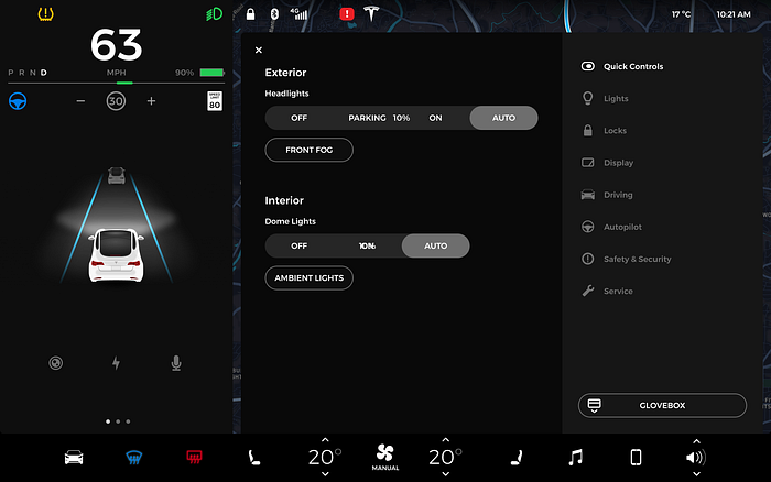
1. Dark mode is preferred
Various researches have shown how dark UI is the safest choice in the automotive context. Dark interfaces reduce distraction and glares, there is however, a component for which switching from dark to light mode can be beneficial for readability, and this is the navigation map. In pretty much all navigation system the map automatically switch from dark to light and vice-a-versa

2. Short text, no paragraphs
Texts should be skimmed, therefore all call-to-actions, menus, and all text, in general, should be kept at a bare minimum. No text should go on two or more lines unless it’s a text intended to be read in a non-motion situation.
3. Minimum font size
The average distance from the eye to the central display is about 60cm/24inches. This number is just an average measurement based on the most common configuration on the market, but again, there is no standard in place, so this distance can vary quite a bit.
Assuming this measure as a valid baseline, the minimum size for the font, in motion situations, is 5.3/6 mm (different studies suggest slightly different best practices). Considering 1mm is 6.299 dp (@160dpi), the text should be 34/38 pixels tall, for texts that are supposed to be read while driving.
4. Reduce the number of call to actions
There should be one primary action and as few secondary actions as possible. Again, we want users to skim rapidly and find what they need in a glance.
The (American) National Highway Traffic Safety Administration (NHTSA) guidelines indicate that a driver should be able to complete a task in a series of 1.5-second glances with a cumulative time spent glancing away from the roadway of not more than 12 seconds.

5. Navigations, media, and calls are the main functions
In-car operative systems are now moving beyond the infotainment function they had since their birth. By mirroring our smartphones or even natively inside the system, we can access a multitude of functionalities such as messaging, calendar and reminders, streaming videos, and much more. But still, the main features users look for when using these systems are 3:
- Music/Podcast/Audiobooks
- Navigation
- Making/receiving calls
These three main functions should be more visible and easily accessible than others while driving.
6. Icons over text, but have to be obvious
Icons are preferred over text labels, but they have to be absolutely clear in their meaning, with no room for interpretation of misconception. Icon labels can have a smaller font size than the minimum indicated in point 3.

7. High contrast
The ideal contrast for driving situations should be at least 7:1, hence the vast majority of systems going for a white (or light grey) on black (or dark grey).
The minimum should be 4.5:1, on components that are not being used/read while driving.
8. Preferred gestures
Knobs and physical buttons still perform better than GUI components, due to muscle memory mapping, visual elements on touchscreen require for the driver to look at the screen every single time. But the flexibility of digital interfaces is undoubted, and the world is moving in that direction. While most (if not all) modern touchscreens support all sort of interactions, like your regular tablet, some are preferred because easier to perform:
- single tap
- flick left/right/up/down
- scroll (with snapping)
Other more complex gestures like touch and hold, double tap, pinching, multi-touch gestures, should be avoided or used in non-motion situations.
A note about scrolling: free-scrolling on lists or cards is not ideal. Both vertical and horizontal scrolling actions should have a snapping effect to always lock the scrolling items in the same place
Touchless gestures are something new that many OEMs are experimenting with. At the moment, the technology seems far from perfect, but besides that, the gestures used in this context are often not really memorable and natural.
9. Voice is not necessarily the solution to all interactions
While voice control seems the ideal choice, there are situations where, according to studies, the mental work-load can be higher than expected. It was truer on older systems, where VUI wasn’t really “conversational”, modern assistants, such as Google Assistant or Siri, have a much higher degree of understanding longer strings of information, reducing the mental effort to phrase commands.
Nonetheless, we should consider situations where talking might not be an option, for example, when a baby is sleeping in the backseat, or someone has a speech impairment, and provide a safe and visual/tactile way of performing all the actions.
10. Consider reachability and readability of the screen
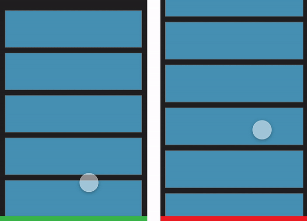
Unlike a mobile device or even your office setup with a desktop computer and a chair, in a car, the seat is at a fixed angle relative to the screen, which is also fixed in place. For this reason, it is essential to consider the reachability of the screen and its readability. Considering a left-seated driver, elements on the right side of the screen result less readable and reachable (the opposite, of course, happens in cars with the steering wheel on the right side).
11. Use clear affordances
Avoid ghost buttons, affordances should be very clear and visible. Both primary and secondary actions should be clearly identifiable
12. Safety and usability before beauty
This doesn’t mean ugly either, of course (and unfortunately there are some UGLY in-car experiences out there). But when designing for in-car screens you have to consider saying goodbye to subtle color tones, delicate contrast, icons with thin strokes, light fonts, tiny texts…
Minimalism is more than welcome, but it’s a minimalism made of fewer very visible components.
These principles are, as stated at the beginning of the article, just rules-of-thumb, that cannot in any way skip rigorous testing. But if you’re approaching HMI for cars for the first time, coming from UX for smartphones and computers, these could be a starting point to start dipping your toes in this complex discipline.
Resources
Human Factors Design Guidance For Driver-Vehicle Interfaces
Automotive User Experience Design Patterns: An Approach and Pattern Examples
⬜️⬜️⬜️⬜️⬜️⬜️⬜ 👧🏻👧🏼🧒🏻👦🏼👧🏾👦🏿👧🏽👧🏻👧🏼🧒🏻👦🏼👧🏾👦🏿👧🏽👧🏻👧🏼 ⬜️⬜️⬜️⬜️⬜⬜️⬜
My new book “Designing Digital Products for Kids”! Out December the 4th!
Learn the secrets to design successful digital products for children.
You’ll find answers to all your questions regarding the industry, and its peculiarities in 📐 UX design, 🎨 UI design, 🔍 user testing, 📈 business strategies, and much more.
⬜️⬜️⬜️⬜️⬜️⬜️⬜ 👧🏻👧🏼🧒🏻👦🏼👧🏾👦🏿👧🏽👧🏻👧🏼🧒🏻👦🏼👧🏾👦🏿👧🏽👧🏻👧🏼 ⬜️⬜️⬜️⬜️⬜️⬜️⬜

