5 typography rules for non-designers
Are you constantly struggling to deal with typography? Here are five tips for non-designers to overcome font-anxiety and start appreciating the beauty of type.

01 Start with only one font
The first tip for non-designers dealing with typography is simple and will make your life much easier: Stop combining different fonts you like individually and try using only one font in your future compositions.
If you don’t believe me, think for a moment about how many different fonts there are out there. And now think about how many great designers there are, who know exactly how to combine a fancy Merriweather with Montserrat to achieve a combination of tradition and modern aesthetic. So if you are not one of those highly educated or visually proficient people and think Merriweather is an American boxer, you should start to use only one font per design job you are doing.

Using two different fonts successfully in a layout is hard. It requires an in-depth understanding of the essence in type or an enormous portion of luck. In general, a good rule of thumb is, to avoid two typefaces that look similar to each other and have the same classification. For example, do not use Akzidenz Grotesk and Avenir–two per se excellent sans serif fonts–together in the same design because they share too many similarities to the unskilled eye. If you have to use two different typefaces, try using a mix of serif and sans serif instead. Maybe you were lucky enough and your combination has even been mentioned in this article of Digital Synopsis.
If you do not want to make your fortune dependent on chance and you aren’t familiar with the art of fresh typography and the decision-making process behind font-matching, just stick to your favourite font family. And make sure it comes with various weights to differentiate your heading and subheading from your body text without concerns.
However, the next rule is going to help you with that.
02 Only use these ten fonts
Most of the time we aren’t truly aware of the fonts that accompany us through our days. If you are a designer, the search for good typefaces is something like a scavenger hunt. Simply because there are so many great fonts out there, waiting to be used — I talk about you, delicious Inter. But most of us have like 1000+ fonts on their machines, some may have been never used, always sticking to the same set of five to ten typefaces for a reason.
If you are always in the veld, chasing your next .tff download you potentially forget about the important things in life: creating stuff. I want to make your work easier here and show you the top 10 classic typefaces you can always use when in doubt:
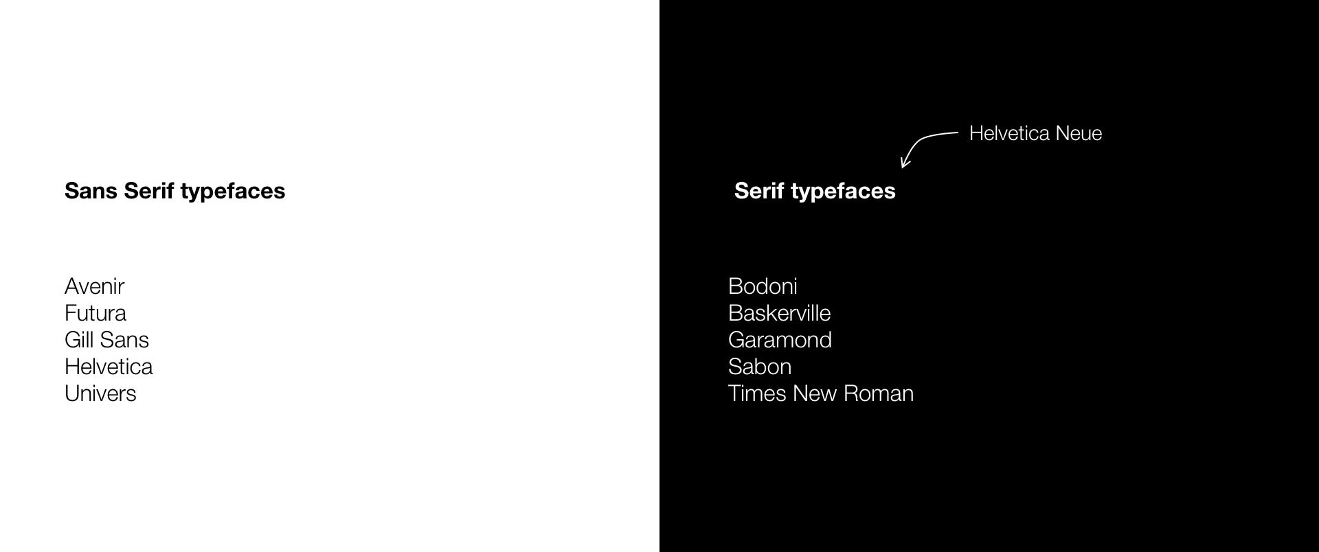
If you don’t know the difference between Serif and Sans serif, “sans” simply means “without” and serifs are small lines or strokes attached to the end of a larger stroke. You know Arial, right? That is a typical Sans Serif typeface — Times New Roman, on the other hand, is a font with serifs. In general, benefits are using both Serif and Sans Serif fonts in different situations. A very simple approach is to use Serif fonts at smaller body copy sizes as they are usually easier to read. While Sans Serif fonts typically really stand out in large titles.
Even in 2020, there is this infamous superstition, that you shouldn’t use serif fonts on a digital screen. This opinion still perseveres because, in the early days of digital design, you would have tried to avoid using serif typefaces on screens because of their small pixel density. However, this argument is no longer valid with today’s technology. You can use every font you like in every scenario you could imagine … as long it’s one of the above mentioned.
03 Double your point size
When you start with Web or Interface Design it’s often difficult to determine the font size of headlines, subheadlines, and body text. Yes, you can indeed use your gut feeling, but especially at the beginning, you should follow this simple rule: Always double your point size.
This is a good rule of thumb to make sure you get the right visual contrast between different parts of your design. Always double or halve your point size. So if we set our body text in font size 20, it is a good idea to set headlines at 40 pixels. In special cases, the incrementation can also be done by a factor of 3x or 4x.

Of course, this is just a tip for the right start in dealing with sizes in typography. And you don’t have to follow this rule in a sectarian way, you might as well experiment with other factors. Often an analysis of websites that use good type design and that you like can help a lot. To check the fonts of other websites quickly and easily, use chrome extensions like Fonts Ninja.
There are also other more complex ratios in scaling fonts up and down like “Major Third” and the “Golden Ratio”, that you can check out here with the handy tool Type-Scale. Also, examine the rule of 8dp increments. The “Double your point size” rule is though the most practical and remarkable one in your daily work.
04 Contrast matters: Skip font weights
In the other tips, you have already heard about font weights. To get a better understanding of that term if you’ve never heard of it: The weight of a typeface is the thickness of the outline. While in normal text editing tools like Word there are usually just two font thicknesses (normal and bold), we as designers can choose from a variety of font weights — as long as we have a font family that allows this.
Take Helvetica for example, it’s probably the most loved typeface on planet earth and millions of designers have used it since it’s development in 1957. The problem with this timeless classic though is, that it has only a limited amount of different font weights and the subsequently added weights are not as consistent for example the variants of the font Univers. This is the reason for the success of Helvetica Neue, a new take on of the classic with a more structurally unified set of heights and widths made up of 51 fonts including nine different weights.

Don’t get me wrong, there are several situations where three font weights are more than enough and Helvetica has proven it’s usability multiple times in the past. But Helvetica Neue allows you to achieve visual contrast much easier, which brings me back to tip four: Skip a font-weight in between.
What that means is, if you want to have a striking headline and some decent body text, try to format the headline in Bold and the body in Light or even thin of it’s still readable and the font family is offering you the possibility. The reason behind that is visual contrast.
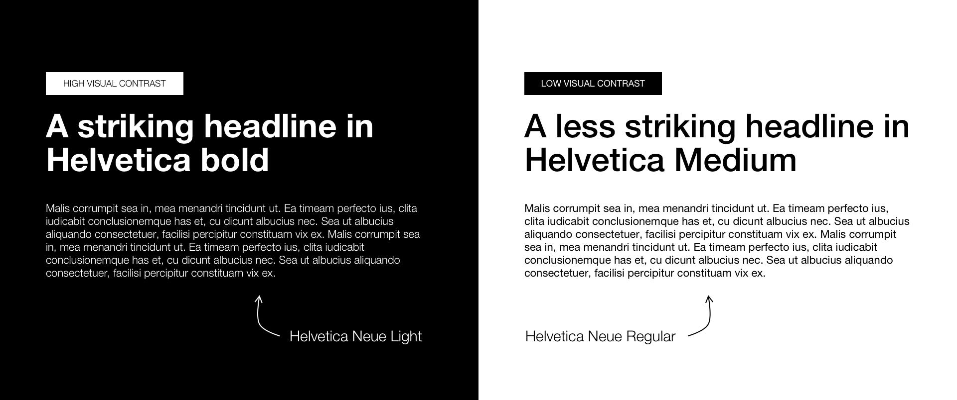
Slight changes in font-weight may often get overlooked by the audience, so to try to catch their eye with diversity and bolden up your typography to make them notice a difference.
05 Mind the space in your composition

Do you know, why Apple is putting their “one more thing” slogan in tightly kerned Helvetica onto a large screen year and year again completely isolated? Because it is striking. And the reason for that is called white space or negative space.
For every design work you are doing, whether it’s a magazine or an app, many different visual elements make up the whole layout. And there is one section beside the text, illustrations or images that is invisible. However it is maybe the most important one in terms of visual aesthetic: the white space between your elements, which indicates the presence of a canvas. Design theory promotes the use of negative space for elegance and ensuring a quality user experience.
So when in doubt, try to let your layout “breathe” a little by reducing the number of things going on at your canvas. If you stuck in your design process, duplicate the artboard and attempt to reduce a certain section of your composition by half and look at the result. Maybe it sucks, maybe not. It is worth trying.
06 Bonus one: Never use Comic Sans or Papyrus
That one was obvious, right? If not, look at how your decisions as a designer can have a significant impact on the lives of others:

