8 (more) tips to quickly improve your UIs
More small and easy to put into practice tips to improve your designs.

Creating beautiful, usable, and efficient UIs takes time, with many design revisions along the way. Making those constant tweaks to produce something that your clients, users, and yourself are truly happy with. I know. I’ve been there many times before myself.
But what I’ve discovered over the years is that by making some simple tweaks you can quickly improve the designs you’re trying to create.
In this follow up article (You can find Part 1 here), I’ve put together a small, and easy to put into practice, selection of tips that can, with little effort, not only help improve your designs today, but hopefully give you some handy pointers for when you’re starting your next project.
Let’s dive on in for some more UI & UX goodness…
Oh. Before you read the rest of the article…
🏠 Growing a SaaS startup? I combine strategic design with proven founder experience to help you build products users love.
Join the Haus waitlist for early-bird perks → https://gohaus.design/
1. Lighten up your text if it looks a little on the heavy side
When it comes to long-form content, certain Regular weight Typefaces can still look a little too heavy, and stark.
Easily fix this by opting for something like a Dark Grey (ie; #4F4F4F) to make that text a little easier on the eye.

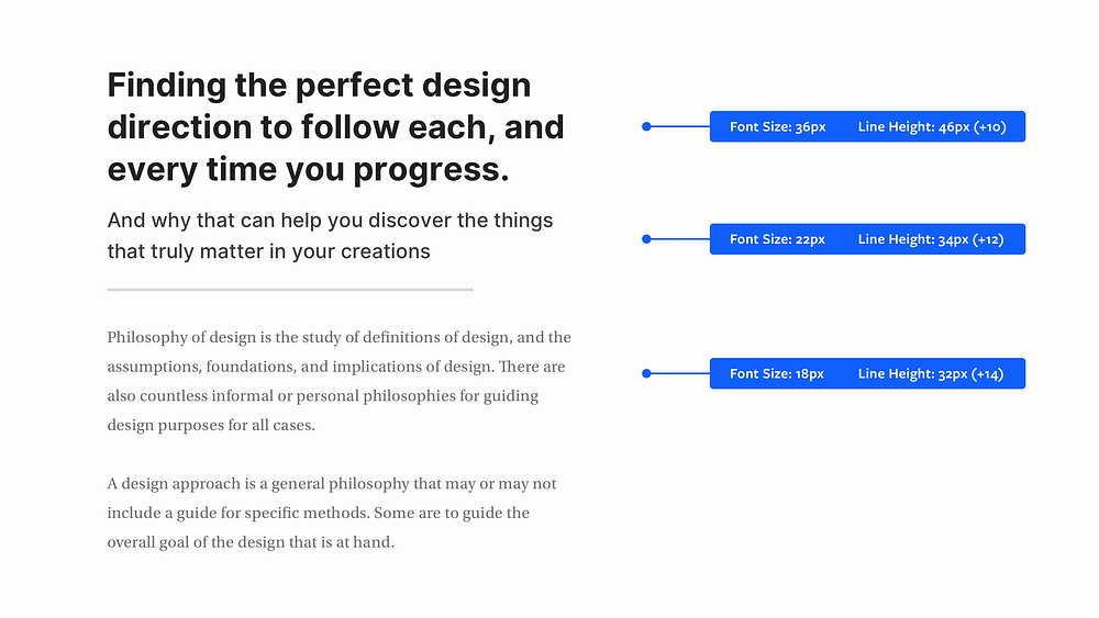
2. The smaller the font size, the more generous the line height
As your font size decreases, increase the line height for better, all-round legibility.
The same applies to when your font size increases. Simply Decrease the line height.
3. Choose a Base Colour, and then use Tints & Shades to add uniformity
You don’t always have to stuff your design with a multitude of colours.
If the project allows it, simply using a restricted colour palette, by choosing a Base Colour and then using Tints and Shades, can add uniformity to your designs in the simplest of ways.

4. Give prominence to the most important elements
By using a combination of Font Sizes, Weights, and Colour, you can easily give prominence to the most important elements in your UI.
Simple adjustments to make the user experience that little bit better.

5. For Consistency, make sure your Icons share the same visual style
When implementing Icons in your UI, keep things consistent.
Make sure they all share the same visual style; the same weight, and either filled, or outlined.
Don’t mix and match.

6. Always make your ‘Call to Action’ the most prominent item on the screen
You think this would be common sense right? Erm. Not always I’m afraid.
Make sure that ‘Call to Action’ is as prominent as possible, via the use of colour contrast, size, and labels.
Don’t always rely on Icons alone if you can. If you can use Text Labels too, use ’em, to enable much better user comprehension.

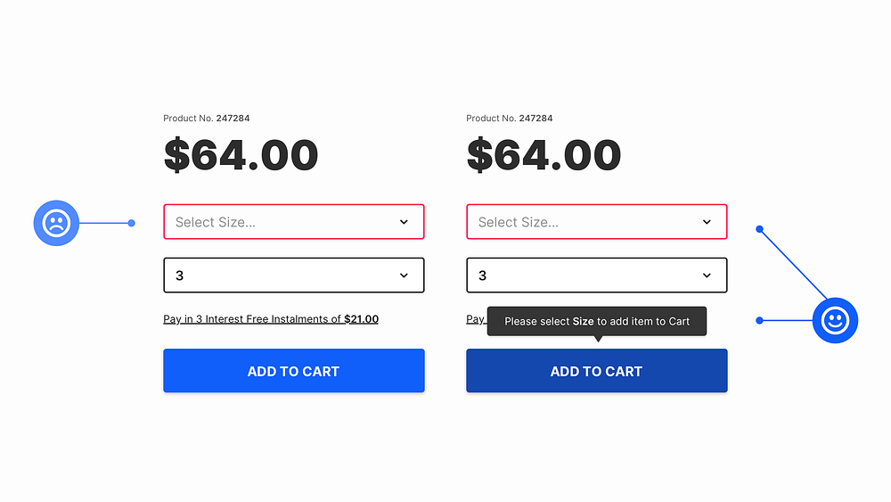
7. Add an extra visual aid to your Form Errors
Adding an Error Message close to the action that the user has just taken can be a simple, but helpful, extra visual aid for when they’re filling out Forms of any kind.
Every little helps right?
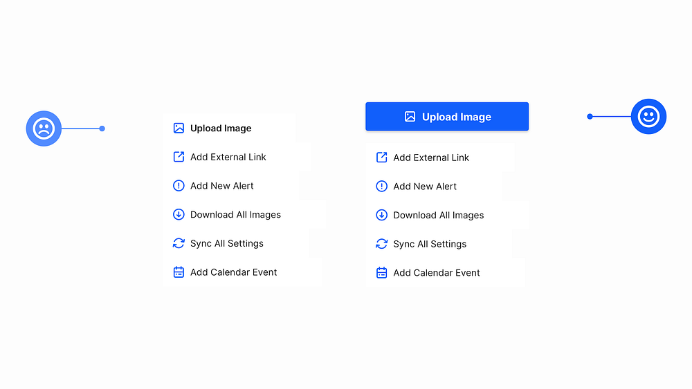
8. Give Prominence to the most frequently used action in a Menu
When designing a Menu to use inside of an application, make sure to give the most frequently used action (ie; Upload Image, Add File etc…) the most prominence on the screen.
Oh. Before you go…
🏠 Growing a SaaS startup? I combine strategic design with proven founder experience to help you build products users love.
Join the Haus waitlist for early-bird perks → https://gohaus.design/


